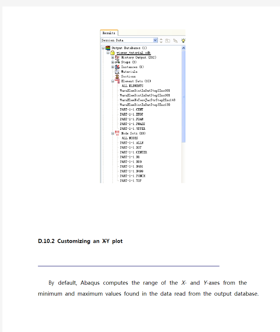
ABAQUS如何画XY曲线图1

D.10.2 Customizing an X–Y plot
By default, Abaqus computes the range of the X- and Y-axes from the minimum and maximum values found in the data read from the output database. Abaqus divides each axis into intervals and displays the appropriate major and minor tick marks. The Axis Options allow you to set the range of each axis and to customize the appearance of the axes; the Curve Options allow you to customize the appearance of the individual curves; the Chart Options and Chart Legend Options allow you to position the grid and legend, respectively. X–Y plot customization options apply only to the current viewport and are not saved between sessions.
(这部分讲的主要是对曲线图进行相关的操作,这些操作主要包括:设置坐标轴的名称,单位;调整图域的大小;设置刻度线的长度,数量;是否显示栅格,是否有标题栏.自已摸索一下就OK了,也可以跳过不看)
To customize an X–Y plot:
1.From the main menu bar, select Options XY Options Axis(or click
in the prompt area to cancel the current procedure, if necessary, and double-click either axis in the viewport).
Abaqus displays the Axis Options dialog box.
2.Switch to the Scale tabbed page, if it is not already selected.
3.Specify that the X-axis should extend from 0 (the X-axis minimum)
to 20 (the X-axis maximum) and that the Y-axis should extend from –200 (the Y-axis minimum) to 0 (the Y-axis maximum).
Tip: Select each axis in turn in the Axis Options dialog box, and then edit the scale as noted above.
4.From the options in the Axis Options dialog box, do the following.
?In the Scale tabbed page, request that major tick marks appear on the X-axis at four-second increments (select By increment
in the Tick Mode region of the page).
?Request 3 minor tick marks per increment along the X-axis (this corresponds to a minor tick mark every second) and 4
minor tick marks per increment along the Y-axis (this
corresponds to a minor tick mark every 10 mm).
?In the Title tabbed page, type a Y-axis title of Displacement U2 (mm).
?In the Axes tabbed page, request a Decimal format with zero decimal places for the Y-axis labels.
5.Click Dismiss to close the Axis Options dialog box.
前面几步主要是设置坐标轴,可按下图操作,主要就是弄明白四个属性页的意思就可以了,SCALE是调整坐标和显示比例的,Trik Marks是用来调整刻度线的长度,线型,数量的. Title是用来设置坐档轴的名称,单位的.Axis是用来设置曲线的线型颜色的.
6.From the main menu bar, select Options XY Options Chart (or
double-click any empty spot in the plot) to modify the grid lines and position the grid.
a.In the Chart Options dialog box that appears, switch to the Grid Display tabbed page.
b.Toggle on Major in both the X Grid Lines and Y Grid Lines fields. Change the color of the major grid lines to blue; the line style should be solid.
c.Switch to the Grid Area tabbed page.
d.In the Size region of this page, select the Square option.
https://www.360docs.net/doc/06266364.html,e the slider to set the size to 75.
f.In the Position region of this page, select the Auto-align option.
g.From the available alignment options, select the fourth to last one (position the grid in the bottom-center of the viewport).
h.Click Dismiss.
以上说了这么多也同什么,就是用来调整图弄的显示区域的大小了,总共就二个属性页,很了看的)