委托的应用(自定义控件)
委托的应用(自定义控件)
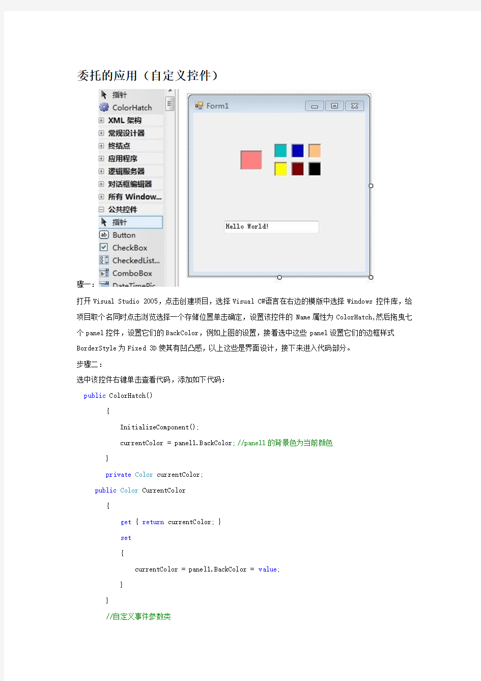
骤一:
打开Visual Studio 2005,点击创建项目,选择Visual C#语言在右边的模版中选择Windows 控件库,给项目取个名同时点击浏览选择一个存储位置单击确定,设置该控件的Name属性为ColorHatch,然后拖曳七个panel控件,设置它们的BackColor,例如上图的设置,接着选中这些panel设置它们的边框样式BorderStyle为Fixed 3D使其有凹凸感,以上这些是界面设计,接下来进入代码部分。
步骤二:
选中该控件右键单击查看代码,添加如下代码:
public ColorHatch()
{
InitializeComponent();
currentColor = panel1.BackColor;//panel1的背景色为当前颜色
}
private Color currentColor;
public Color CurrentColor
{
get { return currentColor; }
set
{
currentColor = panel1.BackColor = value;
}
}
//自定义事件参数类
public class ColorChangedEventArgs
{
private Color c1, c2;
public ColorChangedEventArgs(Color c1, Color c2)
{
this.c1 = c1;
this.c2 = c2;
}
public Color ColorBeforeChange
{
get { return c1; }
}
public Color ColorAfterChange
{
get { return c2; }
}
}
public delegate void ColorChangedEventHandler(object sender, ColorChangedEventArgs e);//声明委托
public event ColorChangedEventHandler ColorChanged;//声明事件
protected virtual void OnColorChanged(ColorChangedEventArgs e)//当颜色改变时的方法,将自定义事件作为参数传递,从而触发颜色改变事件发生
{
if (ColorChanged != null)//如果有对象注册
ColorChanged(this, e);//调用所有注册对象的方法
}
步骤三:
选中这7个面板,到属性窗口事件里面双击Click添加这些代码:
Panel p = (Panel)sender;//强制转化为panel,从而观察到用户点击的是哪个小面板
Color c1 = currentColor;
currentColor = panel1.BackColor = p.BackColor;//每次点击的哪个面板都将该面板的颜色赋值给panel1的背景色同时也赋值给当前颜色
ColorChangedEventArgs args = new ColorChangedEventArgs(c1, currentColor);//创建事件参数类对象
OnColorChanged(args);//调用 OnColorChanged方法
步骤四:
接着新建一个Window应用程序项目,将我们之前写好的ColorHatch控件拖放进来,拖曳一个TextBox,设置其Text属性为Hello World!,找到该文本框的TextChanged事件双击进去
步骤五:
在窗体中确保选中ColorHatch这个控件,然后在属性窗口找到ColorChanged事件双击添加代码如下; textBox1.ForeColor = e.ColorAfterChange;//面板颜色的改变文本框的字体颜色也相应跟着改变
android 自定义圆角头像以及使用declare-styleable进行配置属性解析
android 自定义圆角头像以及使用declare-styleable进行配置属性解析由于最新项目中正在检查UI是否与效果图匹配,结果关于联系人模块给的默认图片是四角稍带弧度的圆角,而我们截取的图片是正方形的,现在要给应用统一替换。应用中既用到大圆角头像(即整个头像是圆的)又用到四角稍带弧度的圆角头像,封装一下以便重用。以下直接见代码 [java] view plain copy 在CODE上查看代码片派生到我的代码片 package com.test.demo; import com.test.demo.R; import android.content.Context; import android.content.res.TypedArray; import android.graphics.Bitmap; import android.graphics.BitmapShader; import android.graphics.Canvas; import android.graphics.Matrix; import android.graphics.Paint; import android.graphics.RectF; import android.graphics.Shader.TileMode; import android.graphics.drawable.BitmapDrawable; import android.graphics.drawable.Drawable; import android.os.Bundle; import android.os.Parcelable; import android.util.AttributeSet; import android.util.Log; import android.util.TypedValue; import android.widget.ImageView; /** * 圆角imageview */ public class RoundImageView extends ImageView { private static final String TAG = "RoundImageView"; /** * 图片的类型,圆形or圆角 */ private int type; public static final int TYPE_CIRCLE = 0; public static final int TYPE_ROUND = 1; /** * 圆角大小的默认值
用户控件事件执行顺序
在WebForm1页面上直接放置用户控件WebUserControl1时的事件顺序:WebUserControl1_Init WebForm1_Init Page_Load WebUserControl1_Load WebForm1_PreRender WebUserControl1_PreRender WebUserControl1_Unload WebForm1_Unload 在WebForm1页面的OnInit方法中用代码Load用户控件WebUserControl1时的事件顺序:WebForm1_Init: OnInit WebForm1: Loading controls WebUserControl1_Init : OnInit WebForm1: added to Controls WebForm1: LoadViewState WebUserControl1: LoadViewState WebUserControl1: LoadPostData Begin WebUserControl1: LoadPostData End WebForm1_PageLoad: OnLoad after base's Onload. WebUserControl1_Load: after base's OnLoad iWebUserControl1: RaisePostDataChange WebForm1: OnPreRender WebUserControl1: OnPreRender WebForm1: SavedViewState WebUserControl1: SaveViewState 在WebForm1页面的Page_Load方法中用代码Load用户控件WebUserControl1时的事件顺序:WebForm1_Init : OnInit WebForm1: LoadViewState WebForm1_PageLoad: OnLoad after base's Onload. WebForm1: Loading controls WebUserControl1_Init : OnInit WebUserControl1: LoadViewState WebForm1: added to Controls WebUserControl1_Load: after base's OnLoad WebUserControl1: LoadPostData Begin WebUserControl1: LoadPostData End iWebUserControl1: RaisePostDataChange WebForm1: OnPreRender WebUserControl1: OnPreRender WebForm1: SavedViewState WebUserControl1: SaveViewState 在WebForm1页面的Button1_Click事件中用代码Load用户控件WebUserControl1时的事件顺序:WebForm1_Init Page_Load Button1_Click WebUserControl1_Init WebUserControl1_Load WebForm1_PreRender WebUserControl1_PreRender WebUserControl1_Unload WebForm1_Unload 在WebForm1页面的Page_Load事件中用代码Load用户控件WebUserControl1,WebUserControl1又在Page_Load事件中用代码Load用户控件WebUserControl2时的事件顺序:WebForm1_Init Page_Load WebUserControl1_Init WebUserControl1_Load WebUserControl2_Init WebUserControl2_Load WebForm1_PreRender WebUserControl1_PreRender WebUserControl2_PreRender WebUserControl2_Unload WebUserControl1_Unload WebForm1_Unload
C# 自定义控件制作和使用实例
C# 自定义控件制作和使用实例 第一步:新建一个控件库项目:myControl 第二步:从工具箱里面拖动1个PictureBox、1个Button、6个Lable控件到用户界面上,布局如下: 如上图,设置pictureBox的Name为picBox,背景为白色,Button的Name为btnOpen,
另外靠左的三个Lable的Text属性分别为:文件名称,文件大小,文件尺寸,靠右的三个Lable的Name分别为:lblName, lblLength, lblSize. 第三步:添加处理程序代码 在btnOpen的Click事件写入代码,打开一个打开文件对话框,选择一个图形文件,打开并将它显示在picBox上。 private void btnOpen_Click(object sender, EventArgs e) { OpenFileDialog ofdPic = new OpenFileDialog(); ofdPic.Filter = "JPG(*.JPG;*.JPEG);gif文件(*.GIF)|*.jpg;*.jpeg;*.gif"; ofdPic.FilterIndex = 1; ofdPic.RestoreDirectory = true; ofdPic.FileName = ""; if (ofdPic.ShowDialog() == DialogResult.OK) { string sPicPaht = ofdPic.FileName.ToString(); FileInfo fiPicInfo = new FileInfo(sPicPaht); long lPicLong = fiPicInfo.Length / 1024; string sPicName = https://www.360docs.net/doc/c69828471.html,; string sPicDirectory = fiPicInfo.Directory.ToString(); string sPicDirectoryPath = fiPicInfo.DirectoryName; Bitmap bmPic = new Bitmap(sPicPaht); if (lPicLong > 400) { MessageBox.Show("此文件大小為" + lPicLong + "K;已超過最大限制的K范圍!"); } else { Point ptLoction = new Point(bmPic.Size); if (ptLoction.X > picBox.Size.Width || ptLoction.Y > picBox.Size.Height) { picBox.SizeMode = PictureBoxSizeMode.Zoom; } else { picBox.SizeMode = PictureBoxSizeMode.CenterImage; } } picBox.LoadAsync(sPicPaht); lblName.Text = sPicName; lblLength.Text = lPicLong.ToString() + " KB"; lblSize.Text = bmPic.Size.Width.ToString() + "×" + bmPic.Size.Height.ToString(); }
.NET4.0 用户控件的概述
https://www.360docs.net/doc/c69828471.html,4.0 用户控件的概述 用户控件是页面的一段,包含了静态HTML代码和服务器控件。其优点在于一旦创建了一个用户控件,可以在同一个应用的多个页面中重用。并且,用户可以在Web用户控件中,添加该控件的属性、事件和方法。 1.什么是用户控件 用户控件(后缀名为.ascx)文件与https://www.360docs.net/doc/c69828471.html,网页窗体(后缀名为.aspx)文件相似。就像网页窗体一样,用户控件由用户接口部分和控制标记组成,而且可以使用嵌入脚本或者.cs代码后置文件。用户控件能够包含网页所能包含的任何东西,包括静态HTML内容和https://www.360docs.net/doc/c69828471.html,控件,它们也作为页面对象(Page Object)接收同样的事件(如Load和PreRender),也能够通过属性(如Application,Session,Request 和Response)来展示https://www.360docs.net/doc/c69828471.html,内建对象。 用户控件使程序员能够很容易地跨Web应用程序划分和重复使用公共UI功能。与窗体页相同,用户可以使用任何文本编辑器创作用户控件,或者使用代码隐藏类开发用户控件。 此外,用户控件可以在第一次请求时被编译并存储在服务器内存中,从而缩短以后请求的响应时间。与服务器端包含文件(SSI)相比,用户控件通过访问由https://www.360docs.net/doc/c69828471.html,提供的对象模型支持,使程序员具有更大的灵活性。程序员可以对在控件中声明的任何属性进行编程,而不只是包含其他文件提供的功能,这与其他任何https://www.360docs.net/doc/c69828471.html,服务器控件一样。 此外,可以独立于包含用户控件的窗体页中除该控件以外的部分来缓存该控件的输出。这一技术称作片段缓存,适当地使用该技术能够提高站点的性能。例如,如果用户控件包含提出数据库请求的https://www.360docs.net/doc/c69828471.html,服务器控件,但该页的其余部分只包含文本和在服务器上运行的简单代码,则程序员可以对用户控件执行片段缓存,以改进应用程序的性能。 用户控件与普通网页页面的区别是: ●用户控件开始于控件指令而不是页面指令。 ●用户控件的文件后缀是.ascx,而不是.aspx。它的后置代码文件继承于 https://www.360docs.net/doc/c69828471.html,erControl类.事实上,UserControl类和Page类都继承于同一个 TemplateControl类,所有它们能够共享很多相同的方法和事件。 ●没有@Page指令,而是包含@Control指令,该指令对配置及其他属性进行定义。 ●用户控件不能被客户端直接访问,不能作为独立文件运行,而必须像处理任何控件一 样,将它们添加到https://www.360docs.net/doc/c69828471.html,页中。 ●用户控件没有html、body、form元素,但同样可以在用户控件上使用HTML元素和 Web控件。 用户可以将常用的内容或者控件以及控件的运行程序逻辑,设计为用户控件,
android studio 控件常用属性
android studio 控件常用属性 下面是RelativeLayout各个属性 1.android:layout_above="@id/xxx" --将控件置于给定ID控件之上 2.android:layout_below="@id/xxx" --将控件置于给定ID控件之下 3. android:layout_toLeftOf="@id/xxx" --将控件的右边缘和给定ID控件的左边缘对齐 4.android:layout_toRightOf="@id/xxx" --将控件的左边缘和给定ID控件的右边缘对齐 5. android:layout_alignLeft="@id/xxx" --将控件的左边缘和给定ID控件的左边缘对齐 6.android:layout_alignTop="@id/xxx" --将控件的上边缘和给定ID控件的上边缘对齐 7.android:layout_alignRight="@id/xxx" --将控件的右边缘和给定ID控件的右边缘对齐 8.android:layout_alignBottom="@id/xxx" --将控件的底边缘和给定ID控件的底边缘对齐 9.android:layout_alignParentLeft="true" --将控件的左边缘和父控件的左边缘对齐 10. android:layout_alignParentTop="true" --将控件的上边缘和父控件的上边缘对齐 11. android:layout_alignParentRight="true" --将控件的右边缘和父控件的右边缘对齐 12.android:layout_alignParentBottom="true" --将控件的底边缘和父控件的底边缘对齐 13.android:layout_centerInParent="true" --将控件置于父控件的中心位置 14.android:layout_centerHorizontal="true" --将控件置于水平方向的中心位置 15.android:layout_centerVertical="true" --将控件置于垂直方向的中心位置 android:layout_width 设置组件的宽度 android:layout_height 设置组件的高度 android:id 给组件定义一个id值,供后期使用 android:background 设置组件的背景颜色或背景图片 android:text 设置组件的显示文字 android:textColor 设置组件的显示文字的颜色 android:layout_below 组件在参考组件的下面 android:alignTop 同指定组件的顶平行
Android平台我的日记设计文档
Android平台我的日记 设计文档 项目名称:mydiray 项目结构示意: 阶段任务名称(一)布局的设计 开始时间: 结束时间: 设计者: 梁凌旭 一、本次任务完成的功能 1、各控件的显示 二、最终功能及效果 三、涉及知识点介绍 四、代码设计 activity_main.xml: android:layout_centerHorizontal="true" android:layout_marginTop="88dp" android:text="@string/wo" android:textSize="35sp"/> [C#] - 用户自定义控件(含源代码)-透明文本框透明文本框 由于在https://www.360docs.net/doc/c69828471.html,只能下载*.dll的文件,没有代码,所以特意发出源代码。 using System; using System.Collections; using https://www.360docs.net/doc/c69828471.html,ponentModel; using System.Drawing; using System.Data; using System.Windows.Forms; using System.Drawing.Imaging; namespace ZBobb { /// 《Android基础应用》 Android常用控件 ?本章任务 ?使用Android开发使用时间组件 ?使用Android开发使用进度条组件 ?使用Android开发创建底部选项卡 ?本章目标 ?了解Android的组件层次结构 ?掌握常用的日期时间类控件 ?掌握常用的几个容器组件 1.Android组件的层次结构 UI组件都是View的子类,View有很多子类,它们之间存在树状的继承关系View及其子类结构图 TextView及其子类结构图 ViewGroup及其子类结构图 其下的子类一般作为容器或布局来使用 FrameLayout及其子类结构图 其下的子类通常作为容器或布局来使用 2.时间控件 2.1日期时间选择器 DatePicker组件可用于输入日期,TimePicker组件可用来选择时间,只能输入小时和分,默认12小时制 DatePicker ●使用onDateChangedListener监听器来获取用户的日期选择 ●使用init对组件进行初始化 ●使用getYear,getMonth,getDayOfMonth方法获得用户选择的年,月,日 TimePicker ●使用onTimeChangedListener监听器获取用户的时间选择 ●使用setIs24HourView设置是否以24小时制显示 ●使用getCurrentHour获得当前的小时数 ●使用getCurrentMinute获得当前的分钟数 示例 示例的实现结果 2.2时钟组件 AnalogClock组件用来以表盘的方式显示当前时间,该表只有时针和分针,DigitClock组件以数字的方式显示当前时间可以显示时分秒,由于DigitClock继承TextView,可以使用TextView 的属性 示例 android 自定义控件的过程 invalidate()会导致computeScroll()以及onDraw()方法的执行computeScroll()方法是在屏幕流动的时候不停的去调用,scrollTo(int x,int y)则是滚动到相应的位置; scrollBy(int x, int y)则是移动一些距离,X为正是向左移动,为负时向右移动,Y与X的意义一个,只是是上下移动而已View对象显示在屏幕上,有几个重要步骤: 1.构造方法创建对象 2.测量View的大小onMeasure(int,int); 3.确定View的位置,View自身有一些权,决定权在父View手中. onLayout();基本上不常用,在继承View的时候基本上用不着,但在继承ViewGroup的时候的就要用到了,因为要对View进行布局,确定View的位置,确定的时候使用 指定子View的位置,左,上,右,下,是指在ViewGroup坐标系中的位置https://www.360docs.net/doc/c69828471.html,yout(int xtop,int ytop, int xbottom, int ybottom); 4.绘制View的内容onDraw(Canvas) 实现过程: 1、构造方法: /** * 在布局文件中声名的view,创建的时候由系统调用 * * @param context * 上下文对象 * @param attrs * 属性集 */ public MyToggleButton(Context context, AttributeSet attrs) { super(context, attrs); initView(); } 2、测量View的大小: /** * 测量尺寸时的回调方法 */ 1.能够连接“层次化数据”的数据源控件是()。 A.SqlDataSource控件和XmlDataSource控件 B.SiteMapDataSource控件和LinqDataSource控件 C.SiteMapDataSource控件和XmlDataSource控 件 D.SqlDataSource控件和LinqDataSource控件 【参考答案】: C 2.APP_Code文件夹用来存储()。 A.数据库文件 B.资源文件 C.自定义类文件 D.主题文件 【参考答案】: C 3.下面不是HttpResponse对象的方法是()。 A.Write() B.Redirect() C.Cookie() D.Clear() 【参考答案】: C 4.下面关于用户控件的说法错误的是()。 A.一个用户控件不能在同一个网页中多次使用 B.用户控件支持可视化开 发 C.可以将已有的aspx文件更改为ascx文件 D.在每个使用用户控件的Web应用程序中,都必须保存一个该控件的副本 【参考答案】: A 5.可以使用属性()禁用主题。 A.EnabledTheme B.EnableThemes C.EnableTheming D.EnabledTheme s 【参考答案】: C 6.GridView控件要实现分页功能需要设置属性()值为True。 A.AllowPages B.AllowPaged C.AllowPaging D.AllowPage 【参考答案】: C 7.HttpRequest对象的()数据集合用于从查询字符串中读取用户提 交的数据。 A.QueryString B.Browser C.ServerVariables D.ClientCertificat e 【参考答案】: A 8.创建一个Cookie的正确代码()。 A.Response.Cookies["userName"]="apple" B.Cookies["userName"]="appl e" C.Cookies["userName"].Value="apple" D.Response.Cookies["user Name"].Value="apple" 【参考答案】: D 9.使用存储过程可以()。 A.提高数据库安全性 B.加快执行速度 C.降低网络通信量 D.使分工更复杂 【参考答案】: D 10.下面关于状态管理的说法错误的是()。 A.客户端状态管理将信息保留在客户端计算机上 B.服务器端状态管理将信息保留在服务器上 C.Web 窗体页是有状态的 D.状态管理可以对同一页或不同页的多个请求维护状态和页信息 【参考答案】: C 11.下面关于存储过程的说法错误的是()。 A.公共数据存储过程可以被多个 Web 应用程序调用 B.存储过程被解释执行 C.一个存储过程可以执行上百条 SQL 语句 D.存储过程或数据库结构的更改不会影响 Web 应用程序 【参考答案】: B 自定义控件开发 一般而言,Visual Studio 2005中自带的几十种控件已经足够我们使用了,但是,在一些特殊的需求中,可能需要一些特殊的控件来与用户进行交互,这时,就需要我们自己开发新的、满足用户需求的控件。(源码网整理:https://www.360docs.net/doc/c69828471.html,) 要开发自己的控件,有几种方法: ?复合控件(Composite Controls):将现有的各种控件组合起来,形成一个新的控件,来满足用户的需求。 ?扩展控件(Extended Controls):就是在现有的控件基础上,派生出一个新的控件,增加新的功能,或者修改原有功能,来满足用户需求。 ?自定义控件(Custom Controls):就是直接从System.Windows.Forms.Control 类派生,也就是说完全由自己来设计、实现一个全新的控件,这是最灵活、最强大的方法,但是,对开发者的要求也是最高的。要实现一个自定义控件,必须为Control类的的OnPaint事件编写代码,在OnPaint事件中实现自定义控件的绘制工作。同时,还可以重写Control类的WndProc方法,来处理底层的Windows消息。所以说,要实现一个自定义控件,对开发者的要求较高,要求开发者必须了解GDI+和Windows API的知识。 下面我们就分别给大家介绍这三种方法。 ?复合控件(Composite Controls) 复合控件实际上是控件的集合,类似于堆积木。因此,可以按照用户的需求,把VS 2005工具箱中的控件任意组合起来,形成一个复合控件。在以后使用中,将生成的这个复合控件作为一个控件来对待。 复合控件一般都是从UserControl类派生而来,因此复合控件(用户控件)可以在“UserControl测试容器”中进行测试。 复合控件的创建步骤: 第一步:新建一个Windows控件库项目“CompositeControlDemo” android常用控件大全 在Android中使用各种控件(View) DatePicker-日期选择控件 TimePicker-时间选择控件 ToggleButton-双状态按钮控件 EditText-可编辑文本控件 ProgressBar-进度条控件 SeekBar-可拖动的进度条控件 AutoCompleteTextView-支持自动完成功能的可编辑文本控件 MultiAutoCompleteTextView-支持自动完成功能的可编辑文本控件,允许输入多值(多值之间会自动地用指定的分隔符分开) ZoomControls-放大/缩小按钮控件 Include-整合控件 VideoView-视频播放控件 WebView-浏览器控件 RatingBar-评分控件 Tab-选项卡控件 Spinner-下拉框控件 Chronometer-计时器控件 ScrollView-滚动条控件 在Android中使用的Layout FrameLayout:里面只可以有一个控件,并且不能设计这个控件的位置,控件会放到左上角 LinearLayout:里面可以放多个控件,但是一行只能放一个控件 TableLayout:这个要和TableRow配合使用,很像html里面的table AbsoluteLayout:里面可以放多个控件,并且可以自己定义控件的x,y的位置 RelativeLayout:里面可以放多个控件,不过控件的位置都是相对位置 (Android界面布局好像还可以直接引用一些view,如ScrollView等) 常用控件: 1,EditText 主要函数:setText/getText设置/获取文本内容,setHint设置缺省显示内容; 2,RadioGroup,RadioButton RadioButton的isChecked()判断是否被选中 获取选中RadioButon的ID:设置 RadioGroup.setOnCheckedChangeListener方法 publiconCheckedChanged(RadioGroupgroup,intcheckedId)//checkedId 是选中RadioButton的ID 3,CheckBox isChecked()判断是否被选中 setOnCheckedChangeListener方法监视选中状态改变情况 4,Spinner a,显示数据 1),硬编码加载 通过setAdapter方法设置类型为 ArrayAdapter(Contextcontext,inttextViewResId,String[]objects) textViewResourceId:显示内容的ViewID默认设置为 https://www.360docs.net/doc/c69828471.html,yout.simple_spinner_item Android进阶——自定义View之自己绘 制彩虹圆环调色板 引言 前面几篇文章都是关于通过继承系统View和组合现有View来实现自定义View的,刚好由于项目需要实现一个滑动切换LED彩灯颜色的功能,所以需要一个类似调色板的功能,随着手在调色板有效区域滑动,LED彩灯随即显示相应的颜色,也可以通过左右的按钮,按顺序切换显示一组颜色,同时都随着亮度的改变LED彩灯的亮度随即变化,这篇基本上把继承View重绘实现自定义控件的大部分知识总结了下(当然还有蛮多没有涉及到,比如说自适应布局等),源码在Github上 一、继承View绘制自定义控件的通用步骤 自定义属性和继承View重写onDraw方法 实现构造方法,其中public RainbowPalette(Context context, AttributeSet attrs) 必须实现,否则无法通过xml引用,public RainbowPalette(Context context) ,public RainbowPalette(Context context, AttributeSet attrs, int defStyleAttr)可选,通常在构造方法中完成属性和其他成员变量的初始化 重写onMeasure方法,否则在xml中有些设置布局参数无效 @Override protected void onMeasure(int widthMeasureSpec, int heightMeasureSpec) { super.onMeasure(width, height);//重新设置View的位置,若不重写的话,则不会布局,即使设置centerInParent为true也无效 //setMeasuredDimension(width,height); } 手动调用invalidate或者postInvalidateon方法完成界面刷新 重写onTouchEvent方法实现基本的交互 定义回调接口供外部调用 二、彩虹圆环调色板设计思想 1.新建用户控件,取名MyForm。 2.将默认的UserControl改成Form 3.在类中添加以下代码 private float X, Y; //获得控件的长度、宽度、位置、字体大小的数据 private void setTag(Control cons)//Control类,定义控件的基类 { foreach (Control con in cons.Controls) { con.Tag = con.Width + ":"+ con.Height + ":"+ con.Left + ":"+ con.Top + ":" + con.Font.Size;//获取或设置包含有关控件的数据的对象 if (con.Controls.Count > 0) setTag(con);//递归算法 } } private void setControls(float newx, float newy, Control cons)//实现控件以及字体的缩放 { foreach (Control con in cons.Controls) { string[] mytag = con.Tag.ToString().Split(new char[] { ':' }); float a = Convert.ToSingle(mytag[0]) * newx; con.Width = (int)a; a = Convert.ToSingle(mytag[1]) * newy; con.Height = (int)(a); a = Convert.ToSingle(mytag[2]) * newx; con.Left = (int)(a); a = Convert.ToSingle(mytag[3]) * newy; con.Top = (int)(a); Single currentSize = Convert.ToSingle(mytag[4]) * newy; con.Font = new Font(https://www.360docs.net/doc/c69828471.html,, currentSize, con.Font.Style, con.Font.Unit); if (con.Controls.Count > 0) { setControls(newx, newy, con);//递归 } } } private void MyForm_Resize(object sender, EventArgs e) { float newx = (this.Width) / X;//当前宽度与变化前宽度之比 float newy = this.Height / Y;//当前高度与变化前宽度之比 setControls(newx, newy, this); this.Text = this.Width.ToString() + ""+ this.Height.ToString(); //窗体标题显示长度和宽度 自定义Dialog; dialog = new Dialog(this); dialog.setContentView(https://www.360docs.net/doc/c69828471.html,yout.by_baseinfo); dialog.setTitle("dialog的title"); /* * 获取Dialog的窗口对象及参数对象以修改对话框的布局设置, 可以直接调用this.getWindow(),表示获得这个Activity的Window * 对象,这样这可以以同样的方式改变这个Activity的属性. * Activity不可见时getWindow()返回值为null; */ Window dialogWindow = dialog.getWindow(); // 对话框的布局设置参数; https://www.360docs.net/doc/c69828471.html,youtParams layoutParams = dialogWindow.getAttributes(); // 设置Window中的内容为左上对齐; dialogWindow.setGravity(Gravity.LEFT | Gravity.TOP); /* * lp.x与lp.y表示相对于原始位置的偏移. * 当参数值包含Gravity.LEFT时,对话框出现在左边,所以lp.x就表示相对左边的偏移,负值忽略. * 当参数值包含Gravity.RIGHT时,对话框出现在右边,所以lp.x就表示相对右边的偏移,负值忽略. * 当参数值包含Gravity.TOP时,对话框出现在上边,所以lp.y就表示相对上边的偏移,负值忽略. * 当参数值包含Gravity.BOTTOM时,对话框出现在下边,所以lp.y就表示相对下边的偏移,负值忽略. * 当参数值包含Gravity.CENTER_HORIZONTAL时 * ,对话框水平居中,所以lp.x就表示在水平居中的位置移动lp.x像素,正值向右移动,负值向左移动. * 当参数值包含Gravity.CENTER_VERTICAL时 * ,对话框垂直居中,所以lp.y就表示在垂直居中的位置移动lp.y像素,正值向右移动,负值向左移动. * gravity的默认值为Gravity.CENTER,即Gravity.CENTER_HORIZONTAL | * Gravity.CENTER_VERTICAL. * * 本来setGravity的参数值为Gravity.LEFT | Gravity.TOP时对话框应出现在程序的左上角,但在 * 我手机上测试时发现距左边与上边都有一小段距离,而且垂直坐标把程序标题栏也计算在内了, Gravity.LEFT, Gravity.TOP, * Gravity.BOTTOM与Gravity.RIGHT都是如此,据边界有一小段距离 */ // 相对于屏幕原位置(加上标题栏) 的偏移量; lp.x = 100; // 新位置X坐标 今天和大家分享下组合控件的使用。很多时候android自定义控件并不能满足需求,如何做呢?很多方法,可以自己绘制一个,可以通过继承基础控件来重写某些环节,当然也可以将控件组合成一个新控件,这也是最方便的一个方法。今天就来介绍下如何使用组合控件,将通过两个实例来介绍。 第一个实现一个带图片和文字的按钮,如图所示: 整个过程可以分四步走。第一步,定义一个layout,实现按钮内部的布局。代码如下: 1. 2.[C#] - 用户自定义控件(含源代码)-透明文本框=
Android常用控件
android 自定义控件的过程
北理工20年春季《https://www.360docs.net/doc/c69828471.html,开发技术》在线作业_2.doc
C#自定义控件开发
android常用控件大全
Android进阶——自定义View之自己绘制彩虹圆环调色板
C#自定义控件实现控件随窗口大小改变
android自定义布局或View
Android自定义控件