雅思小作文柱状图Bar类解析
雅思小作文柱状图Bar类解析
关于柱状图我们主要分两种写法:
1.如果横轴有明显的时间推移的话,烤鸭们应连接柱子顶点,重在描述柱子的升降起伏,写法类似于线状图。
2.如果无时间推移,则写法和饼状图一样。即按照各比较对象所占比例的高低写,同时要注意各所占比例之间的比较。
可以用到的词汇有:
1.表示“占多少”的动词
Account for
Take up
Make up
Contribute to
Have
Represent
2.表示“最高级”和“比较级”
第一/最小the largest/biggest proportion of
第二the second/next largest/expensive(+ 形容词的最高级)
第三followed closely by
最低/最小the smallest percent of all
3.表示“相同比例”
即在饼状图中遇到了比例相同或者差不多的饼,如有A B两个比较对象。
A accounts for the same percentage as
B .
The proportion of A is as high as B
A and
B contributed equally/evenly to (all )
在观察柱形图的时候首先要留意横轴的数据,若横轴为时间轴或者是年龄趋势,那么我们在主体段写作时候的基本思路就为从左到右;若横轴数据为具体专有名词诸如地点,交通工具等时,主体段的写作思路就可能是按照柱形的长度排列。本文根据上述的分析做以下的总结:
一、按照横轴从左到右排列数据:
1. 两根柱且趋势截然相反
在这种写法中,我们要注意观察2根柱的上升/下降的幅度。以下我们就来看一个例子:
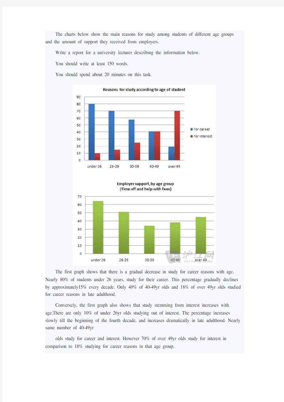
The charts below show the main reasons for study among students of different age groups and the amount of support they received from employers.
Write a report for a university lecturer describing the information below.
You should write at least 150 words.
You should spend about 20 minutes on this task.
The first graph shows that there is a gradual decrease in study for career reasons with age. Nearly 80% of students under 26 years, study for their career. This percentage gradually declines by approximately15% every decade. Only 40% of 40-49yr olds and 18% of over 49yr olds studied for career reasons in late adulthood.
Conversely, the first graph also shows that study stemming from interest increases with age.There are only 10% of under 26yr olds studying out of interest. The percentage increases slowly till the beginning of the fourth decade, and increases dramatically in late adulthood. Nearly same number of 40-49yr
olds study for career and interest. However 70% of over 49yr olds study for interest in comparison to 18% studying for career reasons in that age group.
在第一幅柱状图中,我们可以看到,蓝色和红色的2根柱呈现出截然相反的变化趋势,因此,我们在排列数据时可以分别描述各自的上升/下降幅度,见划线第一个句子。这2根柱的变化幅度相对都是比较均匀的,我们在计算幅度时可以简单的将最大和最小值相减,然后除以区间数,就能得出大约的幅度,在描述时只要在幅度前加上表示大约的副词即可。从句型角度,我们可以选择主谓结构的简单句来实现对变化幅度的描写,见划线第一个句子。
接下来,我们在描述第2根柱形变化的时候,要特别注意选择的句型在逻辑关系上和第一根柱变化幅度间的联系,见划线第二个句子。
2. 三根以上柱形且多种趋势:
应对这样的柱形图,我们可以先描写最长的那根柱的数据,也可以将最长的2根柱的数据放在一起描写。以下我们就来看一个例子:
The graph shows Internet Usage in Taiwan by Age Group, 1998-2000.
Summarize the information by selecting and reporting the main features, and make comparisons where relevant.
The graph shows changes in the age profile of Internet users in Taiwan between 1998 and 2000.
The main users of the Internet in Taiwan are young adults between 16 and 30 years old. In 1998, they accounted for more than half of all users. In 1999 the number dropped slightly to 45%, but even in 2000 they were the biggest group.
The second biggest group of users is aged between 31 and 50. They made up 41% in 1998, falling slightly to 37% in 2000. When combined with the 16-30 age group, over 94% of users in 1998 were between 16 and 50.
However this number is dropping steadily as more children and older users log on. In 1999, the number of children online quadrupled from 2% to 8%, and it continued to increase in 2000. There were similar increases for older users, rising from 4% in 1998 to 10% in 2000.
In summary, while adults between 16 and 50 still represent the great majority of Internet users in Taiwan, their share is declining as more children and older users join the web.
在第一个主体段中,作者先从最长的红色柱形入手,见划线句子。然后在第二个主体段中继续描写蓝色柱形的数据。在句型选择上我们发现2段首句都使用了主系表的简单句,选
择的主语也是类似,因此从高分角度来讲,我们可以将第2个主体段首句的主语换成原先的表语,即31岁至50岁年龄组,效果会更好。
此外,我们还可以从描写柱形的整体趋势作为突破口,如:
You should spend about 20 minutes on this task.
The table below shows the figures for imprisonment in five countries between 1930 and 1980. Write a report for a university, lecturer describing the information shown below. You should write at least 150 words.
The bar graph shows that the figures for imprisonment in the five countries mentioned indicate no overall pattern of increase or decrease. In fact there is considerable fluctuation from country to country.
In Great Britain the numbers in prison have increased steadily from 30 000 in 1930 to 80,000 in 1980. On the other hand in Australia, and particularly in New Zealand the numbers fell markedly from 1930 to 1940. Since then they have increased gradually, apart from in 1980 when the numbers in prison in New Zealand fell by about 30,000 from the 1970 total. Canada is the only country in which the numbers in prison have decreased over the period 1930 to 1980, although there have been fluctuations in this trend. The figures for the United States indicate the greatest number of prisoners compared to the other four countries but population size needs to be taken into account in this analysis.
The prison population in the United States increased rapidly from 1970 to 1980 and this must be a worrying trend.
从图中我们发现,每个国家的数据变化都是不同的,有升有降,没有一个有规律的总体趋势,这时候,我们可以用划线句子的写法在一开始就描述数据的总体情况。接下来再分国家逐一描述即可。
二、横轴为地点,交通工具等其他专有名词:
遇到这样的情况,不管柱形有几根,建议考生都可以按照长度从长写到短,也可以先以描述总体趋势作为突破口,如以下这个图:
The graph above show information of employment rates across 6 countries in 1995 and 2005.
Summarize the information by choosing and describe the main idea, and make comparisons where appropriate.
The graph shows changes in employment rates in six countries between 1995 and 2005, for men and women. Overall more and more people of working age are employed, and there have been significant improvements for women, although they leg behind men in entering the workforce.
The most obvious trend in the graph is that women have lower employment rates in most of the countries in the graph. For example, in Australia in 1995, 57 percent of men could find work or retain a job, but only 27 percent of women. The difference was even bigger in New Zealand, with 60 percent of women. Even in Switzerland and Iceland, alightly more men than women were in the job market.
The second biggest trend in the graph is the improvement in employment between 1995 and 2005. In all countries shown, figures for both men and women improved. The biggest change was in the United Kingdom, from 55 percent of men in 1995 to 73 percent over the ten years period.
Furthermore, the increases in employment rates for women were much higher in New Zealand. The percentage of working women jumped from 25 percent to 42 percent, and in the United States from 45 percent to 61 percent over the decade.
In conclusion, all the countries in the graph showed at least a 12 percent increase in employment rates of both men and women over the ten yeares. While men had relatively higher employment rate throughout the period, more and more women appear to be entering the labour market.
在这幅图里,经过观察,我们首先发现了一个总体趋势,即妇女就业率尽管总体仍旧低于男性,但是情况正在好转,所有国家的妇女就业率都有显著的上升。因此,我们可以抓住这个总趋势,在一上来就进行描写。见第一段的划线句子。但是经过进一步观察分析,我们又发现2个趋势:一个是2005年妇女的就业率不论在哪个国家都要高于1995年同期的数据;另外一个是妇女的就业率在所有国家不管在哪一年都要明显低于男性的就业率。这2个趋势的发现,实际上可以作为2个分趋势,可以分别作为主体段开头的数据描写突破口。见后2段的划线句子。
我们再来看一个例子:
The chart shows the number of mobile phones and landlines per 100 people in selected countries. Write a report for a university lecturer describing the information given.
The graph shows the number of mobile phones and landlines per 100 users, for selected countries. Overall, most of the countries included in the graph have more mobile phones subscribers than landlines.
Most European countries have high mobile phone use. The biggest users of mobile phones are the Italians, with 88 cell phones per 100 people. For example, Italy has twice as many mobile phones as landlines, with 88 mobiles per hundred people compared to 45 for landlines. Mobile phone use is low in Canada, with fewer than 40 phones per 100 people. Denmark is also unusual because it has slightly more landlines than mobile phones.
However, in some countries, the number of landlines is higher than the number of mobile phones. One example is the USA, where the number of mobiles, at 50 per 100 people, is much lower than the number of landlines, at almost 70 per hundred. A similar pattern can be seen in Canada. The highest number of landlines in the graph is in Denmark, with about 90 per 100 people. In contrast, the lowest figures for fixed lines are in Italy and the UK.
In conclusion, it seems that mobile phone use is higher in Europe than in North America.
在这个柱形图中,通过观察,我们也发现了几个趋势:一是大部分国家手机使用数量要多于固定电话使用数量;二是欧洲国家的手机使用量明显多于北美洲国家。见划线的句子。我们在观察图形的时候,若横轴是地点,我们还需注意国家的分类,这点在高分范文中尤其可以成为一个亮点。
2019年雅思写作小作文流程图解析及范文:废纸回收
2019年雅思写作小作文流程图解析及范文:废纸回收 The chart below shows the process of waste paper recycling. 范文: The flow chart shows how waste paper is recycled. It is clear that there are six distinct stages in this process, from the initial collection of waste paper to the eventual production of usable paper. At the first stage in the paper recycling process, waste paper is collected either from paper banks, where members of the public leave their used paper, or directly from businesses. This paper is then sorted by hand and separated according to its grade, with any paper that is not suitable for recycling being removed. Next, the graded paper is transported to a paper mill. Stages four and five of the process both involve cleaning. The paper is cleaned and pulped, and foreign objects such as staples are taken out. Following this, all remnants of ink and glue are removed from the paper at the de-inking stage. Finally, the pulp can be processed in a paper making machine, which makes the end product: usable paper. (160 words, band 9)
雅思A类柱形图小作文范文
雅思A类柱形图小作文范文 The chart shows the division of household tasks by gender in Great Britain. Write a report for a university lecture describing the information shown below. You should write at least 150 words. Source: Office for National Statistics on behalf of the Controller of Her Majesty's Stationery Office. Study these three sentences and then write three similar sentences about other parts of the chart. 1 Women spend over twice as much time doing kitchen tasks as men. 2 Men spend 30 minutes a day doing kitchen tasks whereas / while women spend 74 minutes a day. 3Women are more active in the kitchen than men (74 minutes a day for women as opposed to 30 minutes for men). Sample Report Look at the following sample answer to the writing task.
雅思小作文柱状图Bar类解析
雅思小作文柱状图Bar类解析 关于柱状图我们主要分两种写法: 1.如果横轴有明显的时间推移的话,烤鸭们应连接柱子顶点,重在描述柱子的升降起伏,写法类似于线状图。 2.如果无时间推移,则写法和饼状图一样。即按照各比较对象所占比例的高低写,同时要注意各所占比例之间的比较。 可以用到的词汇有: 1.表示“占多少”的动词 Account for Take up Make up Contribute to Have Represent 2.表示“最高级”和“比较级” 第一/最小the largest/biggest proportion of 第二the second/next largest/expensive(+ 形容词的最高级) 第三followed closely by 最低/最小the smallest percent of all 3.表示“相同比例” 即在饼状图中遇到了比例相同或者差不多的饼,如有A B两个比较对象。 A accounts for the same percentage as B . The proportion of A is as high as B A and B contributed equally/evenly to (all ) 在观察柱形图的时候首先要留意横轴的数据,若横轴为时间轴或者是年龄趋势,那么我们在主体段写作时候的基本思路就为从左到右;若横轴数据为具体专有名词诸如地点,交通工具等时,主体段的写作思路就可能是按照柱形的长度排列。本文根据上述的分析做以下的总结: 一、按照横轴从左到右排列数据: 1. 两根柱且趋势截然相反 在这种写法中,我们要注意观察2根柱的上升/下降的幅度。以下我们就来看一个例子:
雅思写作Task1流程图考官范文(2)
雅思写作Task1流程图考官范文(2) 本文为大家收集整理了雅思写作Task1流程图考官范文(2)。认真研读一定的雅思范文及作文模板可以帮助我们检验自己的写作水平,并能很好地吸收和应用优秀范文里的优秀内容。 The diagram below gives the information about the Hawaiian island chain in the centre of the Pacific Ocean. Write a report for a university lecturer describing the information shown. Sample Answer:
The given illustration presents information on the Hawaiian Island Chain center of the Pacific Ocean. As is observed from the diagram, the Hawaiian island chain directly affects the Pacific tectonic plate and because of it this plate shifts around 7-9 centimeter per year. As is observed from the graph, below the Pacific Ocean, the Hawaiian island chain stands as several volcanos which are almost 80 million years old. These volcanos stand over the Pacific plate and the eruptions of these volcanos’ created a new volcano just over the Magna spume. The Pacific plate is situated on solid dense rock and because of the new volcano development; the hot spot spume remained static. The eruption process of the volcano’s starts from as deep as 2800 km and that has spitted the solid rock layer. Major islands within 100 km of this area are Maui, Molokai, Oahu and Kauai and because of the eruption and sliding of the plates, the center of the Pacific Ocean is ever changing.
雅思小作文范文-柱状图
1.四国人口 The chart below shows the percentage of population in India, China, the USA and Japan in 1950 and 2002. 思路: 【首段】转述题目+补充信息【二段】中国的人口规律和未来趋势【三段】印度的【四段】美国和韩国的【尾段】总结,重申全图最主要趋势,印度将取代中国成人口第一大国 答案: The bar chart compares the changes in the proportion of population in India, China, the USA and Japan in 1950 and 2002. And it also indicates the projections for 2050. In 1950. China accounted for one fourth of the world population. Although this figure decreased slightly, it still ranked the first in 2002, compared to other three countries. It is estimated that the population in China will continue to drop to 19 per cent in the middle of this century. India ranked the second in terms of the population in the table, which made up 15 percent in 1950, but since then, there was a dramatic increase, climbing to approximately 19 percent. The percentage is expected to increase slightly to 21 per cent in 2050 and will probably exceed that in China. When it comes to the population in the USA and Japan, both of which witnessed a decrease from 1950 to 2002. It is predicted that in 2050, the percentage will remain the same in the USA, and in Japan, the percentage is likely to keep falling. Overall, it seems that India will become the country with the largest population although there is still a huge number of people in China.
雅思小作文之图表作文
二.雅思图表作文 1.企业垃圾(线性图) 题目:The graph below shows the amounts of waste produced by three companies over a period of 15 years. 范文:The line graph compares three companies in terms of their waste output between the years 2000 and 2015. It is clear that there were significant changes in the amounts of waste produced by all three companies shown on the graph. While companies A and B saw waste output fall over the 15-year period, the amount of waste produced by company C increased considerably. In 2000, company A produced 12 tonnes of waste, while companies B and C produced around 8 tonnes and 4 tonnes of waste material respectively. Over the following 5 years, the waste output of companies B and C rose by around 2 tonnes, but the figure for company A fell by approximately 1 tonne. From 2005 to 2015, company A cut waste production by roughly 3 tonnes, and company B reduced its waste by around 7 tonnes. By contrast, company C saw an increase
雅思小作文之流程图范文
You should spend about 20 minutes on this task. The diagram below shows the method of obtaining water outdoors. You should write at least 150 words. 1. The chart describes how water is obtained outdoors. 2. According to the figure, the first step of obtaining water outdoors is to find a hole with green plants on its bottom. Next, remove the green plants in the middle and put a container there. Then, cover the hole with a plastic sheet and place two stones on
both ends of it to secure its position. A third stone is laid on the middle of the plastic sheet so that the middle part is also the lowest part. 3. When the sun shines on the green plants in the hole, water evaporates from these plants. The vapor rises up and then cools down to form water drops on the plastic sheet. When there is more and more water, it flows along the sheet to accumulate on the lowest part. Finally, water falls down into the container directly under the middle stone. Thus, water is collected successfully through evaporation from green plants. 流程图的重点: 1.平时的格式 As is displayed in the flow chart, the process/principle, etc of _____ can be explained/ analyzed/ specified as follows. There are ____stages in ______. First, Second, Next Last/Finally/In the end (Thus, the new circle begins.) As to/for, As far as …is concerned In respect/aspect of, in approach to, in regard to
雅思写作流程图
流程图1.首段常用句子 The following diagram shows the structure of……The picture illustrates…… The whole procedure can be divided into…stages. It mainly consists of…… It works as follows. It always involves following steps. 2.描述流程/过程的常用过渡性词语 最后再总结一下流程图的特点: 特点一:现在时 特点二:定语从句 特点三:被动语态 特点四:顺序词 特点五:适当添加 特点六:无总结
题目1:玻璃的回收流程【单图】
范文1: This diagram illustrates the recycling process of glass bottles. The whole process is a cycle which can be divided into three main stages. In the first stage, used bottles are collected at a recycling point ready to be transported by a truck. The second stage starts in a cleaning plant, where these recycled bottles are sorted by color into green, brown and clear ones and washed by high-pressurized water. When the cleaning is done, the bottles are conveyed to a glass factory where they are cut into glass pieces which are then poured into a furnace. After being heated in the furnace, the broken glasses are melted into liquid, which flows into a glass mold. Here glass liquid from other sources is added and the molding process takes place. In the final stage, new, empty bottles are filled with liquid, then packed and dispatched to the supermarket ready to be picked by consumers. At this point, a cycle has been completed and a new cycle will begin.
雅思写作-小作文范文-柱状图
雅思经典小作文柱状图4篇范文+写作要点分析 C1T3 题目 The chart below shows the amount of money per week spent on fast foods in Britain. The graph shows the trends in consumption of fast foods. Write a report a university lecturer describing the information shown below. The chart shows that high income earners consumed considerably more fast foods than the other income groups, spending more than twice as much on hamburgers (43 pence per person per week) than on fish and chips or pizza (both under 20 pence). Average income earners also favored hamburgers, spending 33 pence per person per week, followed by fish and chips at 24 pence, then pizza at 11 pence. Low income earners appear to spend less than other income groups on fast foods, though fish and chip remains their most popular fast food, followed by
雅思小作文范文--流程图写作详解!
流程图写作雅思小作文范文 今天我们就利用一篇经典的考官的雅思小作文范文,来向同学们展示一下关于令大家非常头疼的流程图的写作带给我们的启示:流程图其实一点都不难,掌握好了其中的语法知识点,我们甚至可以拿高分。 雅思写作中,和它联系最为紧密的就是语法。雅思写作四项评分中,语法作为重中之重被提及。语法基础不好,难有好作文的形成。如果一篇英语作文中反复出现低级的语法错误,那么无论你的观点多么吸引人,原本的写作立意多么新颖精彩,生产的都只是一篇有缺陷的英语作文,多会让阅读者对你文章的整体印象打折扣:-一个连基础语法都错误连连的作者,会有能力写出一篇思维严谨的作文吗? 读题分析:由于蚕的生命旅程并不是哪一个特定时刻发生的事情,而是一个公认的自然常识。它是作为一个流程而时时刻刻都在发生的事情,因此采用时态中的一般现在时来表达整篇文字就是最适合不过了 考官范文: The first diagram shows that there are four main stages in the life of the silkworm. First of all, eggs are produced by the moth and it takes ten days for each egg to become a silkworm larva that feeds on mulberry leaves. This stage lasts for
up to 6 weeks until the larva produces a cocoon of silk thread around itself. After a period of about 3 weeks, the adult moths eventually emerge from these cocoons and the life cycle begins again. 详细分析: 一、首先准备流程图的写作时,先考虑一下文章结构的完整。好的文章一般都是“总-分-总”结构,所以看看此文章的开头:The first diagram shows that there are four main stages in the life of the silkworm。这样的开头很符合文章“总起”的结构,所以宾语从句在小作文的开头一般不可少,the first diagram是主语,shows是谓语,that是连接词,而后面的内容都是shows的宾语,因此宾语从句是大家可以利用的开头句型,既简洁又有力。 另外,一定要尽量使用到三大从句来给你的作文增添光彩,刚刚已经讲完宾语从句,另二种复杂句则分别出现在:”…a silkworm larva that feeds on mulberry leaves”句子由that引导的定语从句和由until引导的”This stage lasts for up to 6 weeks until the larva produces a cocoon of silk thread around itself”时间状语从句这两个部分。定语从句能够使得你想表述的对象“silkworm larva”更加具体形象,而状语从句则是可以展现出流程图中时间结构的法宝。 二、There are four main stages…典型的there be 结构,可以说是雅思小作文写作中的一个法宝。只要带有了there be句型,文章就显得非常客观。比如下面这个句型就是
2020雅思小作文流程图的写作方法
2020雅思小作文流程图的写作方法 雅思写作考试中的Task1小有三种题型:图表,流程图和地图。考生们备考时多把注意力放在图表题,对后两类题目准备不足甚至无准备,一旦真遇到了流程图和地图,往往束手无策,凭自己的直觉应付写一下,凑够字数交差。流程图和地图题的写作是有一定的方法的,按照方法来写,其实并不难,在本文中,先来探讨流程图作文的写作。 题目给出的是流程图,就是以图示的方法把一个过程或流程清楚地显示了出来,现在要求考生做的是把该流程图还原成说明文。由此可见,我们实际上要做的就是看图作文。而大家都知道,看图作文是我们在小学最初学写作文时的入门做法。照着图来写,省却了要自己想象和构思的过程,这自然比起写议论文的挑战度要低一些。所以,大家应该更有信心去对付流程图作文,毕竟实际上所做的是“看图作文”。 流程图作文是以对流程的描述为主的。全文的安排通常分为两个主要部分:引言段和主体部分。引言段是用来作简介的,介绍该流程图表示了一个什么什么的过程,常用的句型为主语+谓语+宾语模式。然后视情况可以多加一句说整个过程可以分为若干个阶段。引言段只需一段,通常就是这么一二句话。
主体部分是文章的核心部分,主要是说明该流程,所以是说明文式的行文。主体部分可依照整个流程分成几个阶段而大体相应地分为几个自然段。主体部分的写作原则如下: 这是首要前提,理解了流程图表示的是什么以及是怎样的一个过程,才谈得上用文字表达出来。能否看得懂图取决于几方面的因素:词汇量,知识面,生活经验和常识等。考生平时要有心地做一下这些方面的积累和准备。一般来说,流程图是不难看懂的。万一有些什么地方卡住了,也要大胆地合乎逻辑地去猜测,推想,判断,要灵活机敏。 流程图会表示一个过程的流向顺序。因此,不难按照图示的顺序来写。若是分成几个阶段的,就按顺序逐个阶段来描述,通常就相应地分成几个自然段落。 流程图中会提供一些关键的说明性的词,比如步骤或环节的名称,怎样做,添加什么原料,去掉什么,输送到哪儿等等。我们就可以直接利用这些关键词写成句子,方法有两类,依照图的情况而分别采用之。如果流程图比较简短,用扩展的办法,就是以一个关键词为核心词,扩展成一个甚至两个句子,以达到字数的要求。反之,若图比较长而复杂,就采用串的办法,一句话把两个甚至三个步骤串起来,这样可以把较长的过程压缩得短一些来描述。无论用
雅思小作文流程图的写作方法
雅思小作文流程图的写作方法 导读:题目给出的是流程图,就是以图示的方法把一个过程或流程清楚地显示了出来,现在要求考生做的是把该流程图还原成说明文。由此可见,我们实际上要做的就是看图作文。而大家都知道,看图作文是我们在小学最初学写作文时的入门做法。照着图来写,省却了要自己想象和构思的过程,这自然比起写议论文的挑战度要低一些。所以,大家应该更有信心去对付流程图作文,毕竟实际上所做的是“看图作文”。 流程图写作基本原则 流程图作文是以对流程的描述为主的。全文的安排通常分为两个主要部分:引言段和主体部分。引言段是用来作简介的,介绍该流程图表示了一个什么什么的过程,常用的句型为主语+谓语+宾语模式。然后视情况可以多加一句说整个过程可以分为若干个阶段。引言段只需一段,通常就是这么一二句话。 主体部分是文章的核心部分,主要是说明该流程,所以是说明文式的行文。主体部分可依照整个流程分成几个阶段而大体相应地分为几个自然段。主体部分的写作原则如下: 1. 把图看懂 这是首要前提,理解了流程图表示的是什么以及是怎样的一个过程,才谈得上用文字表达出来。能否看得懂图取决于几方面的因素:词汇量,知识面,生活经验和常识等。考生平时要有心地做一下这些
方面的积累和准备。一般来说,流程图是不难看懂的。万一有些什么地方卡住了,也要大胆地合乎逻辑地去猜测,推想,判断,要灵活机敏。 2. 按图示的顺序写 流程图会表示一个过程的流向顺序。因此,不难按照图示的顺序来写。若是分成几个阶段的,就按顺序逐个阶段来描述,通常就相应地分成几个自然段落。 3. 将图所提供的词扩展(或串)成句子 流程图中会提供一些关键的说明性的词,比如步骤或环节的名称,怎样做,添加什么原料,去掉什么,输送到哪儿等等。我们就可以直接利用这些关键词写成句子,方法有两类,依照图的情况而分别采用之。如果流程图比较简短,用扩展的办法,就是以一个关键词为核心词,扩展成一个甚至两个句子,以达到字数的要求。反之,若图比较长而复杂,就采用串的办法,一句话把两个甚至三个步骤串起来,这样可以把较长的过程压缩得短一些来描述。无论用哪一种方法,都要利用流程图上所给出的'词,这是图提供给我们的方便,要充分利用。在读懂图的基础上,再有这些关键词的帮助,这篇作文就不难写出来了。整篇文章字数要求是150字,图中给出的词往往就占了将近三分之一,考生要写的就只是余下的三分之二左右了。 4. 主体部分的句子多用被动语态 流程图说明文的特点是多用被动语态,主要是指主体部分对过程
最新雅思小作文柱状图模板
最新雅思小作文柱状图模板
雅思小作文A类慎浩(words= 163) 第一段:题目改写与仿写 第二段:总体趋势1 发展变化2 比较 第三段:期中一种情况+另一种情况 第四段:结论段 最大值最小值中间值特殊值起点终点 环球雅思慎浩 Through what is provided in the(图形),we can learn the information about major shifts in(标题) during the period of时间respectively bar / column chart / graph
第一段:题目改写仿写 Through what is provided in the six column charts(图形),we can learn the information about major shifts in aids given by six developed countries(标题) during the period of, and respectively. =33 Through prep 经过 be provided in v.t 提供 Major shift n 主要的变化 graph n 图形 During the period of adj. 在。。。。的时期内Respectively adv 分别地 Column chart 柱状图 bar chart 柱状图 Line chart 线形图 pie chart 饼状图 map 地图 Process 流程图 First and foremost Besides, in addition , 第二段句型 In general, it is noticeable that the total 项目in 时间were slightly more than that in时间, being approximately数值and数值respectively. In
IELTS—Writing第三课时—地图、流程图
IELTS图表作文讲解:地图、流程图 学生面授老师 时间本次课时IELTS写作第三课时 教学思路1. 作文简介、写作技巧 2. 实例讲解 3. 分析总结 4. 课后作业 教学目标1. 地图、流程图理论分析分析 2. 掌握两类图表作文的基本特征和写作方法 3. 学习写作思路 讲解重点地图、流程图写作方法范文学习 常用句式总结 备考资料剑桥基础资料 教学详细内容: 一、分析雅思图表作文—地图、流程图理论 1. 地图题特点 地图题分两种,一种为地理变迁题,一种为选址题。地理变迁题描述的是一个地方(多为一个城镇)在一段时间的发展变化。 时态:地图题反映的是一个地方在过去的一段时间的变化,文章用一般过去时。如果地图题反映的是一个地方在将来一段时间的变化趋势,文章用一般将来时或表“估计”的词汇。如果地图题反映的是一个地方从过去到现在的变化,可用现完成时。 细节变化:地图每个细节变化都要提到,不要忽视一个细节 语态:地图题用被动语态 2.流程图(flow chart)特点 其一,流程图的题目基本不会重复,因此复习已经考过的题目不会太大效果, 第二,流程图的词汇随着图表的对象而变化,很少出现重复的词汇。 流程图考察的次数不多,每年大概3-5次,集中出现在年初和年末的三个月。 一般来说,流程图和普通图表的区别主要在于:
流程图基本上不会出现数据,文字信息占主要地位 流程图以描述为主,比较的机会比图表题少 流程图中出现的信息都需要描述,而普通图表则不需要描述每一个数据 流程图的时态比较单一,主要是用一般现在时 流程图的分段比较灵活,只要不同阶段之间的差距很明显,就可以另起一段 3. 流程图备考注意事项: 1)注意掌握段落连接或者不同阶段之间的说法(sequence expression) 表示首阶段的一些说法 a)The process starts from b)At the first/initial stage, c)At the beginning of the cycle, d)During the initial phase, e)The beginning of the whole cycle is marked by f)(名词 or 动名词)is the first step in (+ 名词 or 动名词) 表示次段的一些说法: a)The second stage is b)The next step in the process is 表示最后阶段的一些说法 a)(名词 or 动名词) is the last step in the procedure. b)The final phase of the procedure is about c)In the final phase, d)Entering the final phase, e)(名词 or 动名词) is the final stage. 2)要注意各个阶段的比较,充实文章内容,避免平铺直叙 3)注意流程图的读图顺序: 找出流程图的始末点,并划分中间的步骤或阶段;掌握表示“顺序”的连接词(Sequencing Words),用来说明过程的各个步骤和先后顺序。
雅思小作文图表作文数据写法
1.介词 From..to.. - The number of divorces increased from 1m in 1970 to almost 1.5m. by, of(表示数值变化差,搭配from/to) 趋势动词+by -The proportion of married people decreased by 11% to about 59%. 趋势名词+of -The proportion of married people underwent a decrease of 11%. at(表示在某一点) -The number of marriages leveled off at 2.5 million during the first decade. -The minutes of local fixed line calls reached the peak at around 90 billion. With(带一个或几个静止的数值) - In 1979, beef was the most popular of these food, with about 225 grams per person per week. - Three of these countries shared similar figures with6.63% in Turkey, 6.51% Spain and 6.43% in Ireland. 2.括号 带静止数据 - Specifically, deforestation was the number one murder (9.8%), followed by over-cultivation and over-grazing (7.7% and 5.5% respectively). 带动态数据 - There was an overall slight increase in both nuclear and solar/wind (up by 3q and 2q respectively). - Both nuclear power and oil went up during the period, although the rise of oil was not as dramatic as that of nuclear power (from 15, 20 to 126, 25 respectively). 3.从句
雅思小作文经典句式图表题整理
【整个时段最高】...were the highest throughout the period./ over the period/during this 25-year period 【起点】In 1940 the proportion of XX stood at ...XX in XX, approximately XX in XX and XX in XX 【最高点后回落】After peaking at ...,XX had fallen back o XX by 2002 【最后两年增长放缓】though the growth slowed over the last two years 【由X剧烈增长到X】There was a dramatic increase in XX from(number) to (number) 【明显缩小】the gap between the three categories narrowed considerably 【相等】was equal at 【尽管有波动】Despite some initial fluctuation, 【尽管有波动】In spite of some fluctuation in the ... 【预计】is expected to/ is predicted to 【分别始于】From XX and XX respectively in 1980 【分别是】..while the impact of this on Oceania and North America was minimal, with only 1.7% and 0.2% of land affected respectively. 【保持稳定】will remain stable at 【相对不重要】relatively insignificant 【经历下降】saw a fall 【时间段末尾】by the end of the period 【时间点对应数字】..but rose dramatically in 2011 when it represented 23% of the school budget 【相应的下降】corresponding drops 【不那么明显的下降到】...also declined, but much less significantly to just below... 【表现出下降趋势】showed an upward trend 【急剧下降】plummet/ plunge 【由xx组成】be made up of /consist of/ be composed of 【维持在某一水平】remain stable at 、level off at/ hover at (高) 【最高点】peak at、reach its peak at /reach the highest level at
易考雅思小作文流程图.doc
易考雅思小作文流程图/解释说明性图(1)
(2) You should spend about 20 minutes on this task. The diagram below shows the method of obtaining water outdoors. You should write at least 150 words.
(3) You should spend about 20 minutes on this task. The flow chart is about the National Yellow Stone Park in use after the fire disaster. You should write at least 150 words.
(4) You should spend about 20 minutes on this task. The diagrams below show some principles of house design for cool and for warm climates. You should write at least 150 words.
(5) You should spend about 20 minutes on this task. The government planned to build a supermarket in G Town. In the following map there are two alternative places for you to choose: place S1 and place S2. According to the information shown in the diagram, describe the benefits and drawbacks of the two locations. You should write at least 150 words.