IBM咨询管理工具

There are three steps to making an IBM presentation:???
Plan It offers advice on organizing your message, sharpening your focus on what you want to say, and arranging it in a manner that audiences can follow.
Prepare It is a resource for constructing graphic support materials in Freelance Graphics (PowerPoint is also supported). You will find instructions on how to include elements such as text, charts and graphs in a style that will be consistent to all our audiences - an "IBM look," in much the same way that our advertising and marketing materials have a distinct appearance.
Present It offers tips on how to deliver what you've prepared effectively to an audience. Presentations are not about showing a series of slides; they are about you, communicating a message, with visual elements in a supporting role.
Where to begin
Here's what you do first: Stop. Take some time. As Thomas Watson Sr. used to advise, famously: Think. You are about to mount an argument. What do you need? Don't succumb to the temptation of
collecting every apparently relevant item
into a jumble and then trying to reshuffle
them into a coherent order. ("Jim has a nice
chart on this, and Lisa has some good market data, I'll get those.") That's the flawed
technique behind many of the more overblown,
leaden presentations you've ever dozed
through. That's working backwards. Instead,
start with nothing... and work forward.
Ask yourself this: What is my point? Every presentation is an attempt to communicate something. It may be a complex topic, with
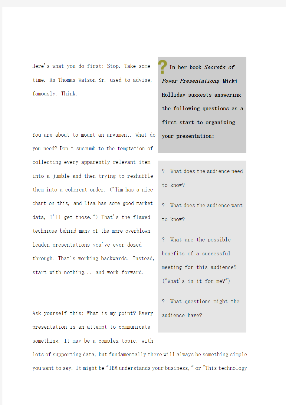
lots of supporting data, but fundamentally there will always be something simple you want to say. It might be "IBM understands your business," or "This technology In her book Secrets of
Power Presentations , Micki Holliday suggests answering
the following questions as a
first start to organizing
your presentation:
? What does the audience need to know? ? What does the audience want
to know?
? What are the possible benefits of a successful meeting for this audience?
("What's in it for me?")
? What questions might the
audience have?
is the best for our requirements" or "We need more time to do this job right."
Figure out what you're trying to communicate, in its simplest, clearest, most concise form. Write it down, in one sentence. Does it make sense? Does it really cut to the heart of what you need to convey? If not, rewrite it.
If you only could deliver this one sentence to your audience, with no charts or any supporting information, would this be the one you'd choose?
Composing this basic sentence might take two minutes, or it might take an hour. It doesn't really matter which. Just get it right. Without a clear point of view, you are navigating without direction.
Get it wrong, and you'll struggle the rest of the way.
Get it right, and the pieces will begin falling naturally into place behind it.
Build your case
OK, you're clear about the point you need to convey. But it's safe to assume that your audience is not prepared to accept your message on faith. After all, if everyone in the room already knew what you wanted to tell them, and agreed with it, there would be no point whatever to your standing up and talking.
The purpose of your talk is to move your audience to your point of view. So you will have to build your case. You need to organize your argument.
Make a rough flow chart of the information you are going to present. Just sketch it out on paper - this isn't going to be a chart you'll show, and you'll probably have to revise it a few times anyway.
The organizing principle behind this is a pyramid: each statement you make will have one, or more likely several, supporting pieces of information under it. As you build your presentation in this outline form, a pyramid will form, with your basic statement at the top and everything else arrayed beneath it. Don't worry yet about the order in which you'll actually present each item. Just get them all down on paper to look at.
The Pyramid Principle book listed in our recommended reading list is devoted
to this method of organization, and it's a useful resource. But the basic idea is really common sense, merely a way of laying out your information so you can arrange and, later on, present it logically.
Let's take a look at a hypothetical presentation and how you might organize its various elements, using this technique.
From the top down
Let's assume your basic point is: IBM's solution is your best option, because its combination of products and services is integrated and flexible, and because we understand your business challenges.
Now, put yourself in your audience's position. They want to know why they should believe this. They expect proof.
You have, let's assume, four reasons. First, IBM products work together. Second, IBM offers the flexibility of open systems. Third, IBM services tie everything together. Fourth, IBM has experience in the customer's industry.
This is the heart and framework of your pitch. Lay it out graphically.
You now see that you're going to open by stating your main point, and you're going to proceed through your presentation by offering facts and data in these four areas. Don't worry yet about which will come first.
Take each of your supporting arguments and do the same again. Build another pyramid under each of the four. Under "products work together" you might have information about each of the elements in the solution: servers, middleware, storage. You might want to talk about inter-divisional efforts in IBM to integrate technologies across our product lines. It would look something like this:
Fallen Pyramids
Some people find it helpful to use a pyramid on its side, with the topic in the left-most box, and building the pyramid out to the right, instead of below it. If you use this method, you'll notice that the
For this example, we don't need to bother
creating all the pyramids that build downward, but you will want to do this for your entire presentation. Organize all the information that you might want to include. You will then have a pyramid that encompasses everything you need to convey. Now, play with it. Look at the big picture. See what's most important. Take out things that, while you might think they're
important, just won't resonate with or be
understood by your audience. Move things
around. Add or delete, but keep the organizing
structure intact.
Once you have a pyramid that seems to represent your theme and the various points you need to get across, you're ready to start creating the materials you will actually show people: bullet points, charts, graphs. Instead of organizing on-the-fly, you've organized first. Congratulations: you now have a clear picture - literally - of what information is relevant to your presentation, what points it supports, and where it should go. Unfortunately, many people pyramid more closely resembles a classic outline structure. Unlike an outline, however, the relative
equality of the boxes make it much easier to restructure and re-order your presentation
and establish new
relationships to item without
altering the entire
organization, as often occurs when creating an outline.
don't bother to begin with this formal, structured approach.
Although you haven't even created your first slide, the most critical (and often botched) work in creating your presentation is complete.
If this all seems too plodding, too restrictive and structured, don't worry: it isn't. By the time you have a presentation ready to show, the underlying organization will fade from view, leaving behind merely a framework that helps your audience focus more easily on your message, and enhances your own mastery of the material, since you understand thoroughly how it all fits together.
Now, let's take your graphical, pyramid outline and prepare a presentation.
Where to begin
Visual elements such as
graphs, charts, and text can
enhance your ability to
communicate, helping your
audience follow your message and quickly understand various types of information.
Used thoughtfully, they can be valuable tools.
Used indiscriminately, or constructed poorly, however, they can actually detract from your message. They can clutter your presentation and confuse your audience.
This template will facilitate the preparation of your presentation and will help to continue establishing you as one of the best expressions of the IBM brand.
It reflects IBM's corporate design style, which also influences our advertising and marketing materials. It is straightforward, clean, and simple.
It's flexible enough to accommodate a variety of uses. Some may use it with little or no graphic elements, while others might need to convey far more complicated data.
It's simple to use. Although communications specialists and graphic designers have worked to create this template, anyone in IBM should be able to use it without any special skills or software beyond what is
already available.
Don't automatically assume you need to use presentation software to make your presentation!
Some of the most effective sales jobs are done just by speaking directly, sincerely and informatively about the subject, without hiding behind charts. In Say It With Presentations, noted presentation designer Gene Zelazny gives three basic types of media you should consider if you need visuals to help convey your message:
Lap visuals, so called because each member of the audience receives his or her own copy of the materials at the start of the meeting, if not before. Best for small groups, their use can open up discussion and help everyone participate as equal partners. The downside is that they may read ahead and start asking questions you would prefer to deal with later in the discussion. And you can also miss opportunities for eye contact if everyone is looking down reading. Easels or white boards. Great for increasing interactivity among 15 or fewer people, since you're recording the audience's ideas as they come up. Downsides: Avoid spending all your time with your back to the audience; perhaps deputize a member of the meeting to help write down points so you can concentrate on their comments and reactions to you and each other.
On-screen presentations. While less personable than the other two methods, this is by far the most polished and suitable for large audiences. Since this is also the medium with the greatest pitfalls, this is the type of presentation
we'll be working on in this section.
Title screen
By using a standard title chart and following the style consistently, we will add a professional touch not only to our individual presentations but collectively to all of IBM's face-to-face communications.
The title slide is a straightforward element, and generally requires only that you include your name, IBM organization, and speaking topic in the places provided. However, the template allows for other elements that might be required, and it's important to follow the guidelines if you will be using these.
More text (if you must)
The template also provides a format for longer blocks of text. You should use blocks of text very sparingly. Yes, once in a while there might be a longer passage that is relevant, and valuable. For instance, you might have a quote from an analyst or customer that is particularly striking:
If you are going to make
your audience read
something, make sure it's
worth their time and
effort. More important,
make sure it's worth your
time, since you don't have much available and you've just turned some of it into a small reading assignment.
Don't overdo it
Before you begin, keep in mind some key points:
Visuals are not your presentation. You are the presentation. Your
audience has not gathered for the purpose of reading your Freelance (or PowerPoint) pages; they have come to hear you communicate. Use visuals to support your message.
Less is more.A graph that shows (for example) levels of customer spending on certain technologies can reveal at a glance trends in the market, but it remains your task to explain that data's relevance to your audience.
A single, well-constructed graphic, supported by your thoughtful
explanation, is more effective than a series of charts that the audience must decipher.
Projected visuals have severe limits. They are constrained by the
resolution of a computer screen, which is far lower than the printed page.
They are limited further by being projected onto a screen that people must read from a distance. For this reason, we want to keep visuals simple and bold. More complex graphics are better suited for inclusion in printed materials.
Let's take a look at the main elements of the IBM Presentation Template that you might need to include. More possibilities and variations are available in the presentation templates themselves. But understanding which you need, and when, is the first step.
Bullet-point text
Your audience is ready to listen and to look, but they don't want to read long passages of text on a screen. And you don't want them too, either — reading takes their attention away from what you are saying.
The most effective way to use text is with short phrases that can be read at a glance. Presented this way, text can remind people of your key points, or help them follow the progress of your presentation. Here's an example of text poorly used:
That isn't a bad-looking page, and it isn't too difficult to read. But it can be improved. This would be even better:
The first example tries to present your message. The second example merely provides cues to the messages you are discussing. It engages the audience's time only for a moment, and demands that they listen to what you're saying as you explain the points.
Of course, even when you reduce your message to a bullet-point phrase, you can still defeat yourself by cramming too many onto a single page. That's why you should limit any page of text to no more than five items (and even five is pushing it). You'll see that the template reflects this limit.
This limit of five is not a matter of how much text will fit onto a page while remaining both legible and visually pleasing, although these are important considerations. Rather, it's a question of how much information someone can easily retain at one time, especially while listening to you speak.
But what if you have more than three or even five points to make about IBM servers? Perhaps you want to talk about the technologies that give our servers their price-performance edge, and cite some benchmark studies as evidence. You have more to say about management capabilities, too. It simply won't fit into five lines.
No problem. If you examine your information, you are likely to find that it will arrange itself into groups of details that support more general points. (If you'd prepared your information carefully, according to the pyramid structure described in the 'Plan It' module, this should already be clear.) The solution is to create another page which focuses in greater detail on one of your topics. In our current example, you might progress to this:
Here again, you are giving your audience a limited, manageable amount of information at any one time. If you have benchmark data (in this example) that simply demands a graphic treatment, don't cram it onto this page unless it's a very simple graphic. Make another page, devoted to that.
When you've finished with your information about price-performance, return to your list and the second point. Your next page might list the key points about IBM servers' advanced management capabilities, followed by one with more detail on Linux and open standards.
If those other topics don't have as much supporting detail, you might simply show your first page about IBM servers again, perhaps with your next point highlighted:
You would then proceed to discuss the advanced management features. Your audience has a clear and quick visual cue that you're moving on to the second point, along with a reminder that a third one will follow.
It's perfectly okay to repeat pages in this manner. Repeating pages can help your audience follow the presentation, without requiring a lot of their attention to do so. While it's true that "less is more" on any single page (and even for visuals in general) so long as your pages are brief and direct, repeating pages in order to highlight the progress of your presentation is an effective use of supporting visuals. In this instance, more can be more. Just don't get carried away: you don't need a line on the screen to summarize every single thing you're going to say.
(If you are preparing a printed version of your pitch to distribute to your audience, you will probably include a page only once, and remove any highlighted and repeated pages.)
Charts & graphs
Chartware
If your presentations require
greater use of a wider variety
of charts, you can find a more
detailed exploration of the
Charts and graphs can be very effective tools. They can also be annoyingly clumsy, obscuring the very information they're intended to communicate. Like other tools, they must be used when the task requires them, and with care. Our template calls for charts stripped clean of extraneous clutter, free from such visual gimmickry as three-dimensional effects, and
restrained in their use of color. If your information is relevant to your audience, it shouldn't be obscured by this sort of distraction. If your information isn't relevant, it shouldn't be on the screen at all.
This introduction to the simplest, most common and effective types of charts used in presentations should help you develop the basic skills you need to decide when to use a graph, how to select the type most appropriate to your data, and how to create it using the software you already have available, in a style that will blend harmoniously into the IBM template.
Before you even begin creating charts, there are a few points to keep in mind.
topic in Say it With Charts , by Gene Zelazny, one of the books in our recommended reading list. For an even deeper
examination of visual
communication, Envisioning Information by Edward Tufte is
excellent, though not as
directly relevant to business presentations.
毕博管理咨询工具方法—Cash HandlingChinese
模块: Module: 行政管理Administration 流程: Process: 安全Security 系统: System: 现金管理 Cash Handling 系统执行人 System Champion: 经理Manager 目标 Objectives: ?按照正确的程序以确保正确、精确地管理所有现金 To follow the correct procedure to ensure that all handling of cash is carried out accurately and diligently 程序 Procedure: ?当收到50元和100元面额的钞票时,员工应该口述“收到50元”或“收到100元”。 When receiving ¥50 & ¥100 notes, the team member must say “check ¥50” or check “¥100”. ?所有已付款的金额都应该记入帐目。 The amount tendered must always be keyed into the till. ?总是给客户一张收据 Always give the customer a receipt. ?应避免在各种帐目间挪用现金。好的管理应是准确地为每种帐目计划金额和按要求命名储备金。如果你不得不挪用现金,必须从另一种帐目中“买出”,例如,从一种帐 目中”买入”50元面额钞票, 就需要从另一个帐目卖出5张10元面额的钞票。 Swapping money between tills should be avoided. Good management practices include accurately planning the amount and required denomination of the float for each till. If you do have to swap monies then the money must be “bought” from one till to another e.g. a ¥50 note from one till will be exchanged with 5 x ¥10 notes from the other till. ?确保在已锁的抽屉或保险柜内存放有零钞 Spare change must be kept in either a locked drawer or in the safe
1毕博-管理咨询工具方法—How to Arrange a Courier-Chinese
模块:Module: 行政管理Administration 流程:Process: 邮件和快递 Mail and Couriers 系统:System: 如何安排一份快递 How to Arrange a Courier 系统执行人:System Champion: 接待员Receptionist 目标: Objectives: 依正确程序安排一份快递 To follow the correct procedures to arrange a courier 确保所有包裹都传送到正确的地方 To ensure that all packages are delivered to the correct address 确保所有包裹都传送给正确的人 To ensure that all packages are delivered to the correct person 程序: Procedure: 与送信人确认适当的联系方式和详细地址 Confirm with the sender the appropriate contact and address details 在客户/顾客/供应商数据库中确认详细资料 Confirm details with client/customer/supplier database 将文档放入合适规格的信封或包裹中,确保内容的安全。 Place documents in appropriately sized envelope or package ensuring that the contents are secure 同与企业有往来账户的快递商联系 Contact the courier service for which the business has a trading account
管理咨询种经典工具
管理咨询35种经典工具 全书三分钟快速阅读版 本书系统地介绍了在日常管理活动当中,经常用到的35种经典工具,这些工具包括公司战略分析与战备管理、战略决策、人力资源管理等多个方面,每种工具首先介绍工具的来源和使用方法,然后结合经典案例进一步进行了说明。 PEST分析法是进行外环境分析的常用工具,从政治、法律、经济、社会、文化和技术的角度,分析环境变化对于企业影响的一种方法。 波特五力量分析主要用于产业环境中对于是产业竞争的性质的该产业中所具有的潜在利润的分析。是由波特教授提出的“五种力量模型”,即潜在竞争对手、现有企业之间的竞争、替代品的威胁、供方的讨价还价能力和买方的讨价还价能力。 行业竞争结构分析使企业管理者可以从定性和定量两个方面分析行业竞争结构和竞争状况,以达到以下两个目的:分析确定五力中影响企业成败的关键因素;企业高层管理者从与这一集团相关的各因素中找出需要立即对付或处理的威胁,以便及时采取行动。 利益相关者分析用于分析与企业利益相关的所有个人和组织,帮助企业在战略制定时分清重大利益相关者对于战略影响。 生命周期理论也是判断产业竞争状况的一个最为普遍采用的模型。模型的基础就是认为市场的不同状态即市场处于从开发到成熟的什么阶段从根本上影响竞争条件和企业的行为。 SWOT分析将企业外部环境的机会(O)与威胁(T),内部环境的优势(W)与劣势(S)罗列在一张十字形图表中加以对照,可以一目了然地看出企业的环境情况,又可以从内部环境条件的相互联系中作出更深入的分析评价。 战略地位和行动评估矩阵是战略方向选择的工具,在SWTO分析的基础上,通过确定两组具体反映客房外部的量化指标,更加准确地进行战略的选择和定位。 雷达图是对企业财务能力分析的重要工具,从动态和静态两个方面分析企业的财务状况。 价值链分析的核心是将客户的所有资源、价值活动与客户的战略目标紧密连接起来,以价值增值为目的,形成了一个简明而清晰的结构框架,帮助客户清晰认识客户中相关各链条的重要意义。
管理咨询及人力资源咨询常用的132项工具
管理咨询及人力资源咨询常用的132项工具.doc 1 战略框架 2 战略实施模型 3 波特价值链分析 4 战略管理过程 5 洛克希德法 6 组织变革的战略类型 7 决策树 8 基础统计技术 9 蒙特卡罗模拟技术 10 阿姆科公司事前测感技术 11 希布纳的预测七原则 12 组织决策的卡耐基模式 13 阿尔布雷克特组织政治分析 14 赋权分析矩阵 15 马斯洛的人类需求五层次理论 16 赫茨伯格的双因素理论 17 奥德费ERG理论 18 麦克利兰成就激励理论 19 波特和劳勒的综合激励模型 20 期权的六要素法 21 弗鲁姆期望理论
22 亚当斯公平理论 23 斯金纳强化理论 24 埃德温洛克目标设置理论 25 股权陷阱规避法 26 工作分析信息的种类 27 工作分析的步骤 28 因素比较法 29 因素计点法 30 分类法 31 排序法 32 问卷法 33 访谈法 34 工作日志法 35 实践法 36 结构化面试法 37 丰田公司选拔计划 38 岗位评价的权重系数确定法 39 管理评价中心法 40 内部选拔的方法 第一页第二页第三页第四页 41 外部选拔的方法 42 员工的投入与收益分析法
43 格兰丘纳斯的上下级关系理论 44 效率\设备\岗位\比例定员法 45 平衡记分法 46 胜任特征模型 47 明尼苏达多相个性测验 48 艾森格人格测验 49 卡特尔16种因素测验 50 比奈-西蒙智力测验 51 罗夏墨迹测验 52 勒温的场论 53 卡兹的组织寿命学说 54 库克创造力曲线 55 默里与摩根的主题统觉测验 56 皮亚尔故事测验 57 科尔伯格两难故事测验 58 中松义郎的目标一致理论 59 赫茨伯格工作丰富化模型 60 比德返转原理 61 冲击晋升模式分析 62 蔓藤晋升模式分析 63 旅行保险公司工作丰富模型 64 TRW五合一