雅思图表作文写作技巧
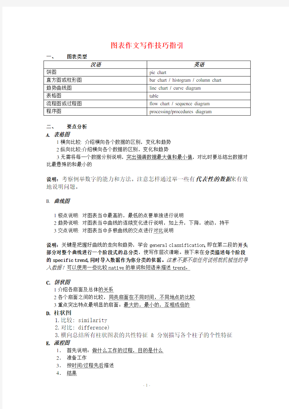

图表作文写作技巧指引
一、图表类型
汉语英语
饼图pie chart
直方图或柱形图bar chart / histogram / column chart
趋势曲线图line chart / curve diagram
表格图table
流程图或过程图flow chart / sequence diagram
程序图processing/procedures diagram
二、要点分析
A. 表格图
1横向比较: 介绍横向各个数据的区别,变化和趋势
2纵向比较:介绍横向各个数据的区别,变化和趋势
3无需将每一个数据分别说明,突出强调数据最大值和最小值,对比时要总结出数据对比最悬殊的和最小的
说明:考察例举数字的能力和方法。注意怎样通过举一些有代表性的数据来有效地说明问题。
B. 曲线图
1极点说明: 对图表当中最高的,最低的点要单独进行说明
2趋势说明: 对图表当中曲线的连续变化进行说明,如上升,下降,波动,持平
3交点说明: 对图表当中多根曲线的交点进行对比说明
说明:关键是把握好曲线的走向和趋势,学会general classification,即在第二段的开头部分对整个曲线进行一个阶段式的总分类,使写作层次清晰。接下来在分类描述每个阶段的specific trend,同时导入数据作为你分类的依据。注意不要不做任何说明就机械性的导入数据!可以使用一些比较native的单词和短语来描述trend。
C. 饼状图
1介绍各扇面及总体的关系
2各个扇面之间的比较,同类扇面在不同时间,不同地点的比较
3重点突出特点最明显的扇面:最大的,最小的,互相成倍的
D. 柱状图
1.比较: similarity
2.对比: difference)
3.横向总结所有柱状图表的共性特征&分别描写各个柱子的个性特征
E. 流程图
1.首先说明:做什么工作的过程,目的是什么
2.准备工作
3.按时间/过程先后描述
4.结果
5.简单总结(可有可无)
说明:注意流程图里的“因果关系”或每一流程的“承前启后”关系;表达每一流程的主体内容,阐明这种关系;揭示其内在联系或规律;最后,给予简要归纳和总结。
F. 实物/器具工作过程
1.实物的名称,功能
2.基本结构
3.工作过程
4.简单总结
G. 综合图
1不求甚解,不拘泥于细节
2分门别类,分段落详细介绍各个图表
3不画蛇添足,主观臆断或猜测图表之间的关系
三、框架结构
1.开头:该图阐述的是______的______.共有以下几个部分组成。
shows (that)/According to / As (is)shown in … / As can be seen from /
It can be seen from /We can see from / It is clear / apparent from the figures/statistics / It is from / This … tells us the main story about / concerning / concerned with / on / related to…
2.分析:首先看到的是____, 在_____年呈现出____的趋势/ 占______; 其次,……第三[比较分析]
1)内容:figure、statistic、number、percentage、proportion
2)用语:
从图中可以看出,……发生了巨大变化as can be seen from the diagram,great changes
have taken place in……
从图表我们可以很清楚(明显)看到……from the table/chart/diagram/figure,we can see
clearly that……or it is clear/apparent from the
chart that……
这个图表向我们展示了……this is a graph which illustrates……
该表格描述了……年到……年间a与b的比例关系this table shows the changing proportion of a & b from……to……
该图以圆形图形式描述了……总的趋势the graph,presented in a pie chart,shows the
general trend in……
在……至……期间,……基本不变。……的数目在……月(年)达到顶点,为……
比率维持在……over the period from……to……the……remained level
在……年到……期间……in the year between……and……
1995年至1998三年里……in the 3 years spanning from 1995 through
1998……
从那时起……from then on/from this time onwards……
……月(年)至……月(年)……的数量基本不变the number of……remained steady/stable from (month/year)to (month/year)
数字急剧上升至……the number sharply went up to……
……至……期间……的比率维持不变the percentage of……stayed the same
between……and……
……的比例比……的比例略高(低)here is not a great deal of difference between……
and……
这是个柱型图,描述了……this is a column chart showing……
如图所示,两条曲线描述了……的波动情况。
……的比例比……的比例略高(低)as can be seen from the graph,the two curves show the flutuation of……
……与……的区别不大.the percentage of……is sightly larger/smaller
than that of……
该图表表明……的数目增长了三倍the graphs show a threefold increase in the
number of……
……逐年减少,而……逐步上升……decreased year by year while……increased
steadily
……的情况(局势)到达顶(高)点,为……百分点the situation reached / mount to a peak(a high point at)of [%]
数字(情况)在……达到底部he figures/situation bottomed out in……
数字(情况)达到底部(低谷)the figures reached the bottom/a low point/hit a
trough
占到…比例gain the percentage of
a是b的……倍 a is ……times as much/many as b.
a增长了…… a increased by……
a增长到…… a increased to……
比低高(低)high/low/great/small/ percentage
……数字呈上升趋势there is an upward trend in the number of…………到……发生急剧上升 a considerable increase/decrease occurred
from……to……
从……到……,下降速率减慢from……to……the rate of decrease slow down.从这年起,……逐渐下降至……rom this year on,there was a gradual declinel
reduction in the……,reaching a figure of……与……相似be similar to……
与……相同be the same as……
……与……之间有许多相似(不同)之处there are a lot similarities/differences
between……and……
a于b有共同之处 a has something in common with b
a与b之间的差别在于……the difference between a and b lies / consists
in……
……年……急剧上升……(year)witnessed/saw a sharp rise in……下降后保持平稳bottom out / level out(降至最低点)
上升后保持平稳level off
修饰语:
汉语英语
图中一些较大变化significant changes
明显趋势noticeable trend
在同一时期during the same period
增长grow/grew
分布,区别Distribute;differentiate
不相等地unequally
在……的情况下in the case of adv.
在……方面in terms of / in respect of / regarding
相反,大不相同in contrast
政府政策government policy
市场规率market forces
尺寸,方法,措施v.估量,调节measure
先见,预见v.预测forecast
3.小结:由上图分析,可以看出/得出______.
在运动范畴中存在着如下的8种运动趋向:
1. 保持平稳:
可以使用的套用结构有: stay stable / remain steady
举例:表示“人口数量保持平稳”的时候可以写: the number of population stayed stable / the number of population remained steady
2. 上升/增加:
可以使用的套用结构有:rise / climb / increase / ascend /mount / aggrandize (增加)
举例:人口数上升:the number of population increased/ascended/mounted等等。
3.下降/减少:
可以使用的套用结构有:fall/ drop/ decrease/ descend/ decline
举例:人口减少:the number of population decreased/ declined
4. 下降后保持平稳:
这个图形比较奇怪,划出的线段应该前面是向下的,后面是平的,在表示这个平的时候我们就不可以使用 remain steady 了,我们要使用的结构是bottom out。
举例:人口下降后保持平稳:the number of population decreased and bottomed out
5.上升后保持平稳:
前面的上升我们就不用说了,但是在上升以后保持平稳,我们需要使用 level off。
举例:人口上升后保持平稳:the number of population mounted and leveled off
6.复苏:
前面下降了以后,然后就上升了,这两条线段的连接点就叫复苏。英语中表达为recover。
举例:人口下降后复苏:the number of population decreased and recovered
7. 波动:
这个就像我们的心电图一样。英语中叫 fluctuate。
举例:人口波动:
the number of population fluctuated.
8. 达到顶峰:peak / reach its summit / reach its zenith
举例:人口到达了顶峰:the number of population peaked/ reached its summit/ reached its zenith.
上面就是运动性线段的八种趋势了。但是上升,下降,波动是存在程度的。所以我们接下来要讨论的是程度的描述方法。程度只有两种,缓慢和陡然。
缓慢的/轻微的:
gradually/ smoothly/ steadily/ slightly
陡然的/大幅度的:
dramatically/ sharply/ considerably/ appreciably/ greatl
举例: 1. 人口大幅度攀升:
the number of population mounted dramatically
2. 人口轻微下降:
the number of population decreased slightly
3. 人口逐渐下降:
the number of population decreased gradually
好了,我们现在已经说了两个范畴了, 这两个范畴可以帮你搞定任何线段组的描述。紧接下来我们要讨论的是如何将线段组与数据进行连接。非常简单, 注意如下的介词使用。
一. remain steady / stay stable / level off / bottom out / peak / reach its peak / reach its zenith 后面需要使用的是 at .
举例:
1. 人口在500万上保持平稳:
the number of population remained steady at 5 million
1. 人口在800万时到达了顶峰:
the number of population peaked at 8 million
2. 下降后, 人口在400万保持平稳:
after decreasing, the number of population bottomed out at 4 million
3. 上升后, 人口在700万保持平稳:
after mounting, the number of population leveled off at 7 million
二. 上升/下降后面使用to(到)和by(了)
举例:
1. 人口下降到200万:
the number of population decreased to 2 million.
2. 人口下降了200万:
the number of population decreased by 2 million.
3. 人口上升到1000万:
the number of population increased to 10 million.
4. 人口上升了500万:
the number of population increased by 5 million.
三. recover的后面大家需要使用的是from
举例: 人口在200万时开始复苏:number of population recovered from 2 million.
四. fluctuate 的后面大家需要连接 between ...... and ......
举例:
人口在2和100亿之间波动:
the number of population fluctuated between 2 and 10 billion(那俩人是ADAM
和EVE)
雅思图表作文经典用词总结手册
1.有用的词
上升:increase、rise、ascend 、core、surge 、go up 、climb 、mount、level up
下降: decrease、fall 、drop、descend、decline 、reduce 、lessen、level down
平稳:stable 、steady、remain/maintain/keep/be the same as/similar to
波动:fluctuate、fluctuation、rise and falls、up and down
占:occupy、take up、account for、gain
而:while、howeve、r whereas、on the other hand、actually/in fact
相比:by contract、on the contrary、likewise、compared with
最高点:the highest 、the top、the summit 、the peak、the most
最低点:bottom 、less 、least 、rock bottom
平均:mean、average
趋势:tendancy 、trend、inclination
预见:prediction
达到顶峰: mount to
在***中占***:***gain the percentage of
有一个稳定的过程:a stable period can be seen
2.分项目的总结
在做这个之前,把“模板”说一下:
第一段:The***(某种图,比如bar chart ,pie chart或是curve graph)show***(简单写写情况,比如“妇女受教育程度”,“美国能源利用”,这些一般可以在图下面的说明文字中找到),From the ***(某种土)we can have a understanding of ***(又是什么情况)
注:第二句话是废话,是为了凑字数,字数够了的时候就可以不用了,当然写的时候注意表达方式的一些小改动
第二段:说明段,From the***/***illustrate*** +一些内容,主要写以下几个方面:极点(极大,极小),趋势,特别点(交点,转折点,相同点和一些在特定图上有意义的点)
第三段:From the chart,we may have a basic understanding of the situation of——凑字数用的!!
3. 一些表达:
A.柱形图
increase rise go up / drop decrease decline
B.饼图
***is dividedsintos***parts ***consume the largest prtion ***accounting for***
***(百分比)of ***is*** ***play a very important role in ***
C.线形图
From this point Drop/increase dramaticly a modest /rapid increase
1.以时间为比较基础的应抓住“变化”:上升,下降,或是波动,题中对两个或两个以上的变量进行描述时应在此基础上进行比较,如变量多于两个应进行分类或有侧重的比较。
2.不以时间为比较基础的应注意对极点的描述。
该数据(字)可以这样理解……
经典语句
一、图表作文写作常识
1、图形种类及概述法:
泛指一份数据图表:a data graph/chart/diagram/illustration/table
饼图:pie chart
直方图或柱形图:bar chart / histogram
趋势曲线图:line chart / curve diagram
表格图:table
流程图或过程图:flow chart / sequence diagram
程序图:processing/procedures diagram
2、常用的描述用法
The table/chart diagram/graph shows (that)
According to the table/chart diagram/graph
As (is)shown in the table/chart diagram/graph
As can be seen from the table/chart/diagram/graph/figures,
figures/statistics shows (that)……
It can be seen from the figures/statistics
We can see from the figures/statistics
It is clear from the figures/statistics
It is apparent from the figures/statistics
table/chart/diagram/graph figures (that)……
table/chart/diagram/graph shows/describes/illustrates how……
3、图表中的数据(Data)具体表达法
数据(Data)在某一个时间段固定不变:fixed in time
在一系列的时间段中转变:changes over time
持续变化的data在不同情况下:
增加:increase / raise / rise / go up ……
减少:decrease / grow down / drop / fall ……
波动:fluctuate / rebound / undulate / wave ……
稳定:remain stable / stabilize / level off ……
最常用的两种表达法:
动词+副词形式(Verb+Adverb form)
形容词+名词形式(Adjective+Noun form)
二、相关常用词组
1、主章开头
图表类型:table、chart、diagramgraph、column chart、pie graph
描述:show、describe、illustrate、can be seen from、clear、apparent、reveal、represent 内容:figure、statistic、number、percentage、proportion
2、表示数据变化的单词或者词组
rapid/rapidly迅速的,飞快的,险峻的
dramatic/dramatically戏剧性的,生动的
significant/significantly有意义的,重大的,重要的
sharp/sharply锐利的,明显的,急剧的
steep/steeply急剧升降的
steady/steadily稳固的,坚定不移的
gradual/gradually渐进的,逐渐的
slow/slowly缓慢的,不活跃的
slight/slightly轻微的、略微地
stable/stably稳定的
3、其它在描述中的常用到的词
significant changes图中一些较大变化
noticeable trend明显趋势
during the same period在同一时期
grow/grew增长
distribute分布,区别
unequally不相等地
in the case of adv.在……的情况下
in terms of / in respect of / regarding在……方面
in contrast相反,大不相同
government policy政府政策
market forces市场规率
measure n.尺寸,方法,措施v.估量,调节
forecast n.先见,预见v.预测
三、考雅英语图表写作套句精选
1.the table shows the changes in the number of……over the period from……to……该表格描述了在……年之……年间……数量的变化。
2.the bar chart illustrates that……
该柱状图展示了……
3.the graph provides some interesting data regarding……
该图为我们提供了有关……有趣数据。
4.the diagram shows (that)……
该图向我们展示了……
5.the pie graph depicts (that)……
该圆形图揭示了……
6.this is a cure graph which describes the trend of……
这个曲线图描述了……的趋势。
7.the figures/statistics show (that)……
数据(字)表明……
8.the tree diagram reveals how……
该树型图向我们揭示了如何……
9.the data/statistics show (that)……
10.the data/statistics/figures lead us to the conclusion that……
这些数据资料令我们得出结论……
11.as is shown/demonstrated/exhibited in the diagram/graph/chart/table……
如图所示……
12.according to the chart/figures……
根据这些表(数字)……
雅思小作文柱状图Bar类解析
雅思小作文柱状图Bar类解析 关于柱状图我们主要分两种写法: 1.如果横轴有明显的时间推移的话,烤鸭们应连接柱子顶点,重在描述柱子的升降起伏,写法类似于线状图。 2.如果无时间推移,则写法和饼状图一样。即按照各比较对象所占比例的高低写,同时要注意各所占比例之间的比较。 可以用到的词汇有: 1.表示“占多少”的动词 Account for Take up Make up Contribute to Have Represent 2.表示“最高级”和“比较级” 第一/最小the largest/biggest proportion of 第二the second/next largest/expensive(+ 形容词的最高级) 第三followed closely by 最低/最小the smallest percent of all 3.表示“相同比例” 即在饼状图中遇到了比例相同或者差不多的饼,如有A B两个比较对象。 A accounts for the same percentage as B . The proportion of A is as high as B A and B contributed equally/evenly to (all ) 在观察柱形图的时候首先要留意横轴的数据,若横轴为时间轴或者是年龄趋势,那么我们在主体段写作时候的基本思路就为从左到右;若横轴数据为具体专有名词诸如地点,交通工具等时,主体段的写作思路就可能是按照柱形的长度排列。本文根据上述的分析做以下的总结: 一、按照横轴从左到右排列数据: 1. 两根柱且趋势截然相反 在这种写法中,我们要注意观察2根柱的上升/下降的幅度。以下我们就来看一个例子:
(完整版)剑桥雅思小作文表格及其他类的写法归纳
【表格的写法】 开头段: 中间段:1. 分析“行” 2. 分析“列” 结尾段:重述或补充说明总体特征(也可不写) *在描写行和列时注意避免重复,后写的可以概括一些 The table gives a breakdown of the different marriage figures in the UK during a long period from 1950 to 2000. The number of first marriages was 330 thousand in 1950, increasing steadily for the following two decades and peaking at 389 thousand in 1970. However, from then on, it experienced a sharp fall to 180 thousand in 2000, the lowest of the whole period. Similarly, the number of re-marriages had generally increased from 78 thousand in 1950 to a peak of 140 thousand in 1980, though its lowest point (58,000) was reached in 1960. The following decade from 1990 to 2000 witnessed an insignificant decrease to 126,000. Since marriages are a sum of first marriages and re-marriages, it can e clearly seen that the trend of marriage saw an overall slump, with its record low (306,000) in 2000, about a third less than its peak (471,000) in 1970
雅思小作文之图表作文
二.雅思图表作文 1.企业垃圾(线性图) 题目:The graph below shows the amounts of waste produced by three companies over a period of 15 years. 范文:The line graph compares three companies in terms of their waste output between the years 2000 and 2015. It is clear that there were significant changes in the amounts of waste produced by all three companies shown on the graph. While companies A and B saw waste output fall over the 15-year period, the amount of waste produced by company C increased considerably. In 2000, company A produced 12 tonnes of waste, while companies B and C produced around 8 tonnes and 4 tonnes of waste material respectively. Over the following 5 years, the waste output of companies B and C rose by around 2 tonnes, but the figure for company A fell by approximately 1 tonne. From 2005 to 2015, company A cut waste production by roughly 3 tonnes, and company B reduced its waste by around 7 tonnes. By contrast, company C saw an increase
雅思经典图表作文范文
# 43. You should spend about 20 minutes on this task. The table below shows CO2 emissions for different forms of transport in the European Union. The Pie Chart shows the percentage of European Union funds being spent on different forms of transport. You should write at least 150 words.
model answer: The chart shows CO2 emissions per passenger kilometre for variuos methods of transport in the European Union while the pie chart shows European Union spending on transport. Flying by air produces by far the greatest CO2 emissions, approximately three times as much as passenger cars which are the next largest producers. Very little is spent by the EU on air travel while roads make up more than half of the EU transport budget. Trains produce about three times less CO2 emissions per passenger kilometre than passenger cars and eight times less than air travel. Nearly a third of EU transport funds are spent on railways. Ships are a clean form of transport and produce about the same amount of CO2 per passenger kilometre as trains do. However, only 2 percent of EU funds are spent on ports. A further one percent is spent on inland waterways. Coaches are the cleanest form of transport. Emissions of CO2 per passenger kilometre from coaches are half those of buses. Buses emit less than half as much CO2 per passenger kilometre as cars. The European Union spends 10 percent of its transport budget on public transport, such as buses and coaches. (197 words)
最新雅思图表小作文范文品读
最新雅思图表小作文范文品读 最新雅思图表小作文范文品读,今天就给大家带来了最新雅思图表小作文范文品读,希望能够帮助到大家,下面就和大家分享,来欣赏一下吧。 最新雅思图表小作文范文品读混合图之成人教育现状 The charts below show the results of a survey of adult education. The first chart shows the reasons why adults decide to study. The pie chart shows how people think the costs of adult education should be shared.Write a report for a university lecturer, describing the information shown above.Write at least 150 Words. 图表展示的是成人继续接受教育培训的理由,以及它的费用该由谁来承担的调查统计。请为大学讲座写一篇150字以上的报告。 雅思图表小作文混合图(线图+饼图)9分范文: The summary of a survey on adult education is presented in the 2 charts. The bar chart summarizes the factors that caused adults to continue their education, while the pie chart shows the public opinion regarding the funding of adult education.(简要概括导入)
雅思图表作文TASK1精讲精练
雅思图表作文TASK1精讲精练
雅思图表作文TASK1精讲精练 A理论部分: 雅思小作文概论 1、文章结构:主要分三部分:i。introductory sentence;ii。body paragraph;iii。Concluding sentence 具体讲:第一段introductory sentence只要写一句话,交待图形(如the line graph, pie chart等等),描述对象(如图表描述的是the number of tourists visiting England),地点(如the US, the UK等)以及时间(如between 1988 and 1997等等);另外要注意的就是第一段不能和图表上方已给的句子太过相似!否则,会失分的! 第二部分一般写1~3段,这要视情况而定。这部分主要就是对比不同的数据,如相似或相同的数据;某个数据是另一个数据的2倍;某个数据所占比例最大或最小等等。 最后一段concluding sentence也只要写一句话,
主要是总结图表的整个趋势。 2。文章的效果。很多学生会发现小作文的例文特别简单(特别是剑桥书里提供的)。原因很简单,这个report的目的就是要让university lecturer了解某个事物的发展趋势,因此写出来的文章必须结构清晰、易懂,绝对不能太复杂,也不要把每个数据都描写出来,只要描写有代表性的,重要的数据即可。 以下为雅思小作文的四个基本步骤 第一步:改写题目 经过同义词转换在短短的1分钟内就写好作文的第一段。 举例:The graph below shows the percentage of people unable to find work in three major countries from 1983 to 1992. 题目中划线的单词都能够进行同义转换: graph—figure, show—illustrate, percentage—proportion, major—key, from…to…—between…and…, 第二步:分析时态
英语考试作文-9分雅思图表写作范文全集之地图篇 滨海村庄
英语考试作文 9分雅思图表写作范文全集之地图篇滨海 村庄 9分雅思图表小作文范文全集之地图滨海村庄The map below shows the development of a seaside village between 1995 and present.Write a short report for a university lecturer describing the information shown below.Write at least 150 words. 范文集结:全部9篇9分雅思写作地图范文汇总放送 参考范文: The two maps show the layout of the same seaside village in 1995 and at present. Overall, it is evident that the infrastructure for housing and recreation has increased at the expense of agricultural land and commercial fishing. The most notable changes are the disappearance of the fishing port and adjacent fish market, as well as the creation of a golf course and tennis courts in the north-east, where
farmland and a forest park were still found in 1995. furthermore, a new housing development containing apartments is now found on the waterfront at the former site of the fish market, and a number of restaurants have been built on the opposite side of the road where shops used to be. There was also an increase in the total number of houses, from 12 in 1995 to 16 at present. In addition, the road encircling a small housing development west of the main road has been extended further westward. The hotel and cafe in the south-east have remained as is. A new car park has been added next to the hotel. Total Words: 180 Task Achievement: 9 Coherence & Cohesion: 9 Lexical resources: 9 Grammar: 9 Overall Score: Band 9
雅思写作小作文范文 雅思写作混合图 温度与降水.doc
雅思写作小作文范文雅思写作混合图温度与降水 今天我们雅思写作小作文范文的文章来研究下雅思写作混合图。该图表为柱状图和折线图的组合。其中柱状图展示了某个城市一月到十二月的降水量,折线图展示了在此期间温度的变化。两者的趋势并不完全一致。小编搜集了一篇相应的范文,大家参考下考官是如何选取数据并进行比较的。 雅思写作小作文题目 The climograph below shows average monthly temperatures and rainfall in the city of Kolkata. Summarise the information by selecting and reporting the main features, and make comparisons where relevant. 雅思写作小作文范文 The chart compares average figures for temperature and precipitation over the course of a calendar year in Kolkata. 该图表比较了加尔各答一年中气温和降雨量的平均数据。 It is noticeable that monthly figures for precipitation in Kolkata vary considerably, whereas monthly temperatures remain relatively stable. Rainfall is highest from July to August, while temperatures are highest in April and May. 很明显,加尔各答每个月降水量的数据差别很大。而每个月的温度则保持相对稳定。从7月到8月,降雨量最高,而四月和五月的温度则最高。 Between the months of January and May, average temperatures in Kolkata rise from their lowest point at around 20°C to a peak of just over 30°C. Average rainfall in the city also rises over the same period, from approximately 20mm of rain in January to 100mm in May. 在一月和五月期间,加尔各答的平均温度从最低的20度左右,上升到顶峰的刚刚超过30度。城市中的平均降水量在同样的时期也在上升,从一月份的大约20毫米,上涨到五月份的平均100毫米。 While temperatures stay roughly the same for the next four months, the amount of rainfall more than doubles between May and June. Figures for precipitation remain above 250mm from June to September, peaking at around 330mm in July. The final three months of the year see a dramatic fall in precipitation, to a low of about 10mm in December, and a steady drop in temperatures back to the January average. (173 words, band 9)
英语考试作文-9分雅思图表写作范文全集之混合图篇 英国移民
英语考试作文 9分雅思图表写作范文全集之混合图篇英 国移民 9分雅思图表小作文范文全集之混合图题型:英国移民The chart below shows long-term international migration in UK. 范文集结:全部9篇9分雅思写作混合图范文汇总放送 真题传送门:2017全年雅思写作真题范文大汇总(第一时间更新) 范文: The chart gives information about UK immigration, emigration and net migration between 1999 and 2008. Both immigration and emigration rates rose over the period shown, but the figures for immigration were significantly higher. Net migration peaked in 2004 and 2007. In 1999, over 450,000 people came to live in the UK, while the number of people who emigrated stood at just under 300,000. The figure for net migration was around 160,000, and
it remained at a similar level until 2003. From 1999 to 2004, the immigration rate rose by nearly 150,000 people, but there was a much smaller rise in emigration. Net migration peaked at almost 250,000 people in 2004. After 2004, the rate of immigration remained high, but the number of people emigrating fluctuated. Emigration fell suddenly in 2007, before peaking at about 420,000 people in 2008. As a result, the net migration figure rose to around 240,000 in 2007, but fell back to around 160,000 in 2008.(159)
雅思小作文写作技巧:常用表达词汇
雅思小作文写作技巧:常用表达词汇 1. 雅思小作文开头图表类型:table; chart; diagram; graph; column chart; pie graph 描述:show; describe; illustrate; can be seen from; clear; apparent; reveal; represent 内容:figure; statistic; number; percentage; proportion 2. 雅思小作文表示数据(低)点:peaked; reached a peak/high point bottomed out; reached the bottom 变化:recover 略有回升; increase; jump; rise/rose; climb上升decrease; fall; drop; decline; reduce下降 fluctuate 浮动,摇摆不定remained steady/stable; stay the same; little/hardly any /no change稳定雅思小作文描述变化程度: sudden/suddenly 突然的,意外的rapid/rapidly 迅速的,飞快的,险峻的dramatic/dramatically 戏剧性的,生动的 3. 其它在描述中常用到的词in the case of adv. 在...的情况下in terms of/in respect of/regarding 在...方面in contrast 相反,大不相同in conclusion adv. 最后,总之in comparison 相比之下inversely adv. 相反地,倒转地in general 通常,大体上,一般而言range from 从…到…excessive adj. 过多的,过分的,额外lower v. 降低,跌落
作文范文之雅思小作文table
作文范文之雅思小作文table
雅思小作文table 【篇一:雅思小作文表格图实例分析】 雅思小作文表格图实例分析 朗阁海外考试研究中心 表格图是雅思小作文的常考图形之一,也是烤鸭们在备考时必须要准备的一类题型。那么烤鸭们具体应该如何准备表格图呢?下面,朗阁海外考试研究中心的专家将以一道具体的实例,就这一题型的解题思路和步骤做出详尽的分析和解答。 the table below shows personal savings as a percentage of personal income for selected countries in 1989, 1999 and 2009. personal savings as a percentage of personal income 一、审题,决定大体写作方式 首先,读题目,了解到这幅表格图是关于“几个国家的人民个人收入中存款的百分比”以及三个时间点(据此,正文部分描述存款率是时态基调为过去时)。表格上方的title和题目表述一样,没有额外信息,因此,读一遍即可。 然后,审具体表格,决定大致写作方向和方式,即分段方式。表格的审图需要注意以下几个方面:横轴,纵轴和总体数据特征。此图中的横纵轴分别是时间和7个研究对象——7个国 家。横纵轴中间有一栏为时间,那说明,此图原则上应该按曲线图原理来写——即,描述7个国家存款率上升或下降趋势;但是,经过下一步对表格中数据总体特征的总结发现:7个国家的存款率在这一段时间内总体呈现下降趋势。这一发现说明,如果继续按照曲线图原理描述,文章会非常单调,而且对比的空间也不大;相反,同一年份里,
雅思经典图表作文范文
#45. The charts below show the percentage of their food budget the average family spent on restaurant meals in different years. The graph shows the number of meals eaten in fast food restaurants and sit-down restaurants. You should write at least 150 words. Give reasons for your answer and include any relevant examples from your own knowledge or experience.
Over the past 30 years, the average family has dramatically increased the number of meals that they eat at restaurants. The percentage of the family's food budget spent on restaurant meals steadily climbed. Just 10 percent of the food budget was spent on restaurant meals in 1970, and 15 percent in 1980. That percentage more than doubled in 1990, to 35 percent, and rose again in 2000 to 50 percent. Where families eat their restaurant meals also changed during that 30-year period. In 1970, families ate the same number of meals at fast food and sit-down restaurants. In 1980, fam?ilies ate slightly more frequently at sit-down restaurants. However, since 1990, fast food restaurants serve more meals to the families than do the sit-down restaurants. Most of the restaurant meals from 2000 were eaten at fast food restaurants. If this pattern continues, eventually the number of meals that families eat at fast food restaurants could double the number of meals they eat at sit-down restaurants. (164 words)
雅思A类小作文范文 Employment 混合图类
The first graph shows the reasons for studying in the UK by age, while the second graph shows the support given by employers for training by age. Summarise the information in the charts and make comparisons where appropriate. Answer The bar chart shows the percentage of students who choose to study because of their career or interest in the UK in five different age groups while the line graph shows how the level of support as a percentage from employers in terms of time-off work and help with fees changes between the age of 20 and 60. The bar shows that young people in the under-25 age group study primarily for reasons of career development (80%) but this number decreases steadily over time and falls to 67% for the 30-39 age group. By the time people reach the 50-59 age group fewer than 20% study because of their career. The opposite trend is seen with the number of students studying because of interest increasing steadily as they age with only 20% studying because of interest in the under 25?group, but this rises to nearly 70% in those in the 50-59 age group. The second chart shows that the level of support for study by employers is high in the early stages of people’s career at about 80% for people aged 20, but this decreases steadily to around 60% by age 40 before falling more steeply to 20% by age 60.
雅思写作图表题解题思路
智课网 IELTS 备考资料 雅思写作图表题解题思路 摘要:雅思写作图表题的解题思路有哪些 ? 无论什么样的考试,事先了解考试的范围内容,以及解题思路就会给考生带来很大的帮助,这也是取得好成绩的重要条件,下面小马过河就帮帮助大家进行详细的讲解雅思写作图表题的解题思路。 第一步:雅思写作改写题目 在考场上,时间是最宝贵的,当考生拿到作文题目,首先通过改写题目完成作文的第一段, “ 同义转换” 是其核心方法,包括两个步骤,第一同义词置换,第二句式变换,也就是说用不同的词、不同的句式表达相同的意思。 第二步:分析时态 1. 图表小作文大部分时候使用过去时态,因为出现的数据一般都是以往的统计数据,过去的情形和现在的情形很有可能完全不一样,因此用过去时态比较恰当。 2. 如果图表里没有出现明显的时间标志,那么用一般现在时态就可以了。 3. 某些情况下,图表作文也会出现将来时间,这个时候用将来时态。 第三步:分析图中数字的含义以及单位 很多同学由于急于完成文章,所以忽略了对图中数据的分析,比如说,有些题目中会在角落里标明百分号和单位,很多同学没有注意到,就认为图中的数字是表示个数或者弄错单位,这样整篇文章的分数就会受到很大的影响。因此先不要急于动笔写,先分析好了,再动笔也不迟。更加值得注意的是,小作文也会走题。 第四步:分析图表
一个图表包含的数据非常多,不能够把每一个数据都列出来,而要描述关键的数据,题目中要求总结,因此作文中必须包含概括性,总结性的语句,除了 specific information,更加需要加入 general information. 通过这四个雅思写作图表题解题步骤,考生可以轻松地在 20分钟内完成小作文,也可以避免出现时态、走题等重大错误。从容的面对小作文,顺利地在 20分钟内完成高质量的小作文是取得雅思写作高分的关键。 相关字搜索:雅思写作
雅思图表作文写作技巧
图表作文写作技巧指引 一、图表类型 汉语英语 饼图pie chart 直方图或柱形图bar chart / histogram / column chart 趋势曲线图line chart / curve diagram 表格图table 流程图或过程图flow chart / sequence diagram 程序图processing/procedures diagram 二、要点分析 A. 表格图 1横向比较: 介绍横向各个数据的区别,变化和趋势 2纵向比较:介绍横向各个数据的区别,变化和趋势 3无需将每一个数据分别说明,突出强调数据最大值和最小值,对比时要总结出数据对比最悬殊的和最小的 说明:考察例举数字的能力和方法。注意怎样通过举一些有代表性的数据来有效地说明问题。 B. 曲线图 1极点说明: 对图表当中最高的,最低的点要单独进行说明 2趋势说明: 对图表当中曲线的连续变化进行说明,如上升,下降,波动,持平 3交点说明: 对图表当中多根曲线的交点进行对比说明 说明:关键是把握好曲线的走向和趋势,学会general classification,即在第二段的开头部分对整个曲线进行一个阶段式的总分类,使写作层次清晰。接下来在分类描述每个阶段的specific trend,同时导入数据作为你分类的依据。注意不要不做任何说明就机械性的导入数据!可以使用一些比较native的单词和短语来描述trend。 C. 饼状图 1介绍各扇面及总体的关系 2各个扇面之间的比较,同类扇面在不同时间,不同地点的比较 3重点突出特点最明显的扇面:最大的,最小的,互相成倍的 D. 柱状图 1.比较: similarity 2.对比: difference) 3.横向总结所有柱状图表的共性特征&分别描写各个柱子的个性特征 E. 流程图 1.首先说明:做什么工作的过程,目的是什么 2.准备工作 3.按时间/过程先后描述 4.结果
雅思写作小作文分类总结
雅思写作小作文分类总结 小作文一般都是图表作文,常见的几种主要类型有:表格图,曲线图,柱状图,饼状图和图画题五大类。一般来说,柱图和线图是每月常考的题型,有时候会有连考或者交替考的趋势。饼图和表格题也是相对频率较高的题型。偶尔也会考综合题。图画题主要分为流程图和地图题,一般每季度轮换题库的时候会出现。不管考到哪种题型,其要求都是一致的,先要挑选重要数值并且在相关处作比较。 在雅思A类小作文图表题的写作当中,考生经常会碰到图表看懂了,但因数据比较凌乱,找不出很明显的特征,或者找到了很多特征,却不知道应该用什么样的思路来把图表当中的重要信息和规律特征有机自然的联系贯穿起来的情况。今天文都国际教育小编将从动态图表和静态图表的角度来详细分析小作文的解题思路。 一、动态图 有时间推移变化的图我们通常叫做动态图。曲线图都是动态图,但是对于表格图,饼图和柱图却有动态和静态之分。对于大多数的动态图我们都可以大致当作线图来处理。动态图重点在数字变化的表达上,利用主语句型的不同和衔接关联词来展开。写好动态图的基础是要准备好三个方面: 1. 解题思路 1). 表格题的动态题解题思路大致可以分为四步:①先相减(年份大的减小的);②后分类(上升一类,下降一类);③挑出极值(最大值);④挑选数值(倍数关系,变化明显的数值); 2). 线图的解题思路大致分为两种:第一种:①按整条线来写(可以把相同趋势的线放在一起,也可把相反趋势的线拿来做对比);②挑选重要信息(整体趋势,起点,重点,最高点,最低点);③整体作比较。第二种:①按时间区间来写(横轴对上去有共同拐点或交点的分为一段);②对比着写(强调交点,拐点,最高点,最低点);
雅思小作文经典句式图表题整理
【整个时段最高】...were the highest throughout the period./ over the period/during this 25-year period 【起点】In 1940 the proportion of XX stood at ...XX in XX, approximately XX in XX and XX in XX 【最高点后回落】After peaking at ...,XX had fallen back o XX by 2002 【最后两年增长放缓】though the growth slowed over the last two years 【由X剧烈增长到X】There was a dramatic increase in XX from(number) to (number) 【明显缩小】the gap between the three categories narrowed considerably 【相等】was equal at 【尽管有波动】Despite some initial fluctuation, 【尽管有波动】In spite of some fluctuation in the ... 【预计】is expected to/ is predicted to 【分别始于】From XX and XX respectively in 1980 【分别是】..while the impact of this on Oceania and North America was minimal, with only 1.7% and 0.2% of land affected respectively. 【保持稳定】will remain stable at 【相对不重要】relatively insignificant 【经历下降】saw a fall 【时间段末尾】by the end of the period 【时间点对应数字】..but rose dramatically in 2011 when it represented 23% of the school budget 【相应的下降】corresponding drops 【不那么明显的下降到】...also declined, but much less significantly to just below... 【表现出下降趋势】showed an upward trend 【急剧下降】plummet/ plunge 【由xx组成】be made up of /consist of/ be composed of 【维持在某一水平】remain stable at 、level off at/ hover at (高) 【最高点】peak at、reach its peak at /reach the highest level at
雅思写作小作文范文 雅思写作混合图 国际移民.doc
雅思写作小作文范文雅思写作混合图国际移民 今天我们雅思写作小作文范文的文章来研究下混合图。该图表由两条折线和一些柱状图构成,涵盖从1999年到2008年这10年的时间。其中最上方的折线表示每年移居到英国的人口数量。第二条折线表示每年离开英国的人口数量。柱状图则表示每年的净人口流入量,即流入量减去流出量的差值。小编搜集了一篇相关的考官范文,以供大家参考。 雅思写作小作文题目 雅思写作小作文范文 The chart gives information about UK immigration, emigration and net migration between 1999 and 2008. 该图表给出了英国在1999年和2008年期间移民进来,移民出去以及净移民人口的相关数据。 Both immigration and emigration rates rose over the period shown, but the figures for immigration were significantly higher. Net migration peaked in 2004 and 2007. 移民进入英国和移民离开英国的数字在上述时间段都有所增长。但移民进来的人数要明显更高一些。净流入人口在2004年和2007年达到顶峰。 In 1999, over 450,000 people came to live in the UK, while the number of people who emigrated stood at just under 300,000. The figure for net migration was around 160,000, and it remained at a similar level until 2003. From 1999 to 2004, the immigration rate rose by nearly 150,000 people, but there was a much smaller rise in emigration. Net migration peaked at almost 250,000 people in 2004. 1999年,超过450000的人来到英国,而选择离开英国的人数还不到300000。净流入人口大约在160000左右。直到2003年,这一数字都维持在相同的水平。从1999年到2004年。移居英国的人口上升了150000人,但选择离开英国的人口上升幅度较小。净流入人口在2004年的时候达到将近250000的顶峰。 After 2004, the rate of immigration remained high, but the number of people emigrating fluctuated. Emigration fell suddenly in 2007, before peaking at about 420,000 people in 2008. As a result, the net migration figure rose to around 240,000 in 2007, but fell back to around 160,000 in 2008. 2004年以后,移居英国的人口数量仍然很高,但迁出英国的人口数量出现波动。迁出人口在2007年突然下降,但在2008年又达到顶峰,有大约420000人。这样一来,净流入人口数据在2007年上升到大约240000,但在2008年又掉回到160000. 雅思写作小作文高分范文,快速提升写作成绩