数据可视化分析外文文献

ThemeRiver: Visualizing Theme Changes over Time Susan Havre, Beth Hetzler, and Lucy Nowell
Battelle Pacific Northwest Division
Richland, Washington 99352 USA
1+509+375-6948
{susan.havre | beth.hetzler | lucy.nowell}@https://www.360docs.net/doc/c29552368.html,
Abstract
ThemeRiver? is a prototype system that visualizes thematic variations over time within a large collection of documents. The “river” flows from left to right through time, changing width to depict changes in thematic strength of temporally associated documents. Colored “currents” flowing within the river narrow or widen to indicate decreases or increases in the strength of an individual topic or a group of topics in the associated documents. The river is shown within the context of a timeline and a corresponding textual presentation of external events.Keywords: visualization metaphors, trend analysis, timeline
1.Introduction
In exploratory information visualization, one goal is to present information so that users can easily discern patterns. Patterns reveal trends, relationships, anoma-lies, and structure in the data, and may help users
Figure 1: ThemeRiver? uses a river metaphor to represent theme changes over time.
confirm knowledge or hypotheses. Perhaps more impor-tantly, they also raise unexpected questions leading users to new insights. The challenge is to create visuali-zations that enable users to find patterns quickly and easily. ThemeRiver, shown in Figure 1, is a prototype system designed to reveal temporal patterns in text collections.
Information visualization systems such as Envision [13], BEAD[1], LyberWorld [ 3, 4] and SPIRE [18] represent each document or group of documents with a glyph or icon, portraying various document attributes. Various methods have been explored for showing change over time in document-centric visualizations. See Section 3 below.
However, a user may be less interested in documents themselves than in theme changes within the whole col-lection over time. For example, how did Shakespeare’s themes change during various periods of his life or in relation to contemporary events? Such information is difficult, if not impossible, to glean from most visuali-zations. A visualization that focuses on themes, rather than documents, could be more useful for such explora-tion.
ThemeRiver provides users with a macro-view of thematic changes in a corpus of documents over a serial dimension. It is designed to facilitate the identification of trends, patterns, and unexpected occurrence or non-occurrence of themes or topics. In our prototype, we use time as the serial dimension. We provide contextual information through a timeline and markers for co-occurring events of interest. Figure 1 shows a sample ThemeRiver visualization. This paper describes the design of ThemeRiver, walks through a sample informa-tion exploration session, and discusses results of forma-tive usability testing.
2.Design
Our major design goal was to provide a visualization of theme change over time. Consider using a histogram to visualize these changes. In a histogram (such as the one shown in Figure 2), each bar represents a time slice, and color variations and size within the bar represent the relative strength of themes specific to that slice. However, understanding the histogram requires users to work at integrating the themes across time because the bars are anchored to a baseline and the position of a particular theme within the bars may vary considerably.
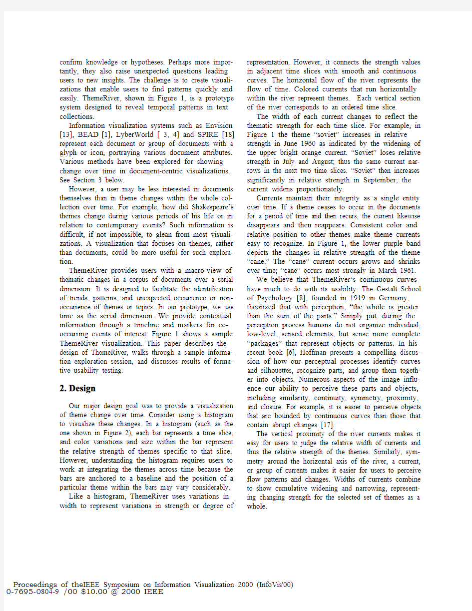
Like a histogram, ThemeRiver uses variations in width to represent variations in strength or degree of representation. However, it connects the strength values in adjacent time slices with smooth and continuous curves. The horizontal flow of the river represents the flow of time. Colored currents that run horizontally within the river represent themes. Each vertical section of the river corresponds to an ordered time slice.
The width of each current changes to reflect the thematic strength for each time slice. For example, in Figure 1 the theme “soviet” increases in relative strength in June 1960 as indicated by the widening of the upper bright orange current. “Soviet” loses relative strength in July and August; thus the same current nar-rows in the next two time slices. “Soviet” then increases significantly in relative strength in September; the current widens proportionately.
Currents maintain their integrity as a single entity over time. If a theme ceases to occur in the documents for a period of time and then recurs, the current likewise disappears and then reappears. Consistent color and relative position to other themes make theme currents easy to recognize. In Figure 1, the lower purple band depicts the changes in relative strength of the theme “cane.” The “cane” current occurs grows and shrinks over time; “cane” occurs most strongly in March 1961.
We believe that ThemeRiver’s continuous curves have much to do with its usability. The Gestalt School of Psychology [8], founded in 1919 in Germany, theorized that with perception, “the whole is greater than the sum of the parts.” Simply put, during the perception process humans do not organize individual, low-level, sensed elements, but sense more complete “packages” that represent objects or patterns. In his recent book [6], Hoffman presents a compelling discus-sion of how our perceptual processes identify curves and silhouettes, recognize parts, and group them togeth-er into objects. Numerous aspects of the image influ-ence our ability to perceive these parts and objects, including similarity, continuity, symmetry, proximity, and closure. For example, it is easier to perceive objects that are bounded by continuous curves than those that contain abrupt changes [17].
The vertical proximity of the river currents makes it easy for users to judge the relative width of currents and thus the relative strength of the themes. Similarly, sym-metry around the horizontal axis of the river, a current, or group of currents makes it easier for users to perceive flow patterns and changes. Widths of currents combine to show cumulative widening and narrowing, represent-ing changing strength for the selected set of themes as a whole.
Values for theme strength can be calculated various ways. For example, they might represent the number of documents containing the word. Because the river loses its continuity and structure if there are too few or too many themes, we created several theme subsets for exploration.
We have implemented a proof-of-principle prototype and used it to explore data from multiple sources. Figure 1 portrays data from a collection of speeches, interviews, articles, and other text associated with Fidel Castro. The visualization includes the river, a timeline below the river, and markers for related historical events along the top. With ThemeRiver, users may ?display topic and event labels
?display time and event grid lines
?display the raw data points
?choose among drawing algorithms for the currents and river.
Users may also display the associated time or theme name by simply moving the mouse across the image. In addition, users may pan and zoom to see other time periods or parts of the river and to see more detail or broader context. In this sample data set, we found several interesting correspondences between themes and events, such as the expansion of the “oil” theme just before Castro confiscated American oil refineries (see Figure 1).
3.Related Work
Many systems include features for viewing time. One common method is to show discrete time slices. For ex-ample, in the Spatial Paradigm for Information Retriev-al and Exploration (SPIRE) Galaxy visualization [18], users may choose to progressively step through time, showing only the icons for documents originating within each specified time period. Another common approach is to show time as an attribute of documents, as done in the Virginia Tech’s Envision system, which lets users map various metadata values, including date, to x-axis, y-axis, or color, shape, or size graphical encodings [13].
More similar to ThemeRiver in intent are systems that focus directly on time. The LifeLines system, developed jointly by the University of Maryland and IBM, has been used to visualize medical records and juvenile criminal records [14, 15]. The visualization displays time along the x-axis and uses the y-axis to categorize events. Bars depict duration for a given event, and graphical attributes such as color show event attributes. TmViewer uses a similar approach, adding the ability to show parent-child relationships with lines between related time bars [10]. The DIVA system [12] uses animation to show how particular measured values change in relation to the temporal flow of a video. To help groups collaborating to create a document or other artifact, the Timewarp system developed at Xerox PARC [2] lets users view and edit multiple timelines of the changing state of that artifact. The metaphor used is similar to a state diagram, with lines connecting state nodes and branches. Additional work on timelines includes Karam’s [7] and Kullberg’s [9].
We know of no other systems that use the river meta-phor to depict the passage of time. However, Tufte [16] presents a similar idea in an artist’s illustration showing trends in music. In that illustration, width represents sales and proximity indicates influence of preceding styles. Our work differs in several aspects, such as the use of color, the inclusion of contextual events, and the ability to generate the visualization automatically from a potentially very large collection of documents.
https://www.360docs.net/doc/c29552368.html,ability Evaluation
Early in ThemeRiver’s development, we carried out a simple formative usability evaluation with two users. Questions we wanted to answer with this evaluation included
?Do users understand the metaphor?
?Can they identify themes that are more often discussed?
?Does the visualization help them raise new questions about the data?
?Do they interpret details of the visualization in ways we had not expected?
?How does their interpretation of the visualization differ from that of a histogram
showing the same data?
The data were the Castro collection described above, focusing on the years 1960-1963. We represented the same data both in ThemeRiver and in a histogram that we created using a spreadsheet. (See Figure 2.) We made the content of the histogram as similar as possible to ThemeRiver’s. For example, the histogram depicted thematic content by months, using the same values that drive ThemeRiver. The month timeline was shown along the bottom and we added an event line to the histogram like the one in ThemeRiver.
Usability evaluation began with a brief explanation of the purpose of the session, followed by an introduc-tion to the data. Both participants viewed the data in both visualizations; one participant started first with the
histogram and one with ThemeRiver. We asked each participant questions about what they observed in each display.
Examples of specific questions include
?In July ’62, what are the three most discussed
themes?
?Where is a new theme introduced?
Examples of more general questions include
?What looks interesting here – what do you
want to explore?
?How would you like to change or manipulate
the view?
We captured verbal protocol during this discussion. At the end, we asked participants to complete a short questionnaire, with feedback about the visualization and possible enhancements.
From the verbal protocol and from user behavior, we observed that the users had no difficulty in understand-ing the metaphor. They were able to identify themes that were strongly represented and able to understand the relationship between the width of the current and theme strength. The visualization also triggered ques-tions about the reasons behind certain theme strengths and patterns. For exploratory visualizations, this is a good result; we believe that a visualization should help the user identify questions of interest to explore.
Questionnaire responses showed that users found ThemeRiver easy to understand. They also found ThemeRiver useful, particularly for identifying macro trends. They told us that it was less useful for identi-fying minor trends because the curves tend to de-emphasize very small values. We asked about the value of the river metaphor, and users rated it highly as well. They observed that the connectedness of the river helped them follow a trend more easily over time than in the histogram; this result is compatible with the per-ception principles described by Ware [17].
Users liked some features of the histogram and rec-ommended adding them to ThemeRiver. One such fea-ture is the ability to see numeric values that drive the histogram and river currents. One user expressed more trust in the histogram, because she “knew” that the bars were exactly the data values, whereas she was not sure exactly what the data values were in ThemeRiver. Her point is a valid one, especially because the curved lines
Figure 2: Like ThemeRiver TM in Figure 1, this histogram uses the Castro collection data and depicts changes in thematic content over time.
of ThemeRiver do require that we interpolate between data points to produce the curves. We have added the capability for users to see the exact data points on demand.
Although users liked the abstraction to the whole collection and thus away from individual documents,both users suggested adding features to access docu-ments if desired. They wanted the ability to see the total number of documents during any time period and to get the text of each document on demand. They wanted to select a current and see the documents that contributed to it.
Users also wanted the ability to reorder the theme currents. Options they discussed included user-defined ordering and ordering by correlation, so that themes appearing together in the documents would be nearby in the river.
5. Interactions and Sample Usage
Based on usability evaluation results, we added a number of features to combine the best of both the river metaphor and histogram capabilities. This section pre-
sents a sample usage scenario, illustrating the capabilities of the current version.
We used ThemeRiver to explore the 1990 Associ-ated Press (AP) newswire data from the TREC5 distri-bution disks, a set of over 100,000 documents (see Figure 3). To explore the selected themes in this collec-tion, a user might begin with a high-level survey of the visualization by panning along the course of the river.The user might look for wider currents that signal heavy use of a topic, such as the one for “baghdad” in Figure 3. Changes in the color distribution of the river signal changes in themes. We see such a change in August 1990, when the “kuwait” current, which had vanished in late July, suddenly appears and rapidly widens. The user could also look for narrow currents in the river that signal relatively light use of particular themes.
In an earlier paper, Hetzler et al. [5] explored the AP data set with a variety of our visual analysis tools, fo-cusing on large theme changes surrounding the Iraqi invasion of Kuwait on August 2. ThemeRiver also re-flects these large theme changes. Near the right side of
Figure 3, we see several currents that expand dramatic-
Figure 3: AP data from July - August 1990. A wide current in the river indicates heavy use of a topic,while changes in color distribution correlate to changes in themes.
ally at the time of the invasion, which is shown on the event line above the river. Labels have been turned on for currents representing the themes “kuwait,” “iraq,”“saddam,” and “baghdad.” ThemeRiver reveals some additional detail not noted in the earlier study. The theme “oil,” which is persistent across the image, also expands noticeably at this time. The themes of “ku-wait,” “iraq,” and “saddam” show up in small bursts before the invasion but are not persistent. News stories corresponding with these bursts covered the verbal con-flicts leading up to the invasion. This distinction between persistent and bursty themes is one advantage that ThemeRiver provides over document-centric visu-alizations.
During late June and throughout July 1990, the themes appear relatively consistent. A user interested in the more prominent themes might turn on theme labels as shown in Figure 3 to discover that the main themes represent “bush” (President Bush), “germany” (the re-unification discussions), and “communist.” Some smaller variations in theme are also apparent, such as the widening of the “nato” band, related to the NATO decision to redefine their military strategy.
Figure 4 shows the ThemeRiver from earlier in the summer of 1990. In late May, a large change in theme strength is shown, this time not matching any previously identified events. Some of the larger currents here are “gorbachev,” “bush,” and “summit.” This might suggest that Bush and Gorbachev both attended a summit. Viewing the pertinent news documents from that time, we found that a four-day summit meeting took place in Washington among several world leaders, including Bush and Gorbachev.
Figure 4: ThemeRiver?of AP data from June - July 1990 identifies very different events from those revealed immediately afterwards (Figure 3).
Some more subtle changes can also be seen in Figure 4. For example, a small current near the middle of the river expands slightly near the beginning of June and again near the end of the month. This is the current for “earthquake.” The wider areas correspond with the quakes in Peru and Iran respectively.
In each of the figures shown so far, there are portions of the river that are extremely narrow overall. In fact, for the AP rivers (Figures 3 and 4), the river seems to narrow quite frequently. On closer inspection, we see that the narrow spots correspond with Sundays. Because the river contains only a subset of the themes in the
collection, we do not know at this point whether the news is generally lighter on Sunday or whether other topics dominate on that day. This uncertainty is one of the points that came up early in user testing. In response, we have added a feature allowing the user to show a histogram representing the total number of documents in a given time slot, along with the portion represented by the themes in the river (see Figure 5). With this histogram, it is apparent that in general fewer news stories are released on Sunday than on other days of the week.
Sometimes users may want to compare theme changes in one set of documents to those in another set; alternatively, they may wish to partition a collection
based on metadata and compare the themes in the two partitions as separate rivers. Figure 6 shows two parallel rivers: the lower river shows AP news stories from Washington, D. C. and the upper river shows the news stories from New York. Some differences in major themes are immediately apparent. The Washington themes emphasize Bush, the Senate, and the Supreme Court. The New York stories show a major growth in the themes “apartheid” and “mandela”; this corresponds with the visit of Nelson Mandela to the US. He arrived first in New York, where he spent several days before proceeding to Washington.
6.Discussion and Design Challenges
Ideally, a visual metaphor facilitates discovery by presenting data in an intuitive, easy way that is consis-tent with the user’s perceptual and cognitive abilities. Lakoff and Johnson [11] argue that metaphors are wired into our understanding of particular concepts, using evidence from common linguistic expressions. One ex-ample they cite is the many English expressions that imply that Anglo-Americans understand time in terms
Figure 5: The addition of a histogram to Theme-River? reveals that news is light on Sundays, not that themes shift.Figure 6: Parallel rivers let users compare AP data from Washington, D.C. and New York from the same time period.
of motion relative to ourselves. Some expressions char-acterize time as moving (e.g., “the time will come,”“don’t let the opportunity pass”), while others imply that people are the ones moving through time (e.g., “as we go through the years”). From formative usability evaluation and anecdotal feedback, we have observed that the river metaphor is intuitive and easy to under-stand. We believe the river metaphor of theme currents changing over time gets part of its strength from this cultural understanding.
Focusing on themes rather than documents changes issues of scalability. ThemeRiver visualizations have little dependence on the number of documents repre-sented. For example, if theme strength is determined by the number of documents containing each theme word,a single pass through the collection is needed to calculate the values, which may be displayed similarly regardless of collection size. On the other hand, the number of currents that can be reasonably included in a single river is limited. Options for addressing this issue include grouping through color families, as suggested in Figure 7, or using each current to represent a set of themes rather than a single theme.
Color choices pose an interesting design challenge.Color perception depends on local contrast. However,because themes come and go, it is impossible to predict which colors will be adjacent at any given time. More-over, we want to show a relatively large number of themes in the river and still achieve acceptable dis-criminability. Currently we are exploring a solution sug-gested during formative usability evaluation: sorting
themes into related groups and displaying each group with a color family. Figure 7 shows a portion of our color legend with such an ordering, which emphasizes changes in related themes and may make it easier to understand relationships among them.
A key cognitive advantage of the river metaphor over a simple histogram lies in the curving continuous lines that define the boundaries between topic currents.But it is also important that the visualization not mislead users. Because dates are not continuous data,we must approximate the true boundaries by interpolat-ing between discrete data points. As long as the reso-lution of the data is sufficient, ThemeRiver provides an overview that meets our criteria for intuitiveness, ease of use, and integrity. If the user zooms in farther than the data resolution supports, the “truthfulness”approximated by the interpolated lines is questionable.While the resolution of data forces a lower limit on the level of zoom, we can deal with the problem of “too much” resolution by combining time slices. That is, as the user zooms out, we can increase the amount of time per time slice and combine theme weights. In this way,we can maintain a suitable level of truthfulness without slowing the rendering speed to a crawl by trying to draw more detail than necessary.
With interactive visualizations, calculation and draw-ing speeds are important. For the current features of ThemeRiver, it is sufficient to calculate the drawing points on startup and then recalculate only after a con-figuration change. Nevertheless, a fast, efficient algo-rithm is needed. We are investigating curved-line algo-rithms and ways to speed up both the calculations and the rendering.
7. Conclusions
ThemeRiver is a demonstration prototype, developed to test the value of the metaphor. We are continuing to add interaction capabilities to it. We also need to develop ways to build the event timeline automatically and to provide more flexibility in selecting and ordering the theme currents. From formative usability evaluation,we learned that users want to know more about the context of the river and want to access the documents that contribute to it at a particular point in time.
We conclude that ThemeRiver is potentially valuable for information analysts and plan to develop it into a
full production system.
Figure 7: Tracking related themes is simplified by assigning them to the same color family. This ensures related themes appear together and are identifiable as a group.
8.Acknowledgments
We gratefully acknowledge the contributions of our colleagues at Battelle to the development and testing of the ThemeRiver visualization. Special thanks for contributions to this paper go to Grant Nakamura, Alan Willse, Sharon Eaton, Wanda Mar, and Dan Donohoo. Battelle Memorial Institute’s Information Synthesis Platform funded this research.
9.References
1. D. Brodbeck, M. Chalmers, A. Lunzer, and P. Cotture,
“Domesticating Bead: Adaptiing an Information Visualization System to a Financial Institution,”
Proceedings of InfoViz ’97. IEEE Computer Society, Los Alamitos, CA, 1997, pp. 73-80.
2.K.W. Edwards and E.D. Mynatt, “Timewarp: Techniques
for Autonomous Collaboration,” Proceedings of CHI’97, Association for Computing Machinery, Inc., 1997, pp.
218-225.
3.M. Hemmje, “LyberWorld: a 3D Graphical User Inter-
face for Fulltext Retrieval,” Conference Companion on Human Factors in Computing Systems, 1995, pp. 417 -418.
4.M. Hemmje, C. Kunkel, and A. Willett. “LyberWorld - a
Visualization User Interface Supporting Fulltext Re-trieval,” Proceedings of the 17th Annual International ACM-SIGR Conference on Research and Development in Information Retrieval, 1994, pp. 249 -259.
5. B. Hetzler, P. Whitney, L. Martucci, L., and J.
Thomas, “Multi-faceted Insight Through Interoperable Visual Information Analysis Paradigms,” Proceedings of IEEE Symposium on Information Visualization, InfoVis '98, 1998, pp.137-144.
6.D.D. Hoffman, Visual Intelligence: How We Create
What We See, W.W. Norton & Company, Inc., New York, 1998.
7. G.M. Karam, “Visualization Using Timelines,”
Proceedings of the 1994 International Symposium on Software Testing and Analysis, 1994, pp. 125-137.8.K. Koffka, (1935), Principles of Gestalt
Psychology, Harcourt-Brace, New York, 1935.
9.R.L. Kullberg, “Dynamic Timelines: Visualizing
the History of Photography,” Proceedings of CHI ’96, 1996, pp. 386-397.
10.V. Kumar and R. Furuta, “Visualization of
Relationships,” Proceedings of Hypertext 99, ACM Press, Darmstadt, Germany, 1999.
11.G. Lakoff and M. Johnson, Metaphors We Live By.
University of Chicago Press, Chicago, 1983.
12.W. Mackay and M. Beaudouin-Lafon, “Diva:
Exploratory Data Analysis with Multimedia Streams,” Proceedings of CHI’98, 1998, pp. 416-423.
13.L.T. Nowell, R.K. France, D. Hix, L.S. Heath, and
E.A. Fox, “Visualizing Search Results: Some
Alternatives to Query-Document Similarity,”
Proceedings of SIGIR ’96, ACM Press, Zurich, 1996, pp. 67-75.
14. C. Plaisant, D. Heller, J. Li, B. Shneiderman, R.J.
Mushinlin, and J. Karat, Visualizing Medical Records with LifeLines. CHI ’98 Summary, 1998, 28-29.
15.C. Plaisant, B. Milash, A. Rose, S. Widoff, and B.
Shneiderman, “Lifelines: Visualizing Personal His-tories,” Proceedings of CHI ’96, Association for Computing Machinery, Inc, 1996, pp. 221-227. 16. E.R. Tufte, Visual Explanations: Images and
Quantities, Evidence and Narrative, Graphics Press, Cheshire, CT, 1997, 90-91.
17.C. Ware, Information Visualization: Perception for
Design, Academic Press, San Diego, 2000.
18.J.A. Wise, J.J. Thomas, K. Pennock, D. Lantrip, M.
Pottier, A. Schur,, and V. Crow, “Visualizing the Non-Visual: Spatial Analysis and Interaction with Information from Text Documents,” S.K Card, J.D.
Mackinlay, and B. Shneiderman, (editors.), Read-ings in Information Visualization: Using Vision to Think, Morgan Kaufmann, San Francisco, 1999, pp. 442-45
毕业论文外文文献翻译-数据库管理系统的介绍
数据库管理系统的介绍 Raghu Ramakrishnan1 数据库(database,有时拼作data base)又称为电子数据库,是专门组织起来的一组数据或信息,其目的是为了便于计算机快速查询及检索。数据库的结构是专门设计的,在各种数据处理操作命令的支持下,可以简化数据的存储,检索,修改和删除。数据库可以存储在磁盘,磁带,光盘或其他辅助存储设备上。 数据库由一个或一套文件组成,其中的信息可以分解为记录,每一记录又包含一个或多个字段(或称为域)。字段是数据存取的基本单位。数据库用于描述实体,其中的一个字段通常表示与实体的某一属性相关的信息。通过关键字以及各种分类(排序)命令,用户可以对多条记录的字段进行查询,重新整理,分组或选择,以实体对某一类数据的检索,也可以生成报表。 所有数据库(最简单的除外)中都有复杂的数据关系及其链接。处理与创建,访问以及维护数据库记录有关的复杂任务的系统软件包叫做数据库管理系统(DBMS)。DBMS软件包中的程序在数据库与其用户间建立接口。(这些用户可以是应用程序员,管理员及其他需要信息的人员和各种操作系统程序)。 DBMS可组织,处理和表示从数据库中选出的数据元。该功能使决策者能搜索,探查和查询数据库的内容,从而对在正规报告中没有的,不再出现的且无法预料的问题做出回答。这些问题最初可能是模糊的并且(或者)是定义不恰当的,但是人们可以浏览数据库直到获得所需的信息。简言之,DBMS将“管理”存储的数据项,并从公共数据库中汇集所需的数据项以回答非程序员的询问。 DBMS由3个主要部分组成:(1)存储子系统,用来存储和检索文件中的数据;(2)建模和操作子系统,提供组织数据以及添加,删除,维护,更新数据的方法;(3)用户和DBMS之间的接口。在提高数据库管理系统的价值和有效性方面正在展现以下一些重要发展趋势; 1.管理人员需要最新的信息以做出有效的决策。 2.客户需要越来越复杂的信息服务以及更多的有关其订单,发票和账号的当前信息。 3.用户发现他们可以使用传统的程序设计语言,在很短的一段时间内用数据1Database Management Systems( 3th Edition ),Wiley ,2004, 5-12
9个常用的国外英文文献数据库
9个常用的国外英文论文文献数据库 9个论文文献数据库,科研搬砖,阅读涨姿势,论文写作小帮手!先说说什么是数据库:学术科研中说的「数据库」和「文献数据库」,往往是一种的形式,这个的贮存了大量文献数据(比如论文)可以简单的理解为一个网络图书馆。 数据库中的论文往往都是耗费了大量的时间和精力整理出来的,还有很多是需要购买才可以放在互联网上的,再加上维护这个本身就耗费颇多,因此这些数据库通常不是完全免费的,你可以在上面免费查找文献,浏览摘要等简介容,但是如果你要下载文献,就要付钱。 大学因为科研和教学需要,常年要下载大量的论文材料,所以就会和数据库的经营者签订很多协议,例如包年,就是给一定量的钱,然后就可以无限制下载论文。也有按照下载的数量进行计费。那英语作为世界第一学术语言,有哪些数据库是值得大家分享的呢?1、Wiley InterScience(英文文献期刊)Wiley InterScience是John Wiely & Sons公司创建的动态在线容服务,1997年开始在网上开通。通过InterScience,Wiley公司以许可协议形式向用户提供在线访问全文容的服务。Wiley InterScience收录了360多种科学、工程技术、医疗领域及相关专业期刊、30多种大型专业
参考书、13种实验室手册的全文和500多个题目的Wiley 学术图书的全文。网址:onlinelibrary.wiley./其中被SCI 收录的核心期刊近200种。期刊具体学科划分为:Business,Finance & Management (商业、金融和管理)、Chemistry (化学)、Computer Science(计算机科学)、Earth Science (地球科学)、Education (教育学)、Engineering (工程学)、Law(法律)、Life and Medical Sciences (生命科学与医学)、Mathematics and Statistics(数学统计学)、Physics (物理)、Psychology (心理学)。 2. ICPSRICPSR全称为Inter-university Consortium for Political and Social Research,即美国校际社会科学数据共享联盟。成立于1962年,位于美国密西根大学安娜堡分校(University of Michigan- Ann Arbor, 1817-),储存超过17000种调查研究资料,如军队官兵总名册,遗嘱、遗嘱查验与税收纪录,是现在世界上最大的社会科学数据中心,拥有600多个成员机构,包括大学和各种研究中心。网址:https://www.360docs.net/doc/c29552368.html,/icpsrweb/landing.jsp其中400多个成员机构在美国,我国的国家人口发展研究战略课题组,大学,大学,科技大学,浸会大学也是成员之一。 3. IEEE 电气电子工程师学会IEEE(Institute of Electrical & Electronics Engineers)是电子信息领域最著名的跨国性学
在研究综述里应用可视化化计量分析
在研究综述里应用CNKI(知网)计量可视化分析 对相关文献进行统计分析 以刘华清论文的研究综述为例 3. 国内外关于城市形象感知的研究 3.1 国外关于城市形象感知的研究 对于国外关于“城市形象”研究的进展分析,可以有以下几个途径获取资料:(1)远程登陆学校图书馆网站,通过外文期刊数据库“爱思唯尔ScienceDircet”进行检索,可以选择主题词“Urban image,city image,the image of the city”检索外文论文;(2)通过知网下载“城市形象感知”研究的论文和博硕论文,参看其中对于国外研究的分析和总结。 注意:不要大量拷贝知网论文内容,这样查重率会很高,影响查重通过!!要将这些内容重新进行总结和表述。 3.2 国内关于城市形象感知的研究 在这部分,可以采用知网里的计量可视化分析功能,通过对国内相关文献的统计,分析研究的进展。 以 CNKI 的中国学术期刊网络出版总库为数据源,以主题=“城市形象”进行精确检索。将时间限定为 1986年至2017 年,共析出相关论文4926篇;为进一步使论析出论文更符合本文研究主题,将学科限定为基础科学(资源科学)、工程科技Ⅱ辑(区域规划、城乡规划)、哲学与人文科学(戏剧电影与电视艺术、地理、文化、心理学、美学)、社会科学Ⅱ辑(社会科学理论与方法、社会学及统计学、民族学)、信息科技(新闻与传媒、出版)、经济与管理科学,通过再次检索,得到3974篇相关文献。 趋势分析 图1-* 1986年—2017年国内城市形象研究文献量分布趋势图 根据趋势图,简要分析城市形象研究的增长情况 关键词共现网络的聚类分析 通过关键词共现网络的聚类分析,发现国内关于“城市形象”的研究集中在3个方面:城市形象的塑造、设计,城市形象的品牌和营销,新媒体和城市形象传播。
9个常用的国外英文论文文献数据库
9个常用的国外英文论文文献数据库9个论文文献数据库,科研搬砖,阅读涨姿势,论文写作小帮手!先说说什么是数据库:学术科研中说的「数据库」和「文献数据库」,往往是一种网站的形式,这个网站的贮存了大量文献数据(比如论文)可以简单的理解为一个网络图书馆。 数据库中的论文往往都是耗费了大量的时间和精力整理出 来的,还有很多是需要购买版权才可以放在互联网上的,再加上维护这个网站本身就耗费颇多,因此这些数据库通常不是完全免费的,你可以在上面免费查找文献,浏览摘要等简介内容,但是如果你要下载文献,就要付钱。 大学因为科研和教学需要,常年要下载大量的论文材料,所以就会和数据库的经营者签订很多协议,例如包年,就是给一定量的钱,然后就可以无限制下载论文。也有按照下载的数量进行计费。那英语作为世界第一学术语言,有哪些数据库是值得大家分享的呢?1、Wiley InterScience(英文文献期刊)Wiley InterScience是John Wiely & Sons公司创建的动态在线内容服务,1997年开始在网上开通。通过InterScience,Wiley 学术期刊集成全文数据库(Academic Search Premier,简称ASP):包括有关生物科学、工商经济、资讯科技、通讯传播、工程、教育、艺术、文学、医药学等领域的七千多种期刊,
其中近四千种全文刊。 学术研究图书馆(Academic Research Library,简称ARL)综合参考及人文社会科学期刊论文数据库,涉及社会科学、人文科学、商业与经济、教育、历史、传播学、法律、军事、文化、科学、医学、艺术、心理学、宗教与神学、社会学等学科,收录2,300多种期刊和报纸,其中全文刊占三分之二,有图像。可检索1971年来的文摘和1986年来的全文。商业信息数据库(ABI/INFORM)ABI即为Abstracts of Business Information的缩写,世界着名商业及经济管理期刊论文数据库,收录有关财会、银行、商业、计算机、经济、能源、工程、环境、金融、国际贸易、保险、法律、管理、市场、税收、电信等主题的1,500多种商业期刊,涉及这些行业的市场、企业文化、企业案例分析、公司新闻和分析、国际贸易与投资、经济状况和预测等方面,其中全文刊超过50%,其余为文摘,有图像。 医学电子期刊全文数据库(ProQuest Medical Library)该数据库收录有220种全文期刊,文献全文以PDF格式或文本加图像格式存储;收录范围包括所有保健专业的期刊,有护理学、儿科学、神经学、药理学、心脏病学、物理治疗及其它方面。 6. BlackwellBlackwell出版公司是世界上最大的期刊出版商之一(总部设在英国伦敦的牛津),以出版国际性期刊为主,
科技外文文献译文
流动的:一个快速的,多平台的开放源码的同步化多媒体整合语言唱机Dick C.A. Bulterman, Jack Jansen, Kleanthis Kleanthous, Kees Blom and Daniel Benden CWI: Centrum voor Wiskunde en Informatica Kruislaan 413 1098 SJ Amsterdam, The Netherlands +31 20 592 43 00 Dick.Bulterman@cwi.nl 摘要: 本文概述了一个出现在早期的流动性的同步化多媒体唱机。不同于其它同步化的实现,早期的播放器是一个可重组的同步化引擎,可以定制作为一个实验媒体播放器的核心。同步化唱机是一个引用了同步化多媒体引擎并可以集成在一个广泛的媒体播放器的项目。本文是以我们要创造一个新的同步化引擎为动机的综述开始的。然后论述的是早期媒体播放器的核心架构(包括可扩展性,播放器自定义的集成装置)。我们以一个关于我们在windows,Mac,Linux版本应用于台式机以及PDA设备上实施流动性例子的体验的讨论结束。 类别和主题描述符: H.5.2 多媒体的信息系统。 H.5.4 超级文本/超级媒体。 一般词汇: 试验,性能,验证。 关键词: 同步化多媒体整合语言,唱机,公开源代码,演示。 1.动机: 早期公开的同步化媒体播放器是一个非常有特色的公开源代码的同步化 2.0播放器,它以研究团体的意图被使用(在我们的研究团体内外)目的是为了研究项目的团体在需要源代码的时候可以访问生产特性的同步化播放器的网站。它也被用作一个独立的不需要专有的媒体格式的同步化播放器使用,播放器支持一系列同步化2.0配置文件(包括台式机和移动的配置)可以被分配利用在Linux,Macintosh,windows系统的台式机,PDA设备和掌上电脑。 同时现存的几个同步化播放器,包括网络视频播放软件,IE浏览器,小型同步化播放器, GRiNS ,X- GRiNS ,以及各种各样专有移动设备,我们发展流动性唱机有三个原因: 准许制作数字以及个人或者课堂使用中的的全部硬拷贝即时没有提供拷贝权限或者商业性的利益分摊,而且在第一页有这种拷贝的注意事项。服务器上有关于复制以及翻版的分发列表的通知。需要事先明确具体的许可权以及费用。 'MM’04, October 10-16, 2004, New Y ork, New Y ork, USA. Copyright 2004 ACM 1-58113-893-8/04/0010...$5.00. 现有的同步化播放器没有提供一个完整同步化2.0播放器的正确实现。早期的播放器所有的同步化工具,是以同步化2.0语言的属性为基础加上扩展功能能够支持高级的动画以及规范可移动设备以3GPP/PSS-6同步化使用. 所有的同步化播放器都是针对商业SMIL表达专有媒介。早期的播发器使用开源的媒体解码器和开源的网络传输协议,以便播放器可以轻松定制广泛的使用范围的研究计划。 我们的目标是建立一个鼓励发展类似的多媒体研究输出的平台,,我们期望的是一个标准的基线播放器的供给,其他研究人员和开发机构可以集中精力到基线播放器的集成扩展(从新媒体的解码器或新的网络控制算法任何一个中)。这些扩展可以在其它的平台上被共享。 在2004年中期,与螺旋形客户机对照,同时移动到一个GPL核心,早期的播放器支持一个广阔的范围的同步化应用指标构架,它提供了一个准确实现的更完整的同步化语言,它在低资源配置下提供了更好的性能,提供了更多可扩展的媒体播放器架构。它也提供了一个包含所有媒体解码作为部分开放的客户基础。
外文文献之数据库信息管理系统简介
Introduction to database information management system The database is stored together a collection of the relevant data, the data is structured, non-harmful or unnecessary redundancy, and for a variety of application services, data storage independent of the use of its procedures; insert new data on the database , revised, and the original data can be retrieved by a common and can be controlled manner. When a system in the structure of a number of entirely separate from the database, the system includes a "database collection." Database management system (database management system) is a manipulation and large-scale database management software is being used to set up, use and maintenance of the database, or dbms. Its unified database management and control so as to ensure database security and integrity. Dbms users access data in the database, the database administrator through dbms database maintenance work. It provides a variety of functions, allows multiple applications and users use different methods at the same time or different time to build, modify, and asked whether the database. It allows users to easily manipulate data definition and maintenance of data security and integrity, as well as the multi-user concurrency control and the restoration of the database. Using the database can bring many benefits: such as reducing data redundancy, thus saving the data storage space; to achieve full sharing of data resources, and so on. In addition, the database technology also provides users with a very simple means to enable users to easily use the preparation of the database applications. Especially in recent years introduced micro-computer relational database management system dBASELL, intuitive operation, the use of flexible, convenient programming environment to extensive (generally 16 machine, such as IBM / PC / XT, China Great Wall 0520, and other species can run software), data-processing capacity strong. Database in our country are being more and more widely used, will be a powerful tool of economic management. The database is through the database management system (DBMS-DATA BASE MANAGEMENT SYSTEM) software for data storage, management and use of dBASELL is a database management system software. Information management system is the use of data acquisition and transmission technology, computer network technology, database construction, multimedia
SQL数据库英文文献及翻译
SQL数据库英文文献及翻译 The fact that you are reading a book on SQL indicates that you, somehow, need to interact with databases. SQL is a language used to do just this, so before looking at SQL itself, it is important that you understand some basic concepts about databases and database technologies. Whether you are aware of it or not, you use databases all the time. Each time you select a name from your email address book, you are using a database. If you conduct a search on an Internet search site, you are using a database. When you log into your network at work, you are validating your name and password against a database. Even when you use your ATM card at a cash machine, you are using databases for PIN number verification and balance checking. But even though we all use databases all the time, there remains much confusion over what exactly a database is. This is especially true because different people use the same database terms to mean different things. Therefore, a good place to start our study is with a list and explanation of the most important database terms.Reviewing Basic Concepts What follows is a very brief overview of some basic database concepts. It is intended to either jolt your memory if you already have some database experience, or to provide you with the absolute basics, if you are new to databases. Understanding databases is an important part of mastering SQL, and you might want to find a good book on database fundamentals to brush up on the subject if needed. What Is a Database? The term database is used in many organized fashion. The simplest way to think of it is to imagine a database as a filing cabinet. The filing cabinet is simply a physical location to store data, regardless of what that data is or how it is organized Database A container (usually a file or set of files) to store organized data. Misuse Causes Confusion People often use the term database to refer to the database software they are running. This is incorrect, and it is a source of much confusion. Database software is actually called the Database Management System (or DBMS). The database is the container created and manipulated via the DBMS. A database might be a file stored on a hard drive, but it might not. And for the most part this is not even significant as you never access a database directly anyway; you always use the DBMS and it accesses the database for you. Tables When you store information in your filing cabinet you don't just toss it in a drawer. Rather, you create files within the filing cabinet, and then you file related data in specific files. In the database world, that file is called a table. A table is a structured file that can store data of a specific type. A table might contain a list of customers, a product catalog, or any other list of information. Table A structured list of data of a specific type. The key here is that the data stored in the table is one type of data or one list. You would never store a list of customers and a list of orders in the same database table. Doing so would make subsequent retrieval and access difficult. Rather, you'd create two tables, one for each list. Every table in a database has a name that identifies it. That name is always unique—meaning no other table in that database can have the same name. Table Names What makes a table name unique is actually a combination of several things including the database name and table name. Some databases also use the name of the database owner as part of the unique name. This means that while you cannot use the same table name
数据库外文参考文献及翻译.
数据库外文参考文献及翻译 数据库外文参考文献及翻译数据库管理系统——实施数据完整性一个数据库,只有用户对它特别有信心的时候。这就是为什么服务器必须实施数据完整性规则和商业政策的原因。执行SQL Server的数据完整性的数据库本身,保证了复杂的业务政策得以遵循,以及强制性数据元素之间的关系得到遵守。因为SQL Server的客户机/服务器体系结构允许你使用各种不同的前端应用程序去操纵和从服务器上呈现同样的数据,这把一切必要的完整性约束,安全权限,业务规则编码成每个应用,是非常繁琐的。如果企业的所有政策都在前端应用程序中被编码,那么各种应用程序都将随着每一次业务的政策的改变而改变。即使您试图把业务规则编码为每个客户端应用程序,其应用程序失常的危险性也将依然存在。大多数应用程序都是不能完全信任的,只有当服务器可以作为最后仲裁者,并且服务器不能为一个很差的书面或恶意程序去破坏其完整性而提供一个后门。SQL Server使用了先进的数据完整性功能,如存储过程,声明引用完整性(DRI),数据类型,限制,规则,默认和触发器来执行数据的完整性。所有这些功能在数据库里都有各自的用途;通过这些完整性功能的结合,可以实现您的数据库的灵活性和易于管理,而且还安全。声明数据完整性声明数据完整原文请找腾讯3249114六,维-论'文.网 https://www.360docs.net/doc/c29552368.html, 定义一个表时指定构成的主键的列。这就是所谓的主键约束。SQL Server使用主键约束以保证所有值的唯一性在指定的列从未侵犯。通过确保这个表有一个主键来实现这个表的实体完整性。有时,在一个表中一个以上的列(或列的组合)可以唯一标志一行,例如,雇员表可能有员工编号( emp_id )列和社会安全号码( soc_sec_num )列,两者的值都被认为是唯一的。这种列经常被称为替代键或候选键。这些项也必须是唯一的。虽然一个表只能有一个主键,但是它可以有多个候选键。 SQL Server的支持多个候选键概念进入唯一性约束。当一列或列的组合被声明是唯一的, SQL Server 会阻止任何行因为违反这个唯一性而进行的添加或更新操作。在没有故指的或者合适的键存在时,指定一个任意的唯一的数字作为主键,往往是最有效的。例如,企业普遍使用的客户号码或账户号码作为唯一识别码或主键。通过允许一个表中的一个列拥有身份属性,SQL Server可以更容易有效地产生唯一数字。您使用的身份属性可以确保每个列中的值是唯一的,并且值将从你指定的起点开始,以你指定的数量进行递增(或递减)。(拥有特定属性的列通常也有一个主键或唯一约束,但这不是必需的。)第二种类型的数据完整性是参照完整性。 SQL Server实现了表和外键约束之间的逻辑关系。外键是一个表中的列或列的组合,连接着另一个表的主键(或着也可能是替代键)。这两个表之间的逻辑关系是关系模型的基础;参照完整性意味着这种关系是从来没有被违反的。例如,一个包括出版商表和标题表的简单的select例子。在标题表中,列title_id (标题编号)是主键。在出版商表,列pub_id (出版者ID )是主键。 titles表还包括一个pub_id列,这不是主键,因为出版商可以发布多个标题。相反, pub_id是一个外键,它对应着出版商表的主键。如果你在定义表的时候声明了这个关系, SQL Server由双方执行它。首先,它确保标题不能进入titles表,或在titles表中现有的pub_id无法被修改,除非有效的出版商ID作为新pub_id出现在出版商表中。其次,它确保在不考虑titles表中对应值的情况下,出版商表中的pub_id的值不做任何改变。以下两种方法可
共享经济外文翻译文献编辑
文献信息: 文献标题:Putting the sharing economy into perspective(透视共享经济) 国外作者:Koen Frenken,Juliet Schor 文献出处:《Environmental Innovation and Societal Transitions》, 2017, 23:3-10 字数统计:英文3345单词,18027字符;中文5823汉字 外文文献: Putting the sharing economy into perspective Abstract We develop a conceptual framework that allows us to define the sharing economy and its close cousins and we understand its sudden rise from an economic-historic perspective. We then assess the sharing economy platforms in terms of the economic, social and environmental impacts. We end with reflections on current regulations and future alternatives, and suggest a number of future research questions. Keywords:Sharing; Platform; Sustainability; Reverse technology assessment; Regulation 1.Introduction In the Spring of 2014, the sharing economy held an unusual gathering in San Francisco, a sort of “coming out” party. Entitled “SHARE,” the conference included not only founders, funders and fans of the sharing economy, but also harsh critics. Politically progressive insiders and outsiders raised questions about access, exclusion and the distribution of value in the sector. They discussed their vision of a fairer, lower-carbon, more transparent, participatory and socially-connected economy, and whether those goals are consistent with the actions of the large, moneyed players—the successful platforms and the venture capitalists who are backing them with vast sums
常见英文数据库介绍
常见英文数据库介绍 A ACM Digital Library收录了美国计算机协会(Association for Computing Machinery)的各种电子期刊、会议录、快报等文献AGRICOLA 农业参考文献数据库,涉及美国农业和生命科学等领域,提供了1970年至今的重要农业信息。 American Chemical Society美国化学学会全文期刊数据库American Mathematics Society 美国数学学会数据库,世界上最权威的数学学术团体,数据库内容涉及数学及数学在统计学、工程学、物理学、经济学、生物学、运筹学、计算机科学中的应用等American Physical Society (APS) 美国物理学会数据库,为用户提供期刊的在线阅读。 Annual Reviews为全世界的科学团体服务,提供由著名科学家撰写的评论。Annual Reviews分生物医学、物理学和社会科学三个主题,共出版29种期刊。 ASCE The American Society of Civil Engineers美国土木工程师协会数据库 ASME Technical Journal 美国机械工程师学会数据库。美国机械工程师学会,主持着世界上最大的技术出版之一,制定各种工业和制造业行业标准。由于工程领域各学科间交叉性不断增长,ASME出版物也相应提供了跨学科前沿科技的资讯。 B
Beilstein/Gmelin crossfire以电子方式提供包含可供检索的化学结构和化学反应、相关的化学和物理性质,以及详细的药理学和生态学数据在内的最全面的信息资源。 BIOSIS Previews世界上最大的关于生命科学的文摘索引数据库。Blackwell 英国Blackwell(英文文献期刊)(https://www.360docs.net/doc/c29552368.html,) Blackwell出版公司是世界上最大的期刊出版商之一(总部设在英国伦敦的牛津),以出版国际性期刊为主,包含很多非英美地区出版的英文期刊。它所出版的学术期刊在科学技术、医学、社会科学以及人文科学等学科领域享有盛誉。 近年来,Blackwell出版的期刊不断发展。目前,Blackwell出版期刊总数已超过700种,其中理科类期刊占54%左右,其余为人文社会科学类。涉及学科包括:农业、动物学、医学、工程、数学统计、计算机技术、商业经济、生命科学、物理学、人文科学、艺术、社会及行为科学等。Blackwell出版期刊的学术质量很高,很多是各学科领域内的核心刊物,据最新统计,其中被SCI收录的核心期刊有239种,被SSCI收录的有118种。 Blackwell-Synergy journals https://www.360docs.net/doc/c29552368.html,/Bowker 多年来在提供图书、期刊和出版信息相关之参考工具资源上,一直扮演着领导者的角色,提供:https://www.360docs.net/doc/c29552368.html, with Reviews(在版书目),https://www.360docs.net/doc/c29552368.html,(乌利希国际期刊指南)及期刊分析系统
毕设外文文献翻译
xxxxxxxxx 毕业设计(论文)外文文献翻译 (本科学生用) 题目:Poduct Line Engineering: The State of the Practice 生产线工程:实践的形态 学生姓名:学号: 学部(系): 专业年级: 指导教师:职称或学位: 2011年3月10日
外文文献翻译(译成中文1000字左右): 【主要阅读文献不少于5篇,译文后附注文献信息,包括:作者、书名(或论文题目)、出版社(或刊物名称)、出版时间(或刊号)、页码。提供所译外文资料附件(印刷类含封面、封底、目录、翻译部分的复印件等,网站类的请附网址及原文】 Requirements engineering practices A precise requirements engineering process— a main driver for successful software development —is even more important for product line engineering. Usually, the product line’s scope addresses various domains simultaneously. This makes requirements engineering more complex. Furthermore, SPL development involves more tasks than single-product development. Many product line requirements are complex, interlinked, and divided into common and product-specific requirements. So, several requirements engineering practices are important specifically in SPL development: ? Domain identification and modeling, as well as commonalities and variations across product instances Separate specification and verification for platform and product requirements ? Management of integrating future requirements into the platform and products ? Identification, modeling, and management of requirement dependencies The first two practices are specific to SPL engineering. The latter two are common to software development but have much higher importance for SPLs. Issues with performing these additional activities can severely affect the product line’s long-term success. During the investigation, we found that most organizations today apply organizational and procedural measures to master these challenges. The applicability of more formal requirements engineering techniques and tools appeared rather limited, partly because such techniques are not yet designed to cope with product line evelopment’s inherent complexities. The investigation determined that the following three SPL requirements engineering practices were most important to SPL success. Domain analysis and domain description. Before starting SPL development, organizations should perform a thorough domain analysis. A well-understood domain is a prerequisite for defining a suitable scope for the product line. It’s the foundation for efficiently identifying and distinguishing platform and product requirements. Among the five participants in our investigation, three explicitly modeled the product line requirements. The others used experienced architects and domain experts to develop the SPL core assets without extensive requirements elicitation. Two organizations from the first group established a continuous requirements management that maintained links between product line and product instance requirements. The three other organizations managed their core assets’ evolution using change management procedures and versioning concepts. Their business did not force them to maintain more detailed links between the requirements on core assets and product instances. The impact of architectural decisions on requirements negotiations. A stable but flexible architecture is important for SPL development. However, focusing SPL evolution too much on architectural issues will lead to shallow or even incorrect specifications. It can cause core assets to ignore important SPL requirements so that the core assets lose relevance for SPL development. Organizations can avoid this problem by establishing clear responsibilities for requirements management in addition to architectural roles. The work group participants reported that a suitable organizational tool for balancing requirements and architecture is roundtable meetings in which requirements engineers,