雅思小作文大全及范文
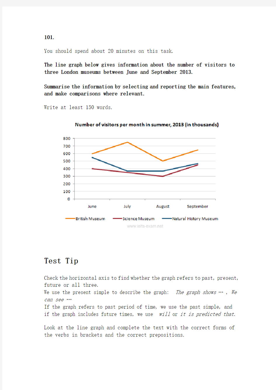

101.
You should spend about 20 minutes on this task.
The line graph below gives information about the number of visitors to three London museums between June and September 2013.
Summarise the information by selecting and reporting the main features, and make comparisons where relevant.
Write at least 150 words.
Test Tip
Check the horizontal axis to find whether the graph refers to past, present, future or all three.
We use the present simple to describe the graph: The graph shows… , We can see…
If the graph refers to past period of time, we use the past simple, and if the graph includes future times, we use will or it is predicted that.
Look at the line graph and complete the text with the correct forms of the verbs in brackets and the correct prepositions.
The graph shows (show) how many people visited (visit) three London museums in the summer of 2013. Most visitors went (go) to the British museum between June and September. The number fluctuated (fluctuate) between 500 and 750. By contrast, the Science Museum and the Natural History Museum received (receive) fewer visitors. The number of people who visited the Science Museum dropped(drop) gradually from 400 thousand to 300 from June to August then rose(rise) to 450 thousand in September. We can see (see) that the trend for the Natural History Museum was (be) similar. There was a sharp drop in visitors from June to July. The number remained stable(remain stable) in August and then increased(increase) steadily in September.
102.
You should spend about 20 minutes on this task.
The chart below shows the percentage change in the share of international students among university graduates in different Canadian provinces between 2001 and 2006.
Summarise the information by selecting and reporting the main features, and make comparisons where relevant.
Write at least 150 words.
Source: Statistics Canada, Postsecondary Student Information System
Test Tip
In Task 1 of the IELTS Writing modules, you may be asked to describe a graph which shows changes over a period of time. To do this you need to use language expressing change and appropriate tenses. In the exam, make sure you leave time to edit your written answer. You will lose marks if you make too many mistakes in grammar and vocabulary.
Model answer
The chart shows changes in the share of international students who graduated from universities in different Canadian provinces over a period of 5 years.
In 2001, this share had a relatively narrow range, from 3% in Ontario to 7.0% in New Brunswick. Nova Scotia had the second highest proportion at 6.5%. Five years later, the figures for most provinces had risen, with the exception of Alberta. There, the figures fell by 1% to just over 4%.
By 2006, some parts of Canada experienced a considerable increase in their share of international graduates. Growth in this share was especially strong in the case of New Brunswick, where the figures rose from 7% to 12%. The largest growth occurred in British Columbia, where it more than doubled to 11%.
Over this five-year period, changes in the proportion of international graduates have been very uneven across the provinces of Canada. However, New Brunswick remained the province with the highest percentage overall.
(158 words)
103.
You should spend about 20 minutes on this task.
The chart below gives information about the UK's ageing population in 1985 and makes predictions for 2035.
Summarise the information by selecting and reporting the main features, and make comparisons where relevant.
Write at least 150 words.
Source: Office for National Statistics, National Records of Scotland, Northern Ireland Statistics and Research
Agency
Exam Tip
In Writing Task 1, it is essential to understand what the graph or chart is representing. Look closely at the information in the instructions as well as all details of the graph or chart.
The graph in this task shows the percentage of over 65s in each country of the UK. The following are incorrect statements:
?Wales had more over 65s than England. (The graph is in percentages, not numbers)
?Northern Ireland had 12% of over 65s in 1985. (The countries do not add up to 100% so Northern Ireland did not have 12% of all over 65s. The graph shows that 12% of the
population of Northern Ireland was over 65.)
Model answer
The graph shows how the size and distribution of the UK's ageing population is likely to change over a 50-year period.
Overall, the proportions are predicted to increase in all UK countries.
In 1985, 15 per cent of the UK population was over 65, but by 2035, this will account for 23 per cent of the total population.
A closer look at the data reveals that the ageing population is expected to rise more in some parts of the UK than in other. In 1985, Wales had the highest percentage of people aged 65 and over, at 16 per cent. The second-largest group could be found in England and the third in Scotland. Northern Ireland had lowest proportion, with 12 per cent aged 65 and over.
By 2035, Wales is still going to have by far the greatest percentage of over 65s, with figures likely to reach 26 per cent. However, the biggest increases in this age group, relative to the rest of the population, are predicted to occur in Northern Ireland and Scotland. In Northern Ireland, for example, this figure will increase almost double to 23 per cent.
(189 words)
104.
You should spend about 20 minutes on this task.
The diagrams below give information on transport and car use in Edmonton.
Summarise the information by selecting and reporting the main features, and make comparisons where relevant.
Write at least 150 words.
People’s reasons for using the car in city
Test Tip
In IELTS Writing Task 1, when you must describe two figures, ask yourself the following:
1) What do both figures relate to?
2) What kind of relationship is evident? (a similarity, a difference, a cause and effect relationship or some other type of relationship)
3) Which aspects of each figure should be highlighted?
4) Should I describe the figures in separate paragraphs, or should I compare different aspects of the figures within a series of paragraph?
Model answer
The table shows the reason why people in Edmonton use their cars in the city and the pie chart explains what type of transport people prefer to use most of the time.
Looking at the pie chart first, it is clear that the car is the most popular means of transport in this city. 45% of the people say that they prefer to commute by car. The second most popular form of transport is the LRT, while busses and taxis are the main means of transport for the rest of the people.
The table gives more detailed information about why people use their cars. Surprisingly, 55% of the people need to commute to work by car. Cars are also used a lot for taking children to school or business purposes. Only 15% of drivers are doing their shopping and, similarly, 15% need to travel by car for leisure.
Overall, people in Edmonton make good use of alternative methods of transport but there is a heavy dependence on cars for work.
(170 words)
105.
You should spend about 20 minutes on this task.
The bar chart below shows shares of expenditures for five major categories in the United States, Canada, the United Kingdom, and Japan in the year 2009.
Write a report for a university lecturer describing the information below.
Write at least 150 words.
Source: U.S. Bureau of Labor Statistics
Test Tip
In Writing Task 1, it is a good idea to end your answer by summarizing the main information shown by the diagram. You are not required to explain this information.
Read the following sample answer. Complete the answer by filling the gaps with the words in the box.
by contrast indicates lowest compares
overall whereas except higher
highest however largest among
The bar chart compares how consumers in the United States, Canada, the United Kingdom, and Japan allocated different shares of total spending to categories such as food, housing, and transportation in 2009.
We can see that the United States had the highest housing expenditure share, 26% of total expenditures in 2009. The United Kingdom and Japan followed, with 24% and 22%, respectively. Canada had the lowest housing share at 21%. Housing was the largest expenditure component in all countries except Japan.
By contrast, Canada had the largest transportation share of all four countries at 20%. The United States and the United Kingdom had the next-highest transportation shares, 17% and 15%, respectively. Japan had the lowest, at 10%.
However, in Japan, consumers spent 23% of their total expenditures on food in 2009. The United Kingdom had the second-highest share at 20%. Canada, with 15%, and the United States, with 14% had the lowest food expenditure shares among the countries studied.
Overall, the data indicates that housing and health care shares of total expenditures were higher in the United States than in Canada, the United Kingdom, and Japan in 2009, whereas Americans had the lowest clothing share. Canada had the highest clothing and transportation shares, and Japan had the highest food share, among the countries compared.
Show Answers - Hide Answers
(214 words)
106.
Vocabulary Tip
Notice the following rules for the spelling of the words programme and program:
programme (UK only) = a show on television
program (US only) = a show on television
program (UK and US) = instructions for a computer (a verb and a noun) You should spend about 20 minutes on this task.
The charts give information about two genres of TV programmes watched by men and women and four different age groups in Australia.
Summarise the information by selecting and reporting the main features, and make comparisons where relevant.
Write at least 150 words.
IELTS Tip
?With graphs, make sure you understand what each axis is measuring.
?With bar and pie charts, there is often a key which tells you what each different bar or area represents.
?With tables, read the data across the rows and down the columns to identify the key features.
Fill in the gaps in the model answer.
The charts give information about the genres of TV programmes that Australian men and women and different age groups watch. It is clear from the charts that women tend to watch more television than man overall, although they watch slightly fewer game shows. The people who watch the
most television are in the 45+ age group.
Nearly 70% of women watch reality shows, which is almost twice as many as the percentage of men who choose this genre of programme. Nevertheless, most age groups watch more reality shows than game shows revealing that game shows are generally less popular than reality shows.
The percentage of people watching reality shows increases steadily from ages 16 to 45 with the lowest / smallest percentage of viewers, at just over 50% of the age group 16-24 and the highest / biggest / largest / greatest percentage, at 68% of the over-45s.
However, the pattern is different for game shows. The number of programmes watched by 25- to 44-year-olds is significantly / considerably lower than the number watched by 16- to 24-year-olds and those over 45. Just over 50% of 16- to 24-year-olds watch game shows, but this share is not as high as the share of people aged 45 and over watching game shows, at nearly 70%. Only 41% of 35- to 44-year-olds watch game shows, and the share of 24- to 34-year-olds is slightly / even lower at 38%.
107.
You should spend about 20 minutes on this task.
The graph below shows the changes in food consumption by Chinese people between 1985 and 2010.
Summarise the information by selecting and reporting the main features, and make comparisons where relevant.
Write at least 150 words.
Writing Tip
It is best to use amount and quantity for uncountable nouns, although both are used for countable nouns as well, particularly quantity.
The amount of consumption decreased in the last 25 years.
Answer
The graph shows changes in the amount of fish, salt and meat eaten per person per week in China between 1985 and 2010.
From the graph we can see that people in China consumed more fish than either meat or salt throughout the period. In 1985, the consumption of fish stood at 610 grams, then increased to 700 grams in 1990. Although it dipped in 1995, it then rose steadily and reached 850 grams in 2010.
In contrast, there was a consistent drop in salt consumption. The amount consumed decreased steadily from almost 500 grams per person to only 200 grams by 2010. The amount of meat consumed weekly started at about 100
grams. However, this gradually increased throughout the period. By 2010 it was at the same level as the consumption of salt.
Overall, the consumption of fish rose, while the consumption of salt fell. In addition, the consumption of meat, while at a relatively low level, rose significantly during this period.
108.
You should spend about 20 minutes on this task.
The graph below shows the population change between 1940 and 2000 in three different counties in the U.S. state of Oregon.
Summarise the information by selecting and reporting the main features, and make comparisons where relevant.
Write at least 150 words.
IELTS Tip
The structure of your answer would look like this:
Introduction - Explain briefly in your own words what the information shows. Give more detail than the question and make comparisons where appropriate.
Main Body - Decide how to organise your paragraphs. For example, in the model answer below, paragraph 2is about 1940-1970, paragraph 3is about 1970-2000 for Columbia and Yamhill, and paragraph 4 is about 1970-2000 for Washington. Use words such as although and however to make contrasts, and words such as likewise to introduce similarities. Always include the actual data you have been given. The final paragraph is not a conclusion in this type of task.
Model answer
The graph shows the increase in population of three counties, Columbia, Yamhill and Washington in the U.S. state of Oregon, between 1940 and 2000. In 1940, Columbia had the lowest population of the three counties, at around 25,000. This compared with about 30,000 in Yamhill and approximately 75,000 in Washington.
By 1970, Columbia’s population had risen to just under 36,000. Although this appears on the graph to be a gentle increase, it is in fact an increase of approximately 50%. Yamhill’s population also rose by nearly 50% between 1940 and 1970: from 30,000 to just under 45,000. However, the greatest real increase was in Washington, where the population in 1970 had increased by approximately 75,000, to 125,000.
The years 1970 to 2000 saw the populations of Columbia and Yamhill increase by approximately the same amounts that they had increased by the thirty years before. In 2000, Columbia’s population –at approximately 76,000 –was triple what it had been in 1940. Likewise, Yamhill’s population, at around 90,000, was almost triple what it was in 1940.
Although Washington’s increase in population between 1940 and 1970 was large, its increase in the following thirty years was even sharper, rising from about 125,000 in 1970 to more than 240,000 in 2000.
(206 words)
109.
IELTS Tip
You will lose marks if you make grammatical errors in your writing, particularly when errors are frequent and effect meaning. Be careful of the following common mistakes when describing numbers.
amount and number: amount is used with uncountable nouns; number is used with countable nouns, e.g. The amount of meat consumed in China between 1985 and 2010. NOT .
per cent and percentage: per cent is always used with a number; percentage is used on its own without a number, e.g. The percentage of male teachers in the UK. NOT . According to the graph, four per cent of the total household budget went towards transportation. NOT .
You should spend about 20 minutes on this task.
The graph below shows the amount of money spent on books in Germany, France, Italy and Austria between 1995 and 2005.
Write a report for a university lecturer describing the information below.
Write at least 150 words.
Read the following sample answer. Complete the answer by filling the gaps with the words in the box.
biggest sharp least dramatically
much less more three times
The line graph compares the amount of money spent on buying books in Germany, France, Italy and Austria over a period of ten years between 1995 and 2005.
In 1995 Austria spent the least amount of money on books, while Italy and France spent about as much as each other. However, by 2001, the gap in spending between these two countries had widened and considerably more money was spent in France than In Italy.
As can be seen from the graph, the amount of money spent increased in all four countries but rose the most dramatically in Austria. The period between 2000 and 2005 saw a sharp growth and in 2005 the Austrians spent three times as much money as they did in 1995.
However, during this ten-year period, Germany remained the biggest spenders on book, with all three other countries spending much less on them.
110.
IELTS Tip
It is quite common for IELTS Writing Task 1 to involve more than one piece of information relating to the topic. For example, you may get two or three pie charts that you must compare. The pie charts may represent different years and show trends over time. In this case, you will have to describe the changes and similarities/differences between the pie charts.
Related Topic: Comparing pie charts
You should spend about 20 minutes on this task.
The three pie charts below show the changes in annual spending by local authorities in Someland in 1980, 1990 and 2000.
Summarise the information by selecting and reporting the main features, and make comparisons where relevant.
Write at least 150 words.
Expenditure by local authorities in Someland
Model answer
The charts show how much local authorities spent on a range of services in Someland in three separate years: 1980, 1990 and 2000.
In all three years, the greatest expenditure was on education. But while K-12 education saw a fall from 25% in 1980 to only 18% of spending in 2000, higher education remained the largest proportion, reaching 45% of total spending in 1990 and ending at 40% in 2000.
Expenditure on health and human resources had increased to 20% by 1990
before decreasing to only 10% by the end of the period. In contrast, the share of transportation saw an opposite trend. This cost decreased to only 6% of total expenditure in 1990 but rose dramatically in 2000 when it represented 22% of the total budget. Similarly, the cost of environmental services saw a rising trend, growing from only 4% to 9% by 2000.
Overall, higher education constituted the largest cost to local authorities, and while spending increased for transportation and environmental services, there were corresponding drops in expenditure on health and human resources and K-12 education.
(178 words)
(完整版)剑桥英语10雅思考官范文(大作文小作文)
剑10 1-2 It is important for children to learn the difference between right and wrong at an early age. Punishment is necessary to help them learn this distinction. To what extent do you agree or disagree with this opinion? What sort of punishment should parents and teachers be allowed to use to teach good behavior to children? One important stage in a child 'gsr owth is certainly the development of a conscience, which is linked to the ability to tell right from wrong. This skill comes with time and good parenting, and my firm conviction is that punishment does not have much of a role to play in this. Therefore I have to disagree almost entirely with the given statement. To some extent the question depends on the age of the child. To punish a very young child is both wrong and foolish, as an infant will not understand what is happening or why he or she is being punished. Once the age of reason is reached however, a child can be rewarded for good behavior and discouraged from bad. This kind but firm approach will achieve more than harsh punishments, which might entail many negative consequences unintended by the parents. To help a child learn the difference between right and wrong, teachers and parents should firstly provide good role modelling in their own behavior. After that, if sanctions are needed, the punishment should not be of a physical nature, as that merely sends the message that it is acceptable for larger people to hit smaller ones-an outcome which may well result in the child starting to bully others. Nor should the punishment be in any way cruel. Rather, teachers and parents can use a variety of methods to discipline their young
Simon雅思小作文真题范文 Task 1: table essay
The table below shows changes in the numbers of residents cycling to work in different areas of the UK between 2001 and 2011. The table compares the numbers of people who cycled to work in twelve areas of the UK in the years 2001 and 2011. Overall, the number of UK commuters who travelled to work by bicycle rose considerably over the 10-year period. Inner London had by far the highest number of cycling commuters in both years. In 2001, well over 43 thousand residents of inner London commuted by bicycle, and this figure rose to more than 106 thousand in 2011, an increase of 144%. By contrast, although outer London had the second highest number of cycling commuters in each year, the percentage change, at only 45%, was the lowest of the twelve areas shown in the table. Brighton and Hove saw the second biggest increase (109%) in the number of residents cycling to work, but Bristol was the UK’s second city in terms of total numbers of cycling commuters, with 8,108 in 2001 and 15,768 in 2011. Figures for the other eight areas were below the 10 thousand mark in both years. (172 words, band 9)
雅思6.5分 小作文范文参考
●批改By Will 本次批改严格按照ILETS小作文评分标准进行。ILETS小作文评分项:TA (内容的完整性), CC (连贯性及一致性), GRA (语法范围及精准度), LR (词汇资源)。文末会进行总评及打分。 ●文中标识: 用词不当逻辑错误语法错误修改添加 The graph provides the information concerning the average temperatures on a month basis in three major cities.(介于有两张图,都要提一下。此后可加一句:In addition, clearly demonstrated in the table are the time of sunshine on an annual base.) (补充:在下一段看到了你对于后一张图的总结,这样的话建议你在开头强调一下“the first graph”) As can be seen from the graph, there is a similar trend in terms of average monthly temperature between London and New York during the period from January to December. (可加入连接词:To be specific) The average temperature in London (介于你后面写的是两个城市的数据,这里改为:for both of the cities) gradually rises from January to July both in London and new york, reaching a peak at 25 degrees and 20 degrees respectively. After that, the following 4 months witness a dramatic decrease both in London and new york. In comparison (这里不妨分段), an opposite trend is found in Sydney. It (这是悉尼的第一句,建议写出来具体的量词至少:The temperature) keeps stable at 25 degrees from January to march, after which the average temperature undergoes a considerable descent, reaching the bottom point at approximately 15 degrees, before there is (there is 没必要了,可以去除) a steady ascent by 10 degrees. It is obvious that the table depicts the average number of hours of sunshine per year in three major cities. As we can see from the statistics, when it comes to the total annual hours of sunshine, new york ranks first, followed by Sydney ,London lies last. Specifically, people who live in new york enjoy 2,353 hours of sunshine every year, which is similar to people living in London with 2,473 hours (不是人和人像,是时间长短像,改为:which is similar to the amount of sunshine for those in London). However, only 1,180 hours of sunshine are found in London annually. 总评6.5(TA6.5 CC6.5 LR6.5 GRA7.0) 1.语法变化上从句数量可以了,分词的使用还可以多一些。偶尔试试一到两句倒装,如我在开头给你的那个。 2.趋势等词汇变化可以,试着多换换题目话题词汇,如people=residents=citizens
作文范文之雅思小作文真题
作文范文之雅思小作文真题
雅思小作文真题 【篇一:雅思作文题目汇总】 一、教育 1、教育应该包括哪些内容? 母题:it is generally believed that education is of vital importance to the development of individuals and the well-being of societies. what should education consist of to fulfil both these functions? (050312) 提示:本题围绕教育的两大功能来展开(个人与社会),准备好这篇文章,即可应付教育类话题中的最大分支—教育的功能,做到以不变应万变。对于社会角度,可以从促进经济发展、增加社会流动性(social mobility)、维护社会稳定这几个方面来展开,对于个人,可以写改变思维模式、有利于就业和便利生活来写。 子题:大学应当教授理论知识还是实践技能?大学的是应当把学生培养成合格的公民还是让他们自己得益?准备未来职业最好的方法是上大学还是尽快离校积累工作经验?大学要不要扩招?中学阶段应当提供通才教育还是专才教育?要不要延长义务教育年限?要不要让农村地区的学生更容易上学?老师要教学生如何判断是非吗? 2、学校的科目谁来选择?(060916) 母题:some people think that the government should decide which subjects students should study at the university, while others think that students should be allowed to apply for the subject they prefer. discuss the two views and give your opinion. 提示:这类题目采取的策略就是“双批判”,因为题目中提供的两种选择往往都是错误的。
雅思写作-小作文范文-柱状图
雅思经典小作文柱状图4篇范文+写作要点分析 C1T3 题目 The chart below shows the amount of money per week spent on fast foods in Britain. The graph shows the trends in consumption of fast foods. Write a report a university lecturer describing the information shown below. The chart shows that high income earners consumed considerably more fast foods than the other income groups, spending more than twice as much on hamburgers (43 pence per person per week) than on fish and chips or pizza (both under 20 pence). Average income earners also favored hamburgers, spending 33 pence per person per week, followed by fish and chips at 24 pence, then pizza at 11 pence. Low income earners appear to spend less than other income groups on fast foods, though fish and chip remains their most popular fast food, followed by
2019年雅思小作文范文:剑桥雅思5册29页作文-范文模板 (1页)
2019年雅思小作文范文:剑桥雅思5册29页作文-范文模板 本文部分内容来自网络整理,本司不为其真实性负责,如有异议或侵权请及时联系,本司将立即删除! == 本文为word格式,下载后可方便编辑和修改! == 雅思小作文范文:剑桥雅思5册29页作文 This line chart shows the changes in the proportion of the elderly people in three countries from 1940 till today . Moreover , it offers predictions for a period to 2040. 注意趋势描述的语言,对照对比的点和表达方式 During the three score years , the USA generally outweighed Sweden in terms of the proportion of those aged 65 and over . But the gaps between have never been remarkable . In stark contrast , Sweden strikingly eclipsed Japan in this aspect evidenced by the fact that in 1940 the proportion for the USA was about 9%, clearly higher than 5% for Japan . Whereas Japan experienced declines from 5% to 3% , both Sweden and the USA climbed . Put it in detail , by the year 1983, the figures have peaked at 15% and 13% in the USA and Sweden respectively . Noticeably , in 1997 the proportion in the USA was equal to that in Sweden . According to the forecast , from now on , all of the three countries will skyrocket although exceptions might happen . However , by 2040 the proportion will have peaked at 27%, 25%, and 23% in Japan , Sweden , and the USA respectively . In sum , the three countries are different in the field under study .
雅思小作文及范文汇总
101. You should spend about 20 minutes on this task. The line graph below gives information about the number of visitors to three London museums between June and September 2013. Summarise the information by selecting and reporting the main features, and make comparisons where relevant. Write at least 150 words. Test Tip Check the horizontal axis to find whether the graph refers to past, present, future or all three. We use the present simple to describe the graph: The graph shows… , We can see… If the graph refers to past period of time, we use the past simple, and if the graph includes future times, we use will or it is predicted that. Look at the line graph and complete the text with the correct forms of the verbs in brackets and the correct prepositions.
雅思写作小作文范文118篇之范文14
雅思写作小作文范文118篇之范文14 以下是三立在线雅思网给大家分享的雅思写作小作文范文118篇:范文14。希望对大家的雅思备考有所帮助,更多雅思备考资料欢迎大家随时关注三立在线雅思网。 范文14 The computer is widely used in education,and some people think teachers do not play important roles in the classroom. To what extend do you agree or disagree? In this period of communication,computer has been used in all kinds of fields widely, and plays a particular role in our lives. Especially computer has become more and more important in educational field, therefore dozens of people considered teachers could be replaced computers that will go with the current of the times. The above point is certainly wrong; this essay will outline three reasons. The main reason is that people’s brain better than computer. Firstly, people design all kinds of computer’s programs. Secondly, computer doesn’t have logistic ideation. Computer only can defend on that designer inputted computer’s programs to judge a question’s right or wrong. In other words, computer can’t defend on thinking that computer independently analyzes a question’s right or wrong. In case, designer inputted programs that are wrong. Computer output the result that also will be wrong. If this kind of problem happened in classroom, students would be infused plenty of wrong information.
剑桥雅思1-4 Writing_Task_1小作文范文
剑一--Test 3—Task1 (bar chart combined with line graph) The chart below shows the amount of money per week spent on fast foods in Britain. The graph shows the trends in consumption of fast-foods. Write a report for a university lecturer describing the information shown below. (Model answer 165 words) The chart shows that high income earners consumed considerably more fast foods than the other income groups, spending more than twice as much on hamburgers (43 pence per person per week) than on fish and chips or pizza(both under 20 pence). Average income earners also favoured hamburgers,spending 33 pence per person per week, followed by fish and chips at 24 pence,then pizza at 11 pence. Low income earners appear to spend less than otherincome groups on fast foods, though fish and chips remains their most popularfast food, followed by hamburgers and then pizza. From the graph we can see that in 1970, fish and chips were twice as popular
Simon雅思小作文真题范文 Task 1: 'waste table' essay
The table below shows the amount of waste production (in millions of tonnes) in six different countries over a twenty-year period. The chart compares the amounts of waste that were produced in six countries in the years 1980, 1990 and 2000. In each of these years, the US produced more waste than Ireland, Japan, Korea, Poland and Portugal combined. It is also noticeable that Korea was the only country that managed to reduce its waste output by the year 2000. Between 1980 and 2000, waste production in the US rose from 131 to 192 million tonnes, and rising trends were also seen in Japan, Poland and Portugal. Japan’s waste output increased from 28 to 53 million tonnes, while Poland and Portugal saw waste totals increase from 4 to 6.6 and from 2 to 5 million tonnes respectively. The trends for Ireland and Korea were noticeably different from those described above. In Ireland, waste production increased more than eightfold, from only 0.6 million tonnes in 1980 to 5 million tonnes in 2000. Korea, by contrast, cut its waste output by 12 million tonnes between 1990 and 2000.
剑桥雅思大作文A类题目
剑桥雅思作文题目-大作文 目录 IELTS 8 ............................................................. Test 1.......................................................... Test 2.......................................................... Test 3.......................................................... Test 4.......................................................... IELTS 7............................................................. Test 1.......................................................... Test 2 P165..................................................... Test 3 P167..................................................... Test 4.......................................................... IELTS 6............................................................. Test 1.......................................................... Test 2.......................................................... Test 3.......................................................... Test 4 P99 P168................................................. IELTS 5............................................................. Test 1.......................................................... Test 2.......................................................... Test 3.......................................................... Test 4 P99 P169................................................. IELTS 4............................................................. Test 1.......................................................... Test 2.......................................................... Test 3.......................................................... Test 4.......................................................... IELTS 3............................................................. Test 1.......................................................... Test 2.......................................................... Test 3.......................................................... Test 4.......................................................... IELTS 8 Test 1 Task 1 Pie chart Table Task 2 Some people think that parents should teach children how to be good members of society. Others, however, believe that school is the place to learn this. Discuss both these views and give your own opinion. Test 2
雅思小作文真题范文-Process diagram answer
题目: The diagrams below show the stages and equipment used in the cement-making process, and how cement is used to produce concrete for building purposes. 范文: The first diagram illustrates the process of cement manufacture, and the second diagram shows the materials that go into the production of concrete. It is clear that there are five stages in the production of cement, beginning with the input of raw materials and ending with bags of the finished product. To produce concrete, four different materials are mixed together. At the first stage in the production of cement, limestone and clay are crushed to form a powder. This powder is then mixed before it passes into a rotating heater. After heating, the resulting mixture is ground, and cement is produced. Finally, the cement is packaged in large bags. Cement is one of the four raw materials that are used in the production of concrete, along with gravel, sand and water. To be exact, concrete consists of 50% gravel, 25% sand, 15% cement and 10% water. All four materials are blended together in a rotating machine called a concrete mixer. (160 words, band 9)
剑桥英语10雅思考官范文(大作文+小作文)
剑桥英语10雅思考官范文(大作文+小作文)
剑10 1-2 It is important for children to learn the difference between right and wrong at an early age. Punishment is necessary to help them learn this distinction. To what extent do you agree or disagree with this opinion? What sort of punishment should parents and teachers be allowed to use to teach good behavior to children? One important stage in a child’s growth is certainly the development of a conscience, which is linked to the ability to tell right from wrong. This skill comes with time and good parenting, and my firm conviction is that punishment does not have much of a role to play in this. Therefore I have to disagree almost entirely with the given statement. To some extent the question depends on the age of the child. To punish a very young child is both wrong and foolish, as an infant will not understand what is happening or why he or she is being punished. Once the age of reason is reached however, a child can be rewarded for good behavior and discouraged from bad. This kind but firm approach will achieve more than harsh punishments, which might entail many negative consequences unintended by the parents. To help a child learn the difference between right and wrong, teachers and parents should firstly provide good role modelling in their own behavior. After that, if sanctions are needed, the punishment should not be of a physical nature, as that merely sends the message that it is acceptable for larger people to hit smaller ones-an outcome which may well result in the child starting to bully others. Nor should the punishment be in any way cruel.
英语考试作文-9分雅思图表写作范文全集之地图篇 学校变迁
英语考试作文 9分雅思图表写作范文全集之地图篇学校 变迁 9分雅思图表小作文范文全集之地图学校变迁The diagrams below show the site of a school in 2004 and the plan for changes to the school site in 2024. 真题传送门:2017全年雅思写作真题范文大汇总(第一时间更新) 范文集结:全部9篇9分雅思写作地图范文汇总放送 范文 The two pictures compare the layout of a school as it was in the year 2004 with a proposed site design for the year 2024. It is clear that the main change for 2024 involves the addition of a new school building. The school will then be able to accommodate a considerably larger number of students. In 2004, there were 600 pupils attending the school,
and the two school buildings were separated by a path running from the main entrance to the sports field. By 2024, it is expected that there will be 1000 pupils, and a third building will have been constructed. Furthermore, the plan is to join the two original buildings together, creating a shorter path that links the buildings only. As the third building and a second car park will be built on the site of the original sports field, a new, smaller sports field will need to be laid. A new road will also be built from the main entrance to the second car park. Finally, no changes will be made to the main entrance and original car park. (183 words, band 9)